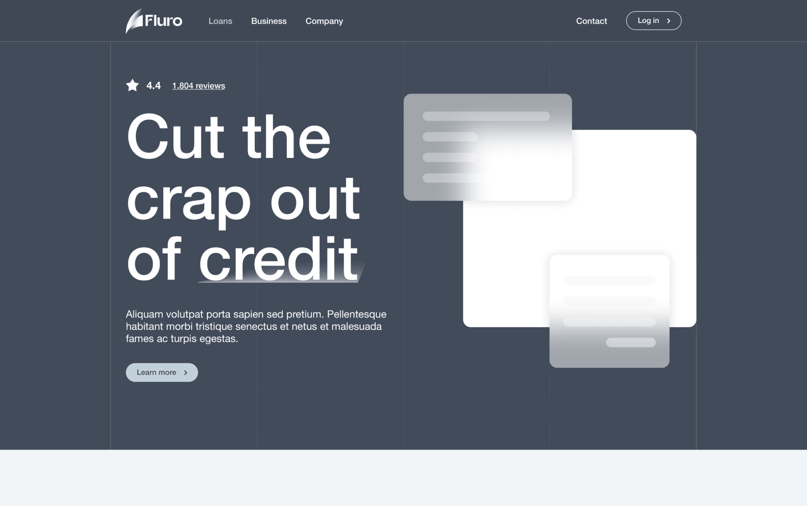
Fluro Website
Fluro • Senior Product Designer • 2021 - 2022
01 OVERVIEW
The project
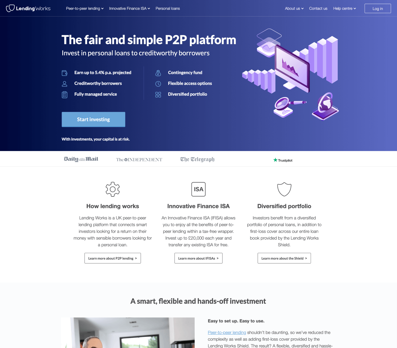
Lending Works started as a peer-to-peer lending company but overtime the vision changed and it evolved towards a borrower focus. The Lending Works branding had a functional feel, bogged down by financial jargon directed towards retail investors instead. In this project I’m describing my cooperation with Design Studio (AirBnB brand designers) to transition from Lending Works to Fluro with a big emphasis on the website as it’s encompassing almost all the new brand assets, vision and design.
My role
Being part of the core rebrand team along with the Head of Brand and CEO, I had participated and contributed throughout the whole rebrand process established by Design Studio. My main role was to help with the design directions as well as bringing a UX and Product perspective to the new brand. This has culminated with me taking full ownership of the new Fluro website, from creating the designs, to leading the developers to ensure design awesomeness.
Results
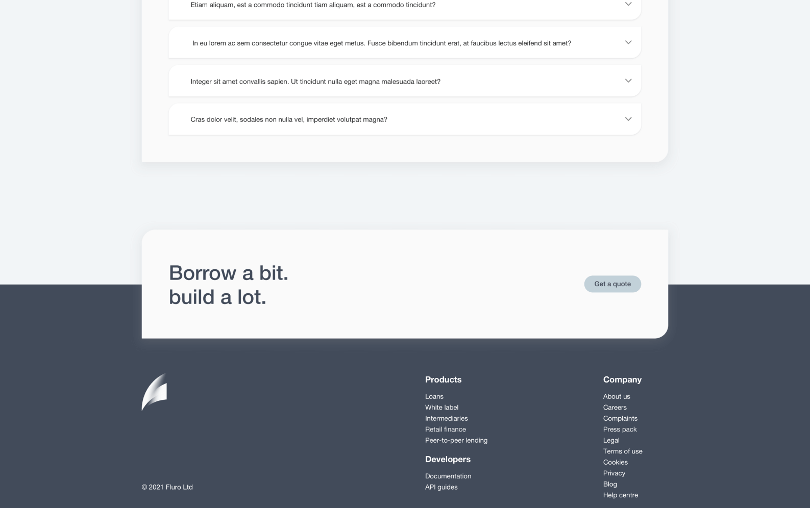
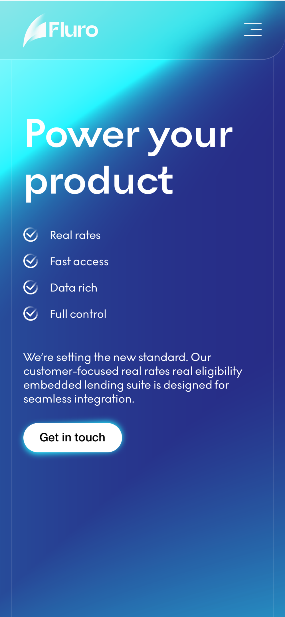
A brand new website with awesome animations and a big coolness factor
Mobile optimisation and a seamless brand connection to the borrower portal and journey
Nick (Fluro’s CEO) was invited on Sky News with Ian King to present our new branding along with our new website
We’ve run a survey for our existing customers about the new brand and majority of feedback mentioned the words “stylish”, “clean”, “eye-catching” and “professional” as key terms

02 PROBLEMS
Catering to a different audience
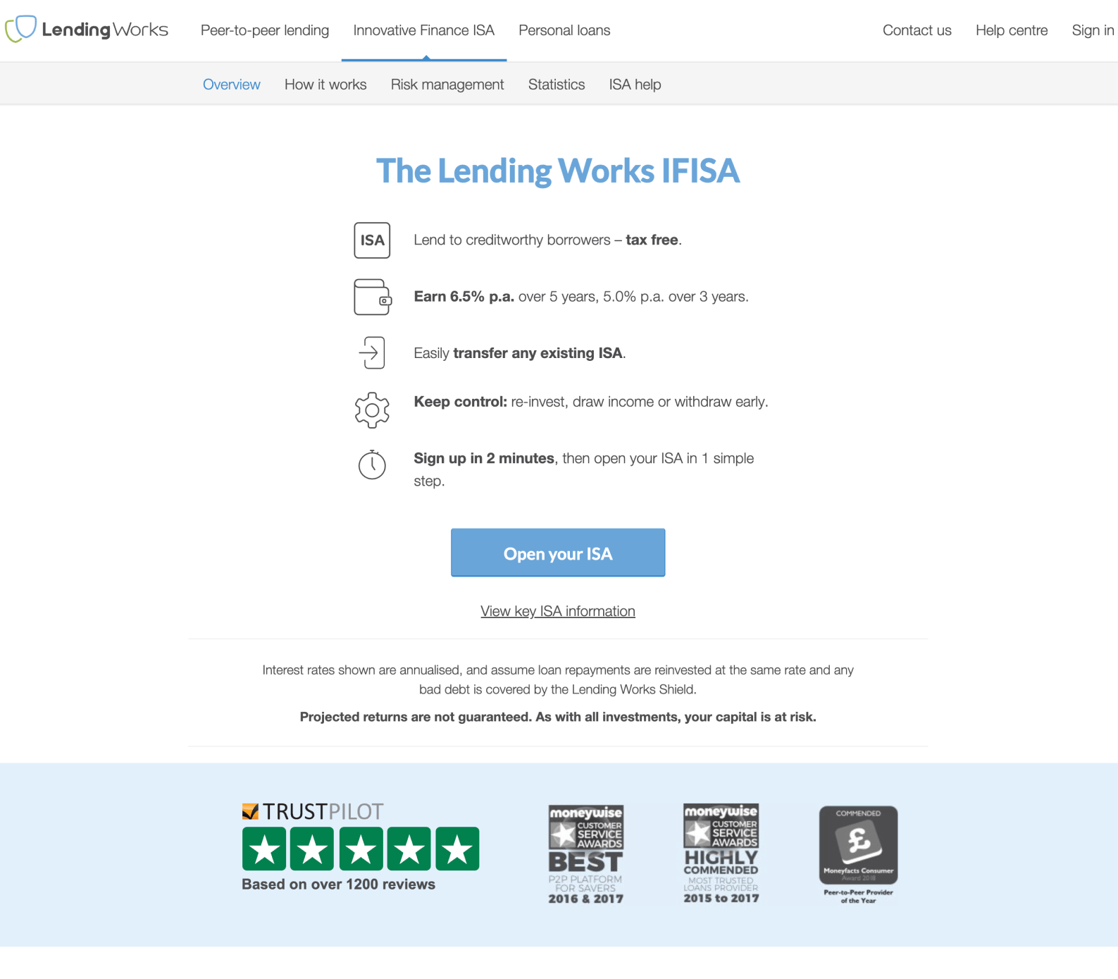
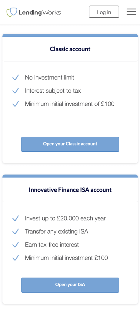
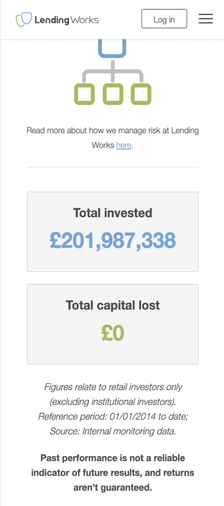
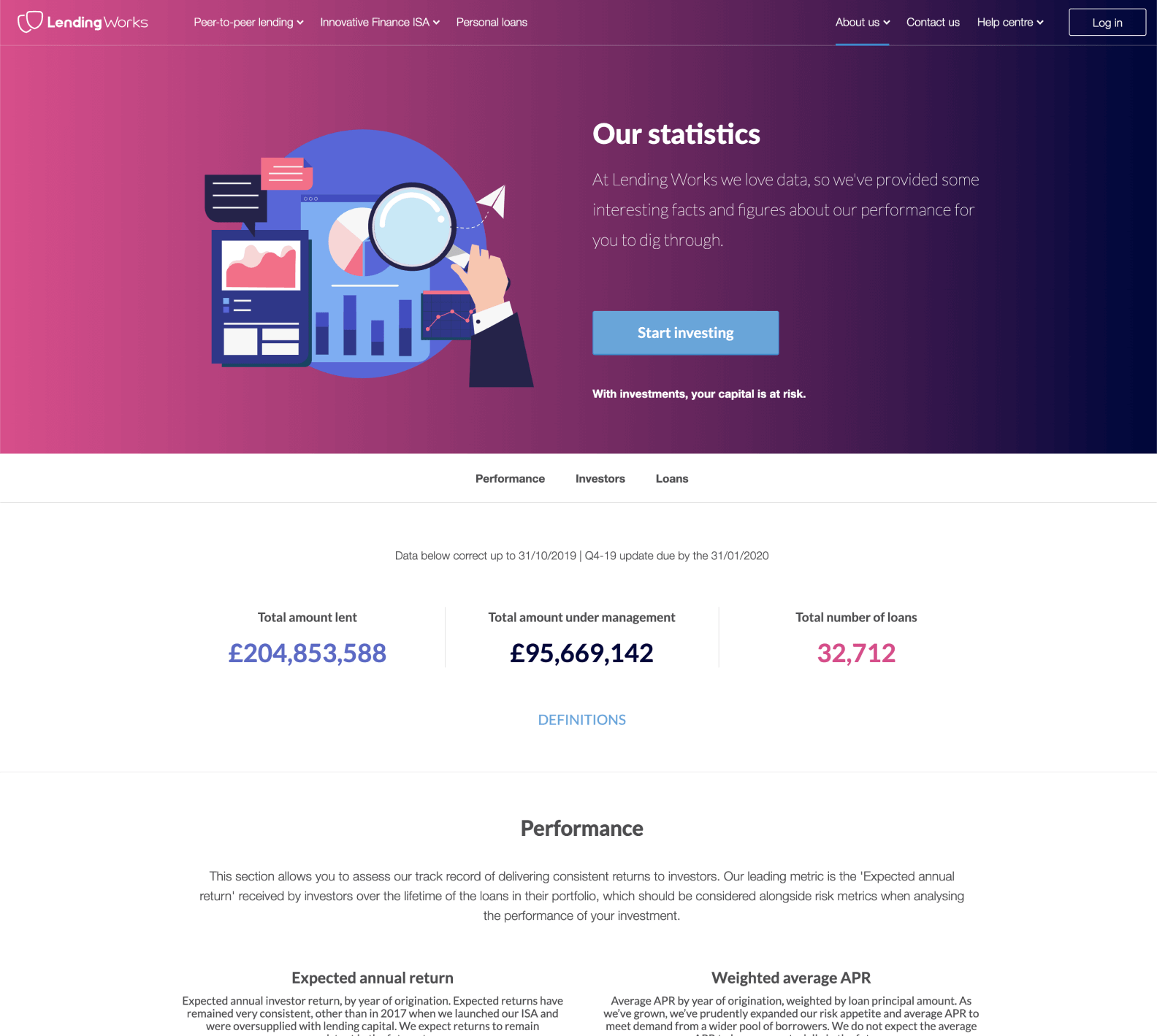
The peer-to-peer lending model means that retail investors were adding money to the platform and they were being matched with credit-worthy borrowers. However, since COVID-19 things have changed and funding from retail investors was drying up. The shift in business model meant that now the biggest focus was attracting and acquiring borrowers and using institutional investors for funding. This resulted in a website filled with a lot of redundant content catering to retail investors and frankly a brand lost in financial jargon which did not have the facilities to appeal to a wider audience of borrowers.

No emotional connection
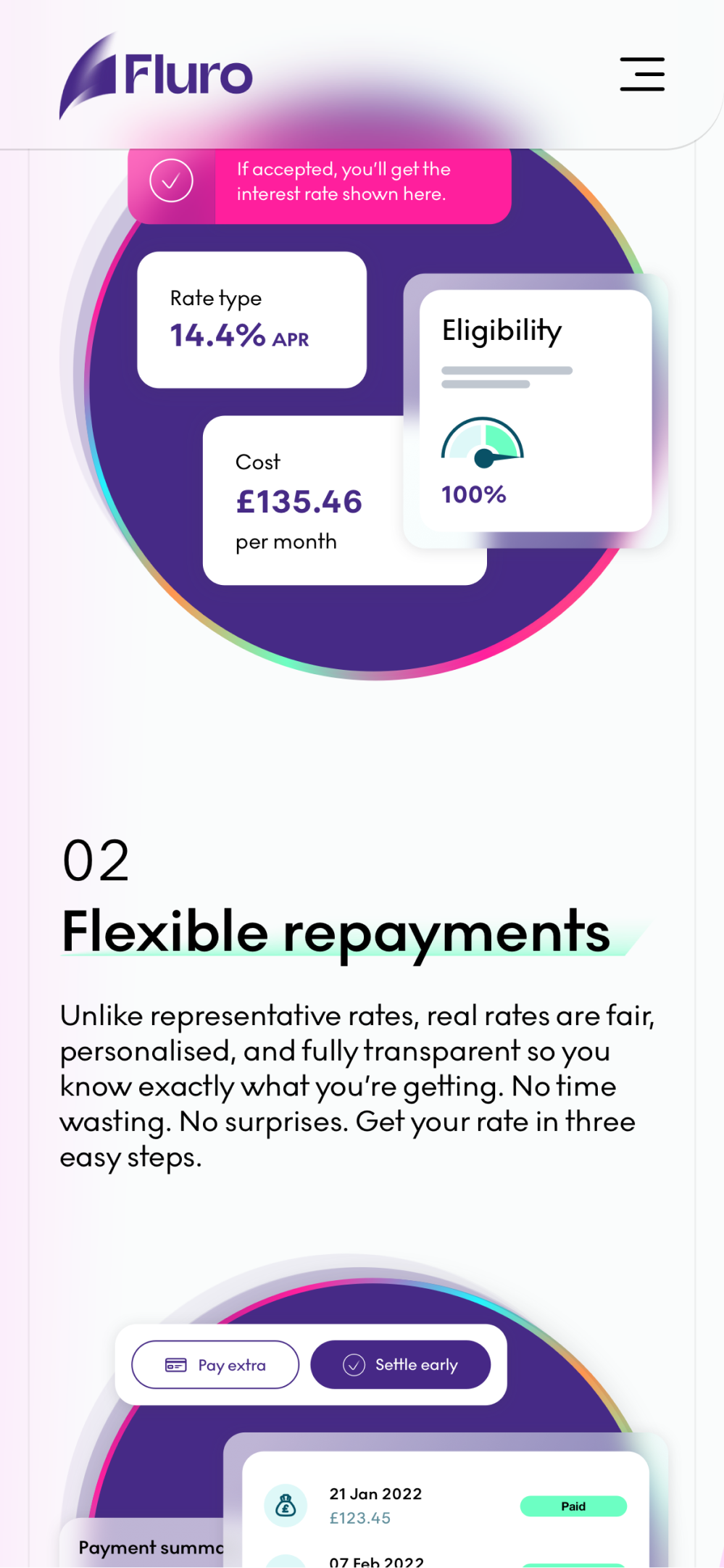
Lending Works attracted borrowers mostly by signing up partnerships with price comparison websites like Experian, Compare The Market, Clearscore etc. and retail investors through direct website sign-ups. Due to all the financial regulation for the investor product, this meant the website content was really dry, full of financial jargon and it couldn’t establish an emotional connection with a potential borrower. Considering finance is already a complex subject for many, Lending Works wanted from the beginning to simplify this and make it fair for customers, something the current branding couldn’t support without a total overhaul.
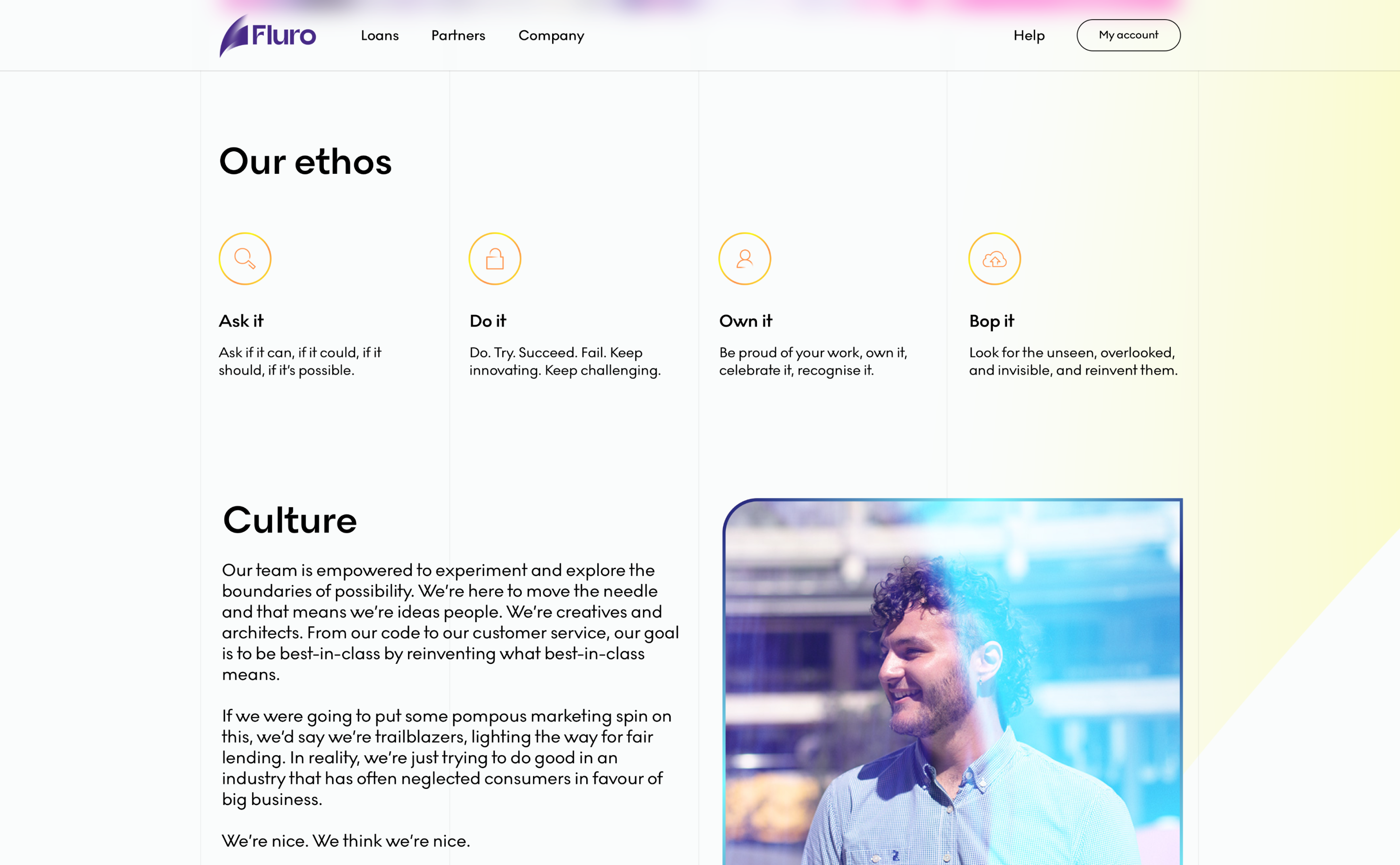
Outdated visual language
The company was started 10+ years ago with limited resources but a big mission. However, this meant rudimentary brand guidelines that couldn’t support a modern UI and user experience. Many things were missing, even fundamental colours so I tried to complement the existing assets with new ones. Although some things improved, the overall felt a bit like a Frankenstein because it was really hard to make the brand fresh and modern without changing the essence of it and the essence was really constraining. To compete in the current environment with the latests FinTechs, a new brand and website was needed.
03 PROCESS
Design process
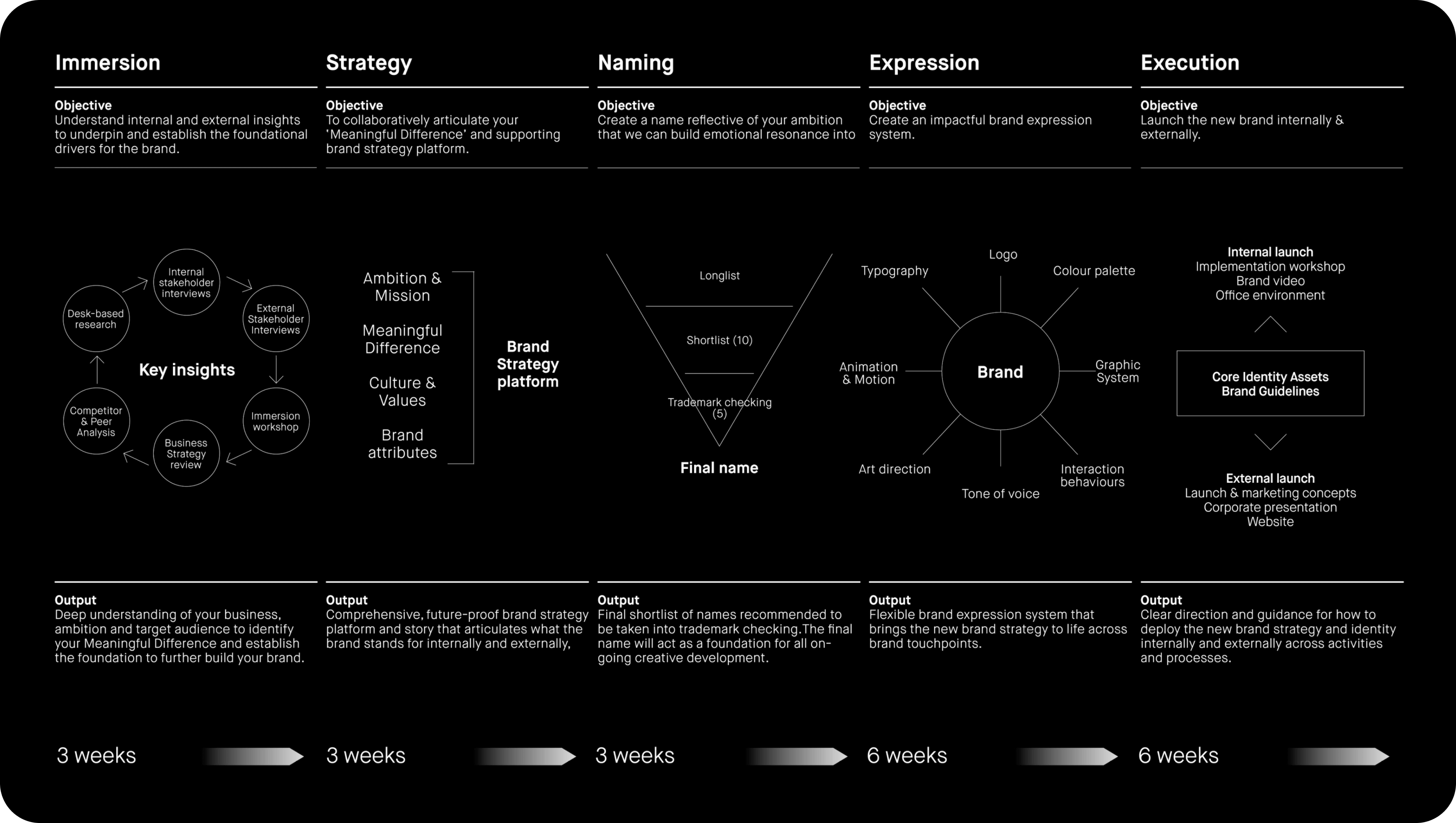
This whole process started with the realisation that scaling the business under Lending Works branding will be challenging so we pinned down and defined the specific requirements for a new brand. Once we had that, Design Studio came in with their own design process which involved a series of workshops, which I’ve been part of, that culminated with a package of Fluro assets and guidelines.
Immersion was used to understand internal and external insights to underpin and establish the foundational drivers for the brand. Strategy workshops helped us to collaboratively articulate our “Meaningful Difference” and the supporting brand strategy platform. Naming was a really fun part of the process as I later realised that it served as the main building block for almost all of the creative direction of the brand. There was at some point the suggestion of using “Barley” as the new name and I’m really glad this didn’t make it till the end as now all you’ve been seeing on my projects would be beige images of crops 😖. Finally, we had quite a bit of back and forth in choosing the new brand assets, but in the end I was really pleased to see that my suggestion of using gradients made it to the end product 😌.
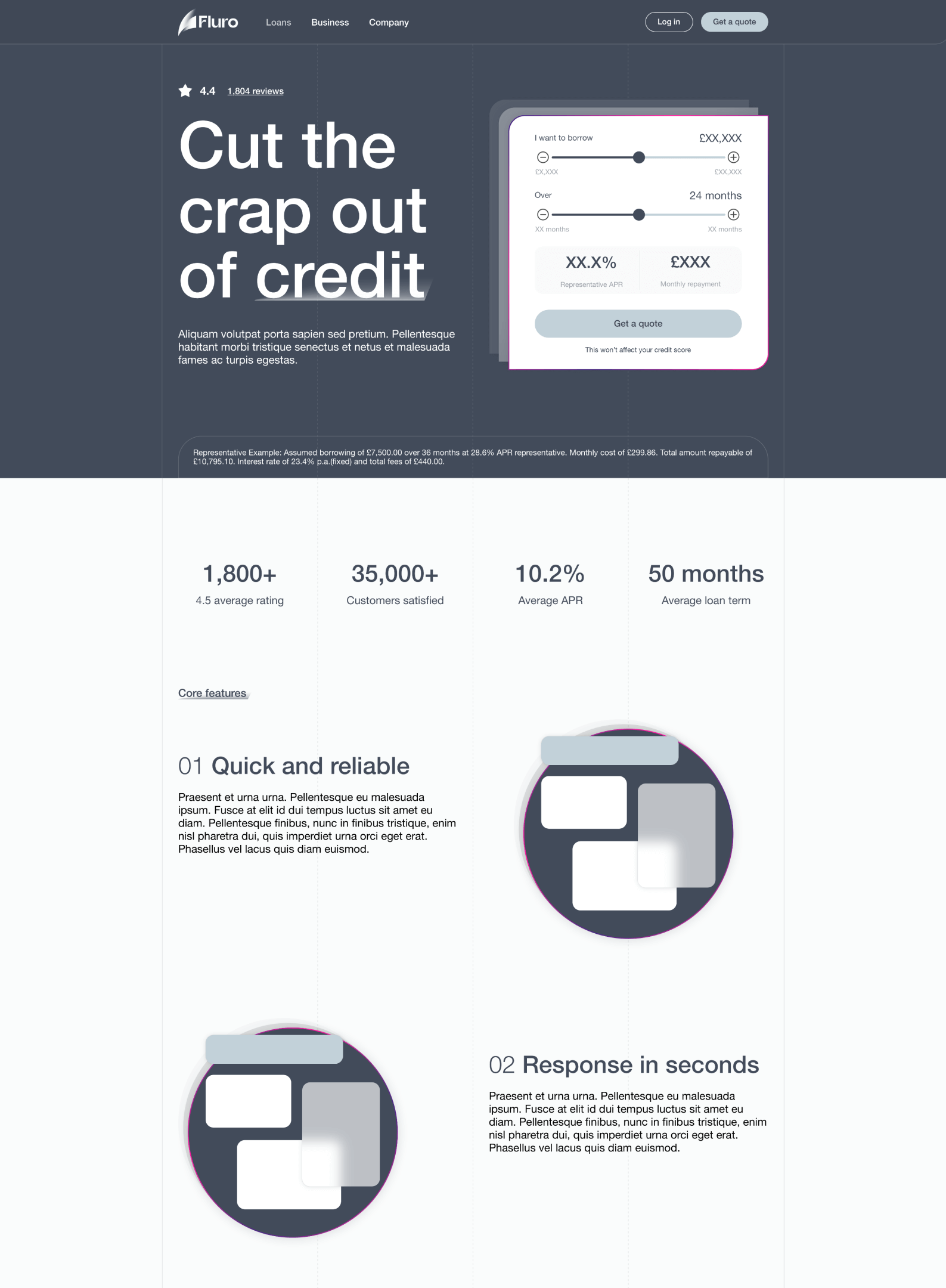
Once I had the final assets from Design Studio, it was time for me to get to do the real work, although I have been experimenting throughout the process using the provisional assets anyway. I’ve been conducting a lot of competitive analysis on the best in class websites, not only in FinTech, but from all industries to gather as much inspiration as possible. Once I had some creative directions I wanted to explore, I started creating concepts and fed them back to the team for feedback. I eventually settled on a grid type website structure due to the flexibility it provides when optimising for different resolutions.
After I finished all the hi-fi designs for desktop, tablet and mobile resolutions, I got heavily involved in the development of the website as a Product Owner to ensure design excellence. At some point I even got involved in trying to code the OpenGL, threeJS gradient that you can see on the homepage. We eventually found a contractor to help us with that 😮💨.

Rebrand stages
Although I can’t take any credit for the rebrand process that Design Studio led, being part of this has been a great experience which made me understand companies and brands from a top-level perspectives as well as the little details. Usually Product Designers, when they start working they already have a set of brand guidelines that have been established, but gaining an insight on how and why those specific guidelines were developed had a tremendous impact on my expression of the brand, from the UI to the tone of voice of the micro copy.
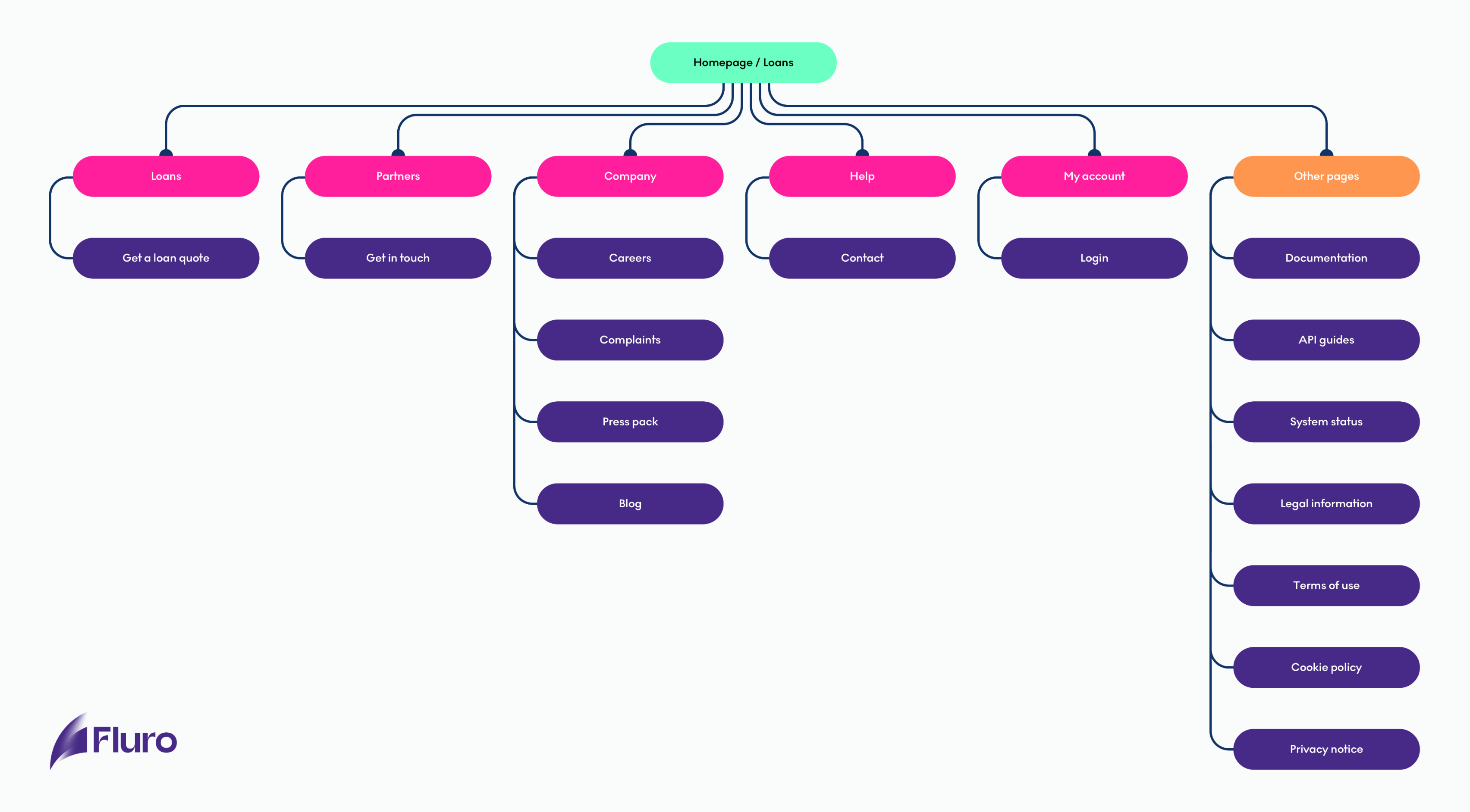
Sitemap
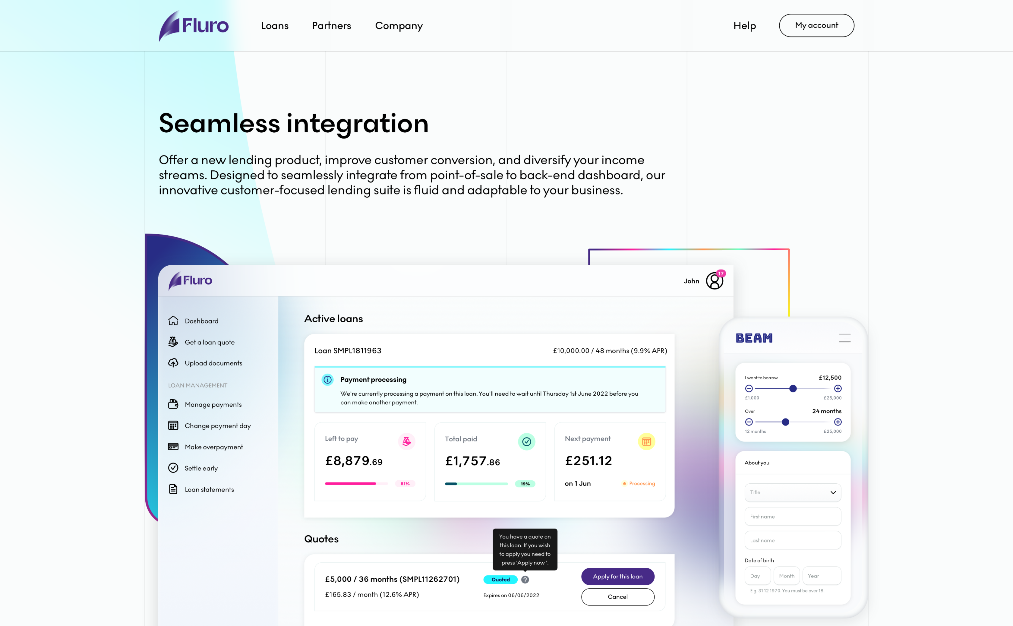
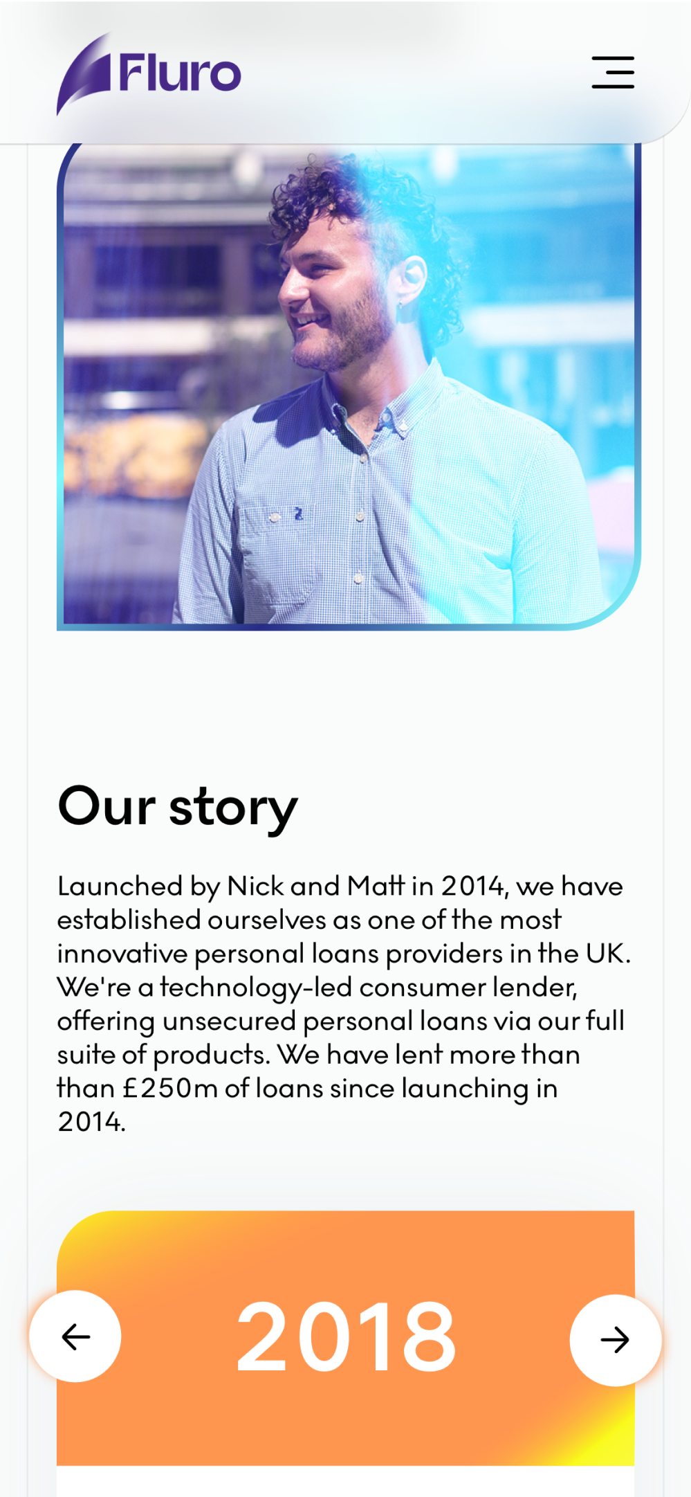
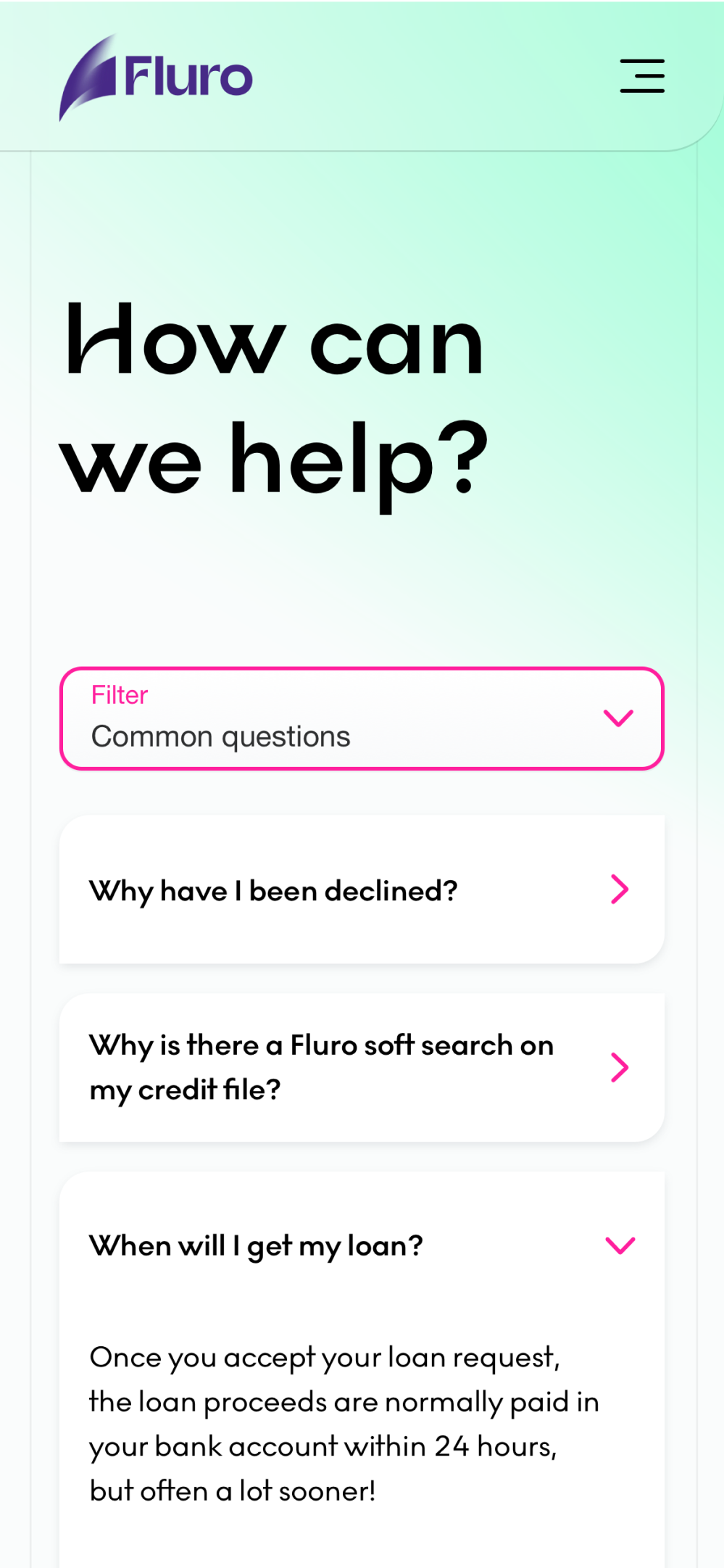
Having a focus primarily on borrowers, we wanted to strip down the website as much as possible and have only essential pages. Therefore, the sitemap is quite simple and we have three main pages targeting borrowers, partners and future employees. The plan was to start with minimal pages, but with the potential to expand these into subcategories when introducing new products.
Concepts
Being part of the rebrand process allowed me to get early access to concepts which I started using to create some website wirefames before final brand assets were finished. While looking for inspiration, I tried to find a mix of good usability combined with modern looking graphics. I wanted to build something that overcomes the competitors in terms of quality, professionalism, UI and overall user experience.
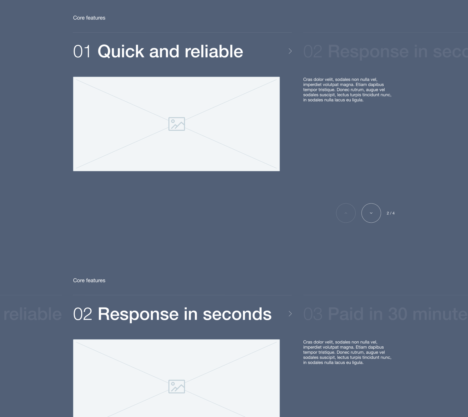
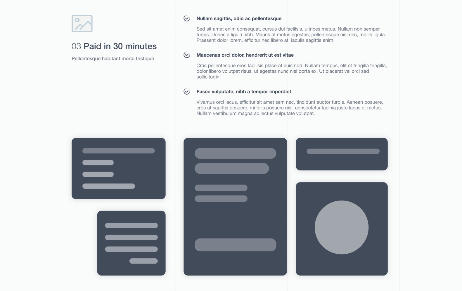
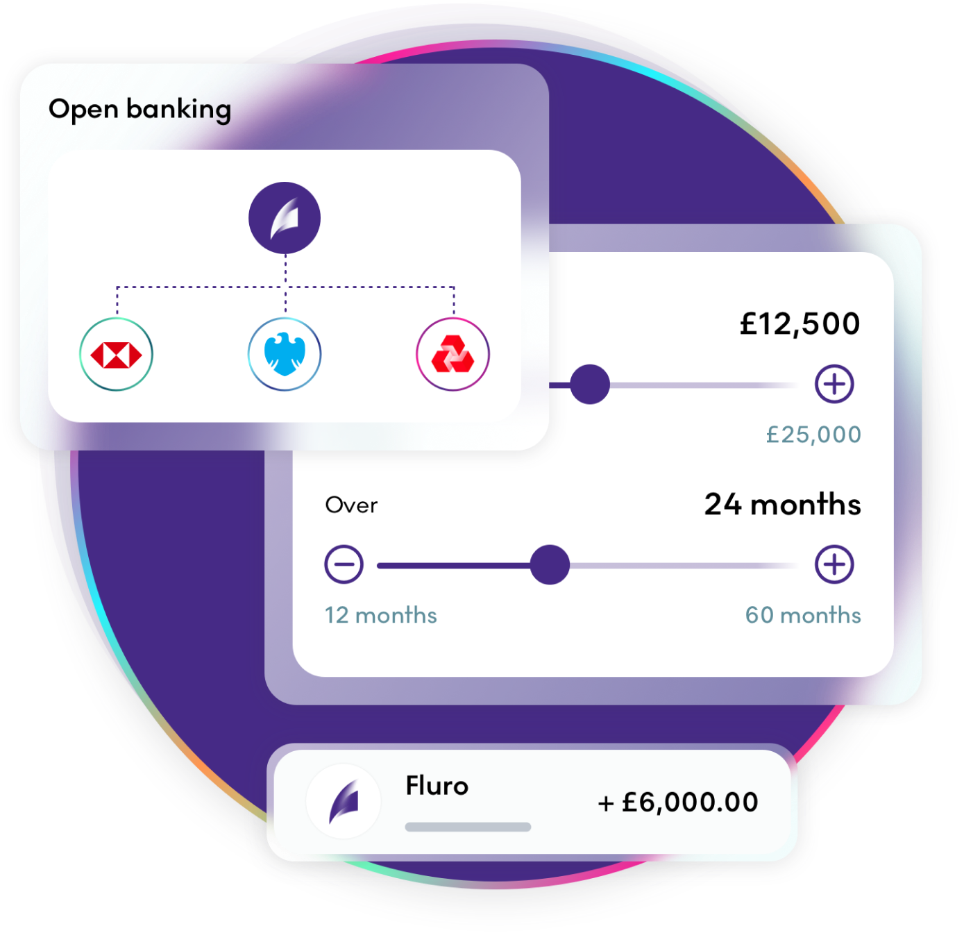
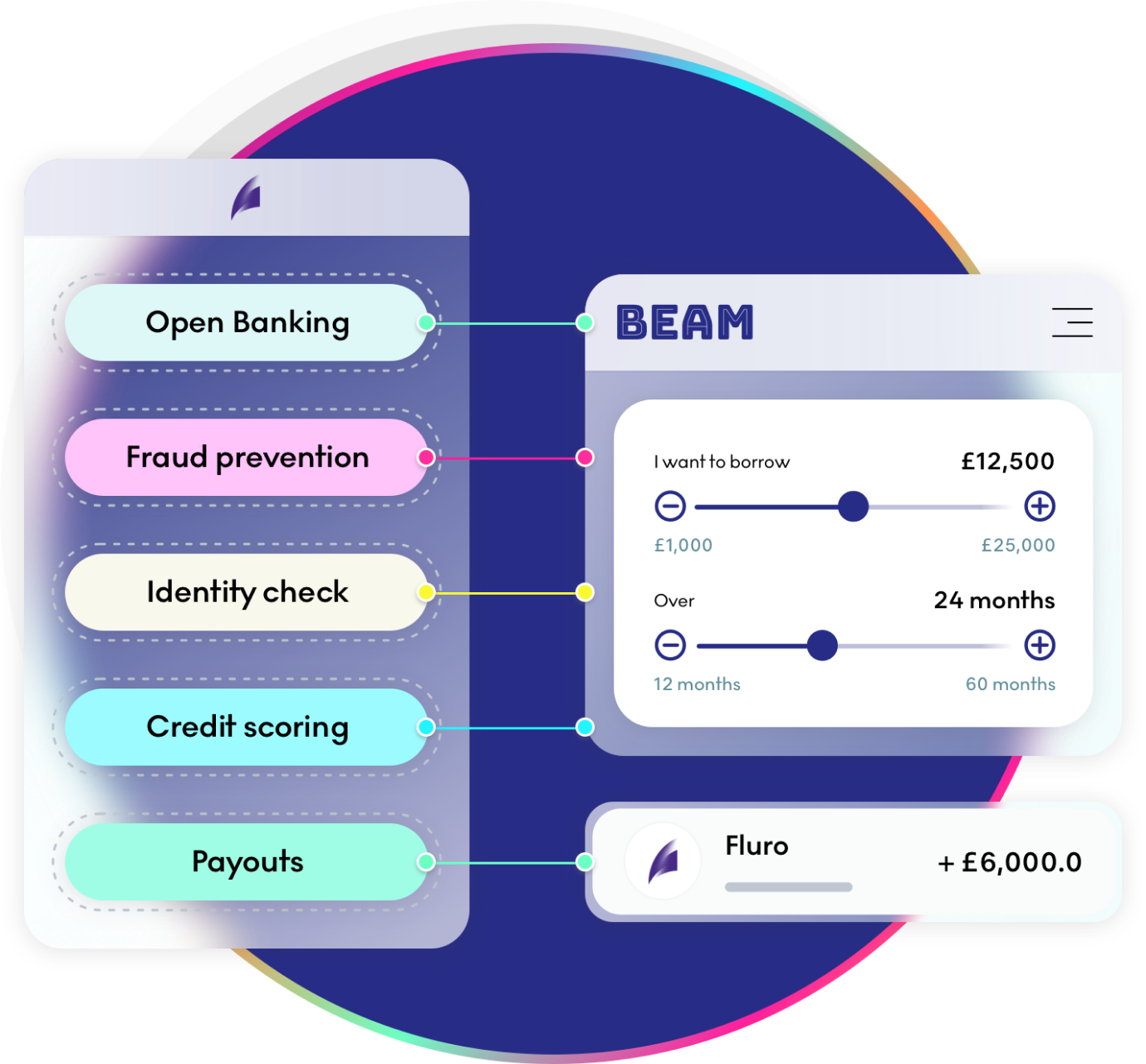
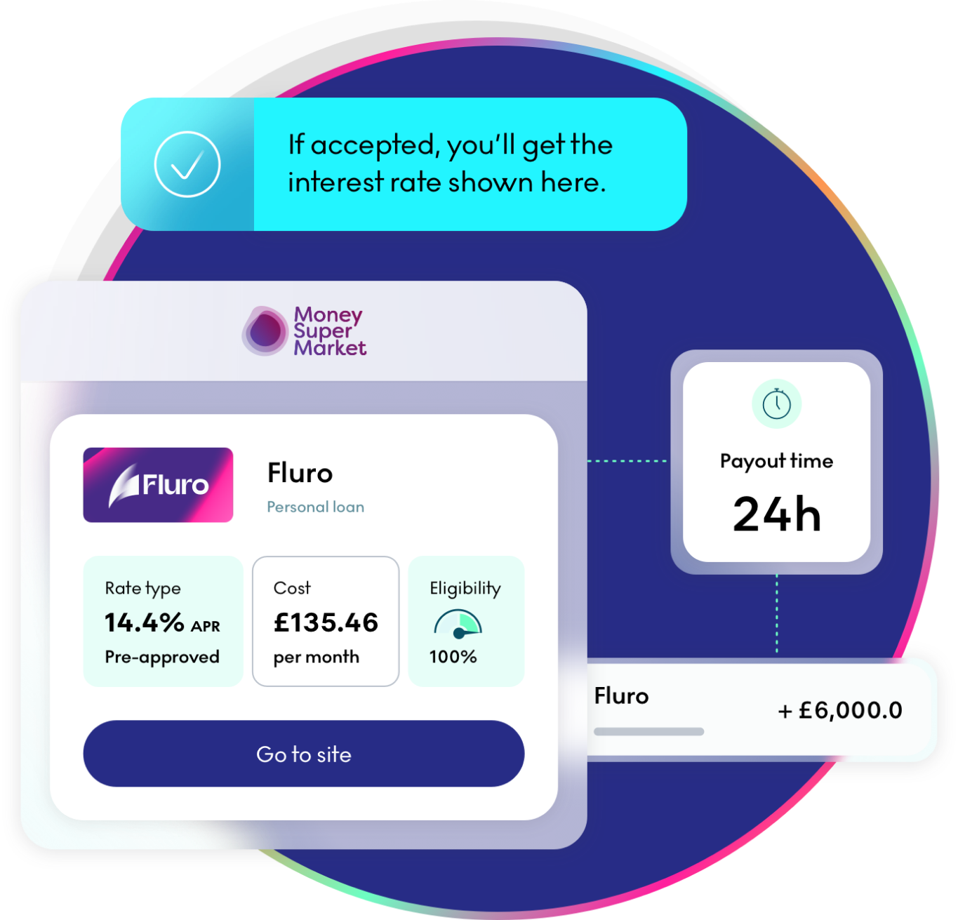
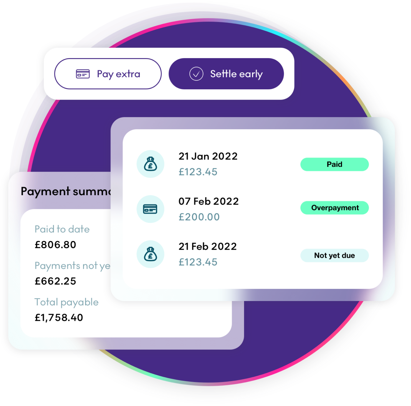
UI assets
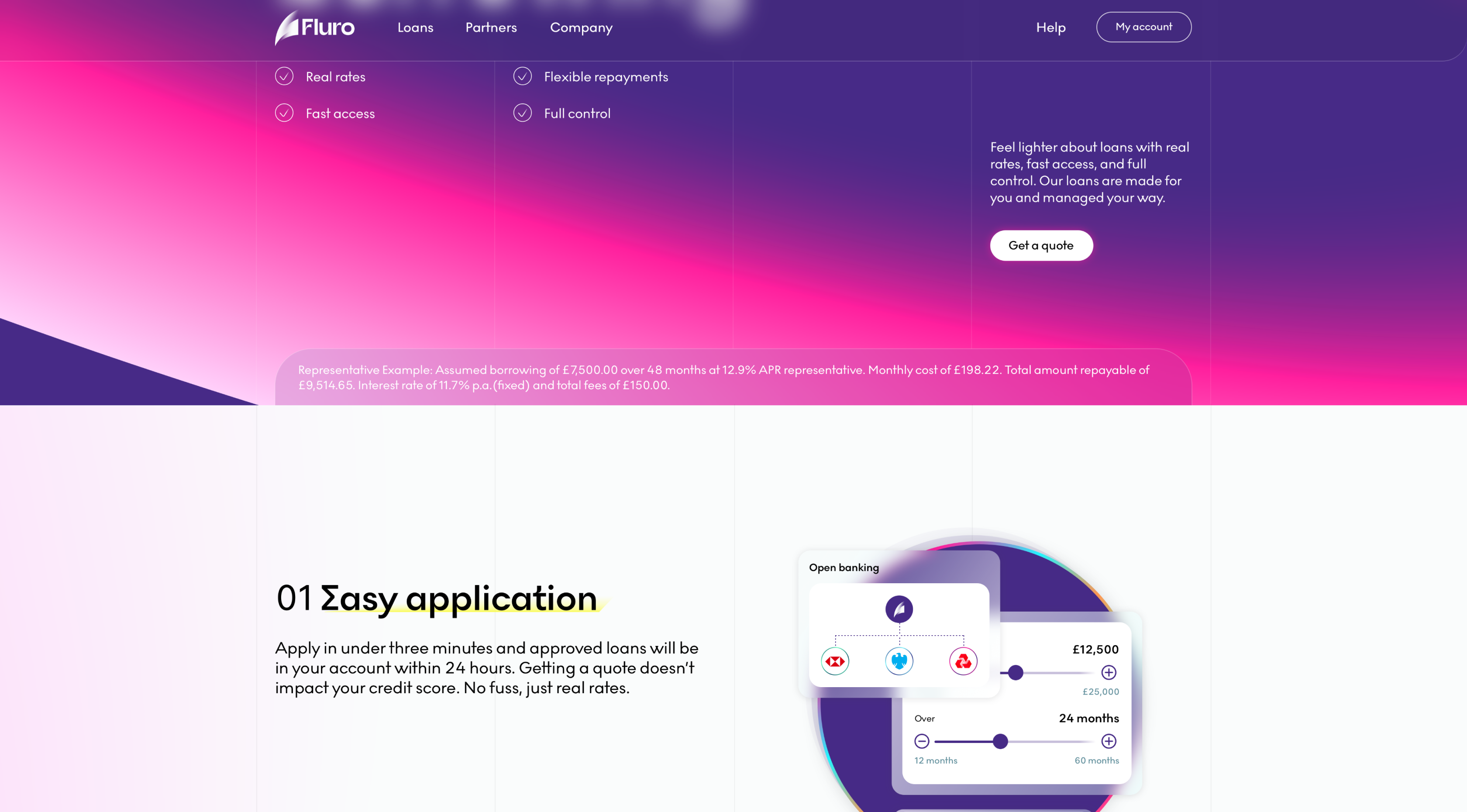
When we were reaching almost the final variations of the new Fluro assets, we realised that we won’t have much content to fill the website with. Since stock images were completely out of the question and we didn’t have any kind of illustrations, I proposed using some UI work based on our processes. I started the design work with the idea of mathematical precision from the Fluro logo which is using the Fibonacci sequence. I wanted to produce something that can match that as well as the grid design of the pages.
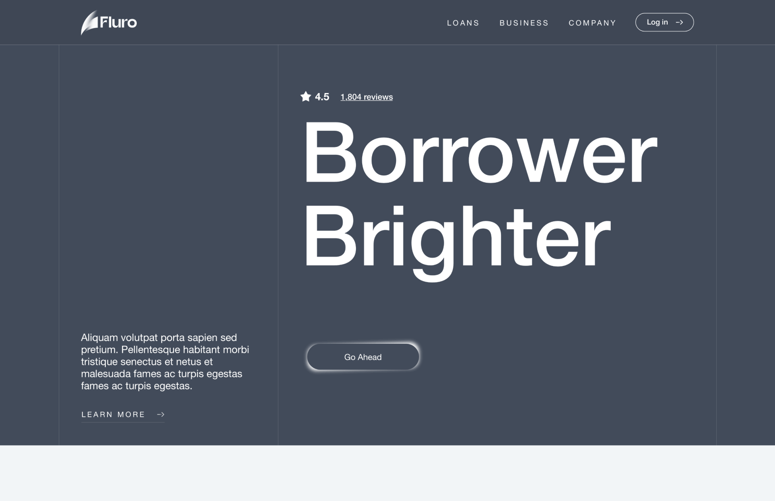
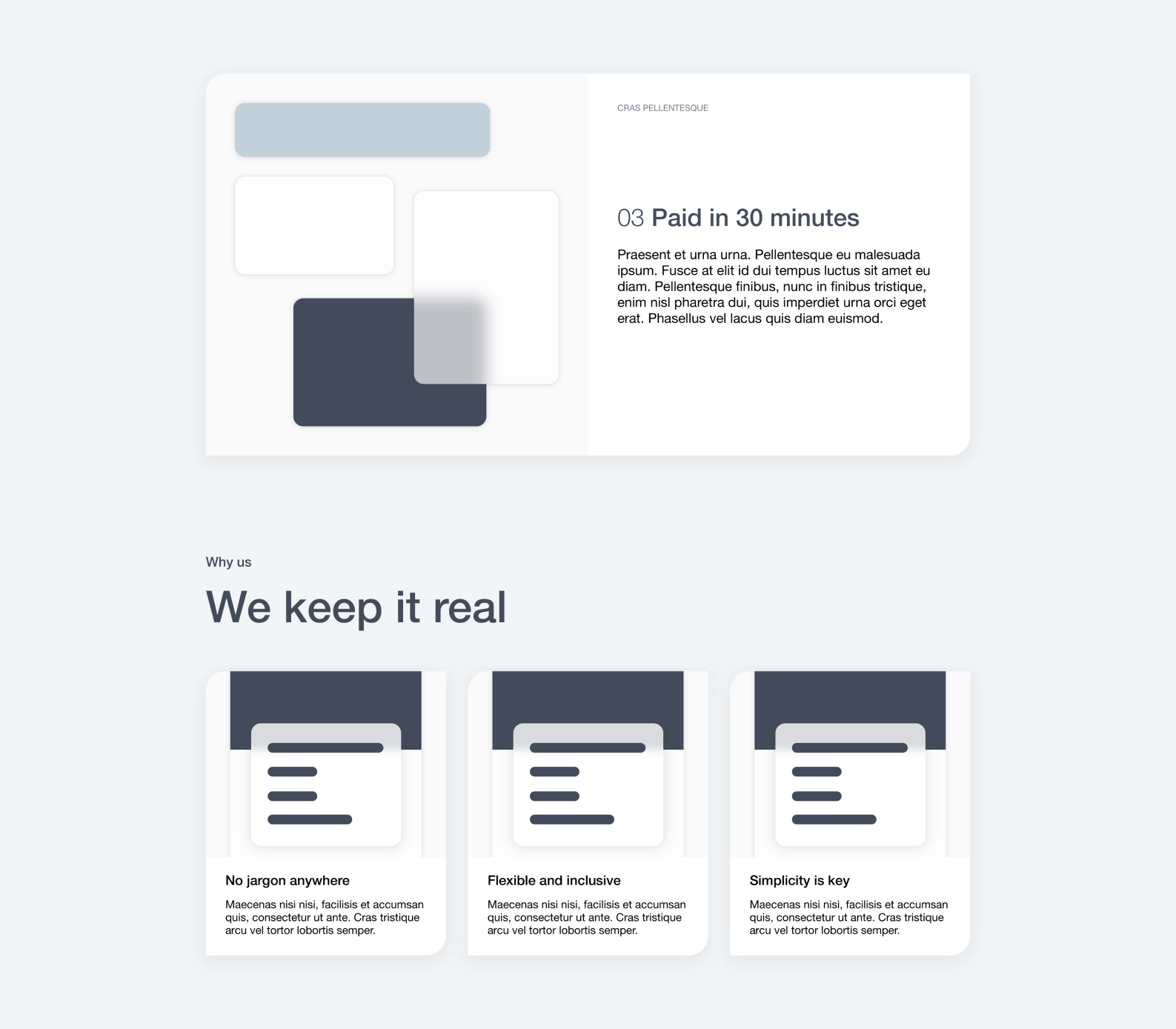
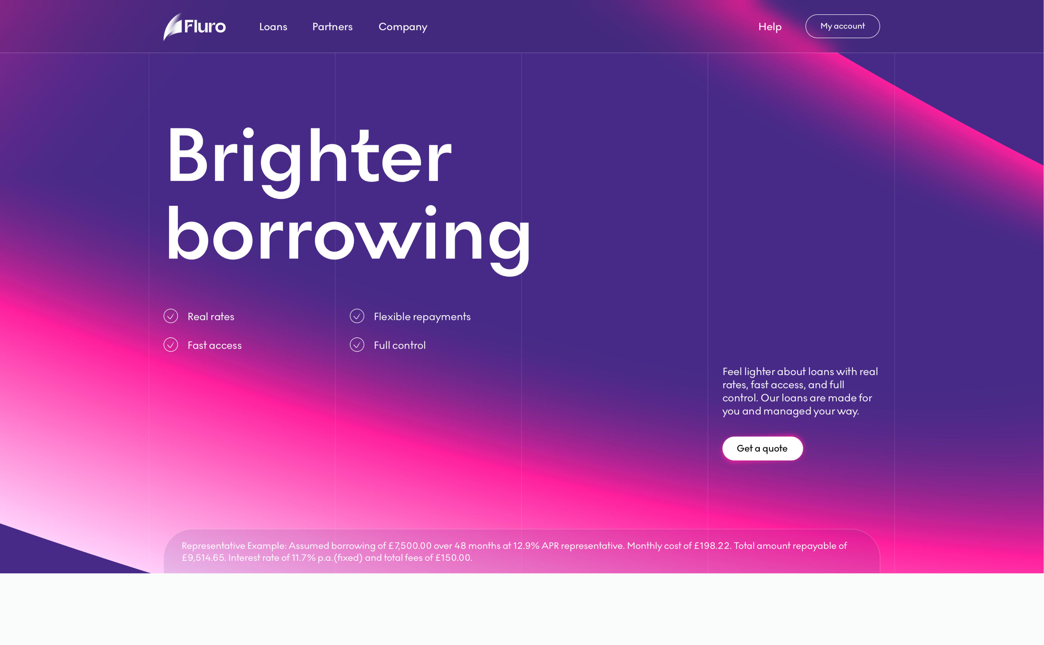
Hi-fi designs
I have to admit that even though I was part of the whole rebrand process, translating the new brand assets into a fully functional website from scratch was a frustrating creative process. It’s true that I had the basic building blocks, but in terms of the expression of those I could go in an unlimited number of directions. I’m really glad I had the freedom to explore and was aligned with the co-founders in terms of vision. In the end I am really pleased with how everything turned up, even the CEO mentioning he’s been through this website design process many times before, but this time it exceeded all his expectations. What you see below is the final representation of all the iterations we’ve been through and all the efforts combined from many people involved into such a big project.

Implementation and QA
Being the Product Owner for this project and having a computer science background have been tremendous advantages in delivering a high-quality implementation. I was really lucky to work with experienced front-end professionals, however building something from scratch and expecting the developers be as detail oriented as a designer is simply not possible. That’s why I tried to help as much as I could with detail front-end explanations when doing QA sessions.
Overall, I think this project turned up to be a great success and a big enabler for the rest of the rebrand process. In this project I also established the design direction that I used in the other projects like the design system, borrower journey and borrower portal.