Borrower portal
Fluro • Senior Product Designer • 2020 - 2022
01 OVERVIEW
The project
Once a customer goes through the journey and applies for a loan, they are also creating an account for the portal. This is where the customer goes to manage the loan, make extra payments, change the payment day or settle early. The scope of the project was to do a total overhaul of the portal. This was achieved by documenting every action that the user can do, removing inconsistencies, simplifying the UX, redesigning and rebranding the UI.
My role
I worked on the project as a lead designer along with the product manager and developers. My role was to research and document all the possible actions that the user can do, identify UX issues as well as general queries that the Customer Experience team were constantly getting. Once I had those, I’ve redesigned all the portal pages, creating new ones where needed, optimising for mobile and applying the newly created design system.
Results
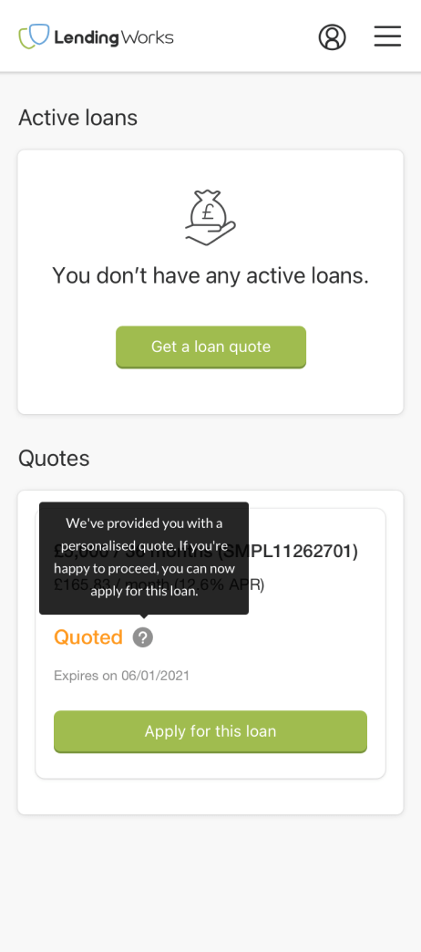
The portal has been fully optimised on mobile which is used by more than 80% of users
Trustpilot score has improved from 3.8 stars to 4.9 stars
On the feedback widget on the portal, majority of users mention “ease of use” as the highlight of the portal
Customer queries to the CX team have been considerably reduced, for some specific queries they reduced to zero
Productivity for teams like Finance and CX have been improved also because customers are now able to self-serve on many issues, avoiding unnecessary mistakes and the need for contact

02 PROBLEMS
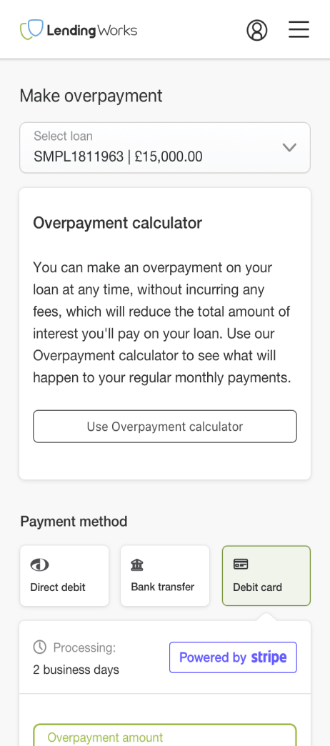
Mobile friendly
The company started in 2012 and the world looked different back then. The main focus of the company was designing and developing for desktop platforms. However, during the years, things have changed drastically and nowadays more than 80% of our users are using mobile devices. Focusing mainly on desktop led to some quite bad UX outcomes for the mobile portal. Unfortunately I wasn’t smart enough to collect mobile screenshots, but you can get an idea from the images below. Optimisation for desktop wasn’t great either, now imagine how those looked like on smaller screens.
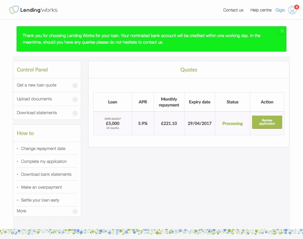
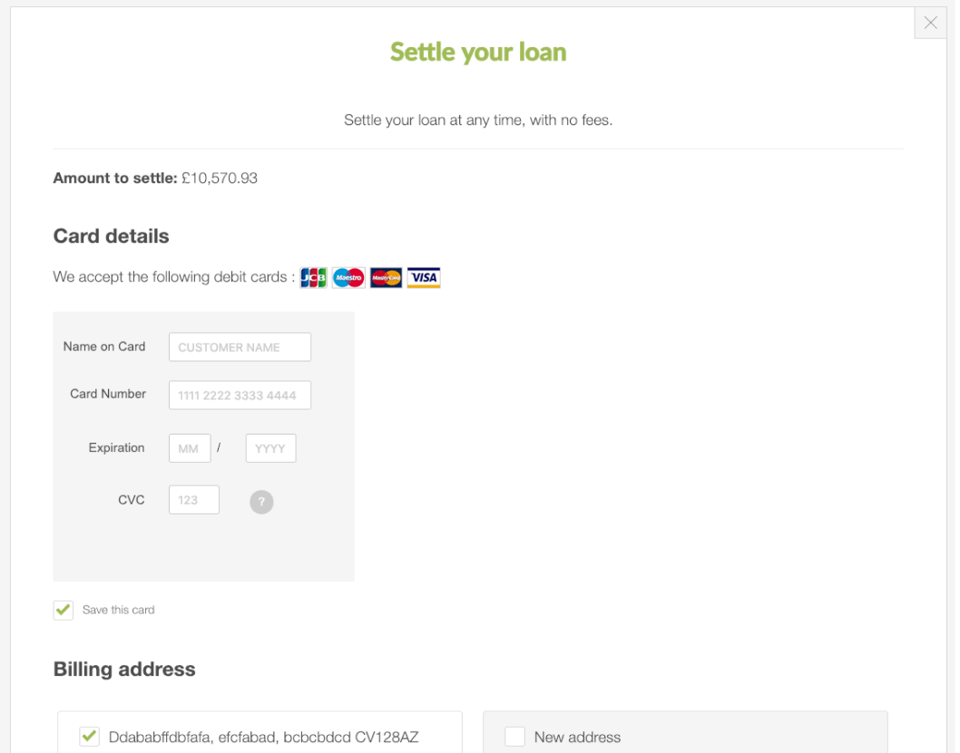
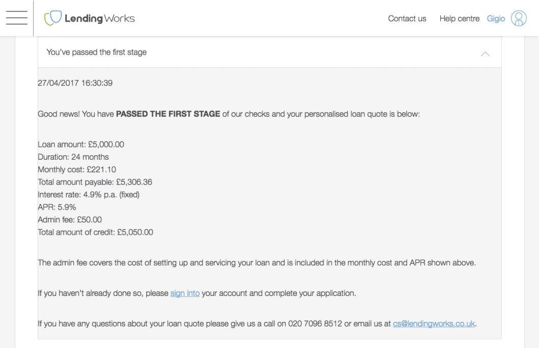
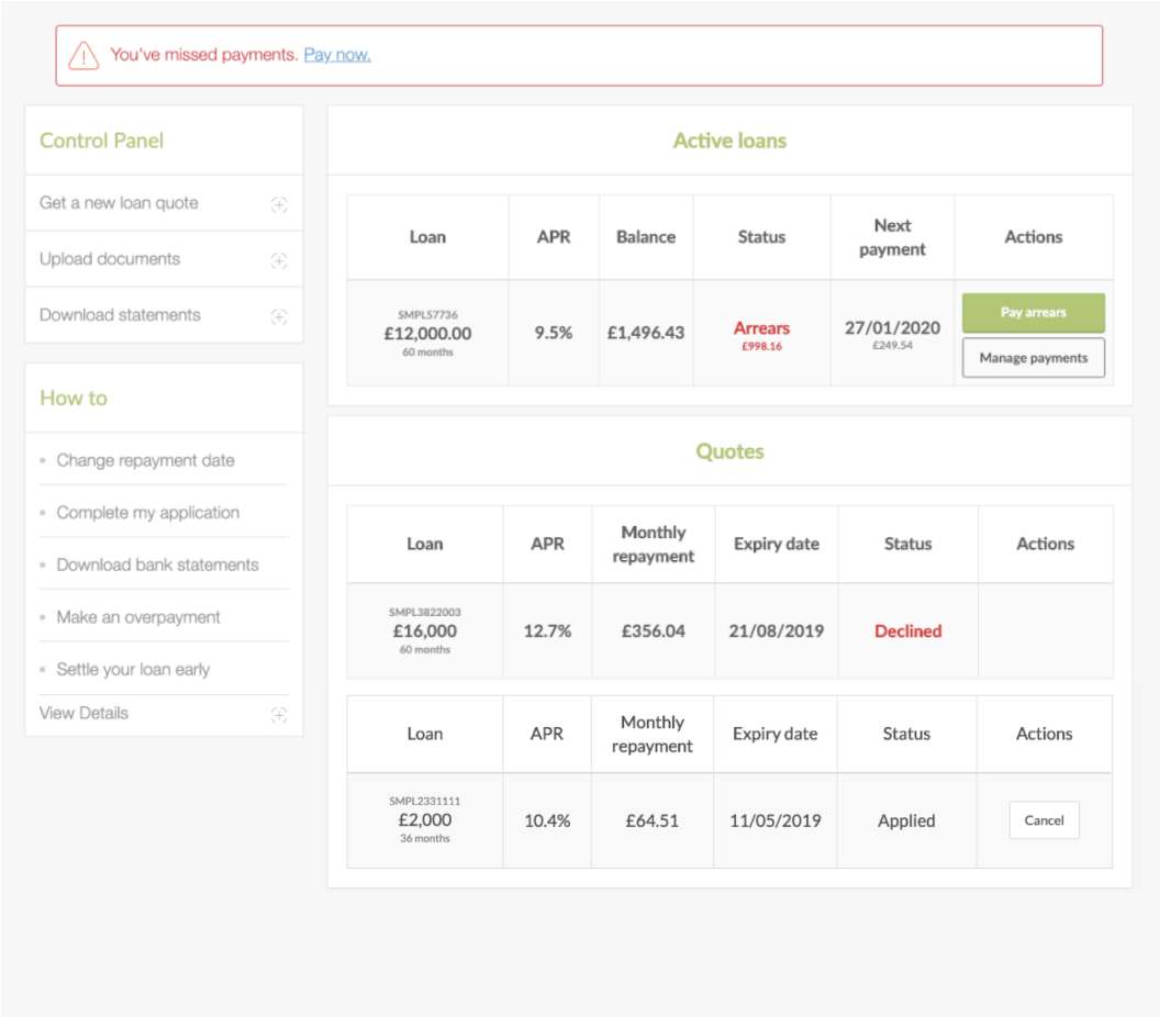
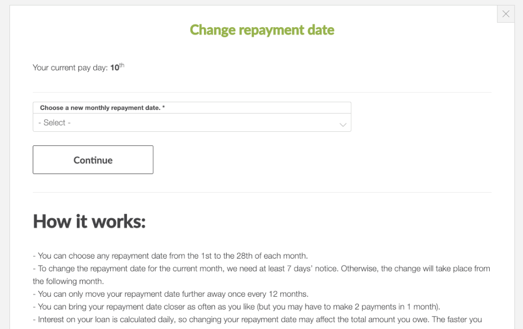
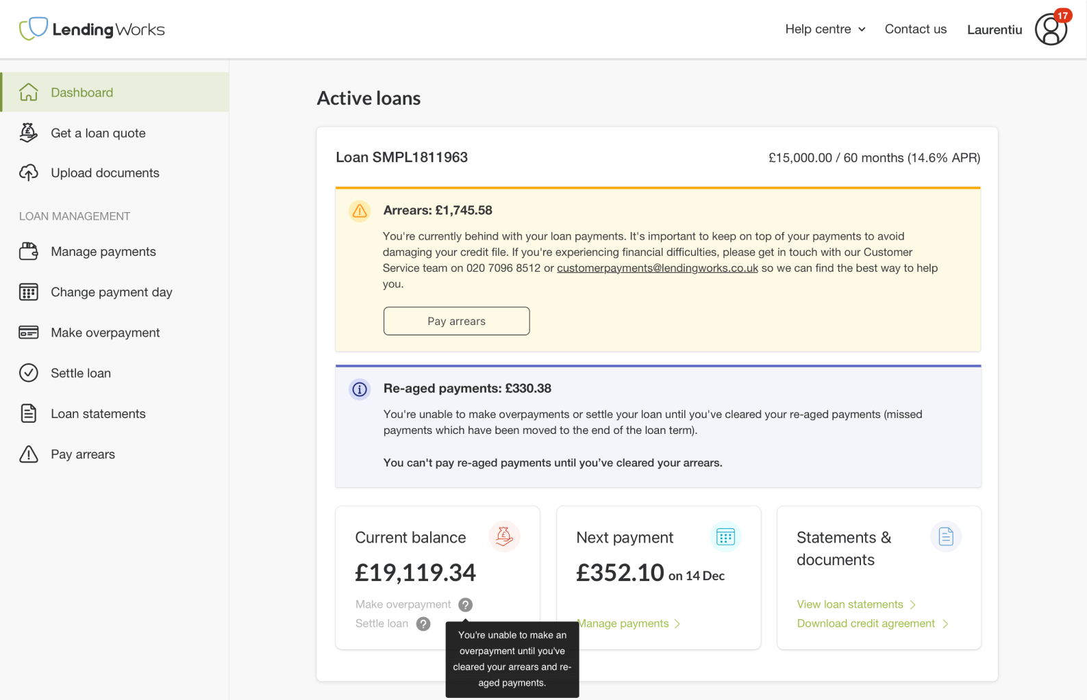
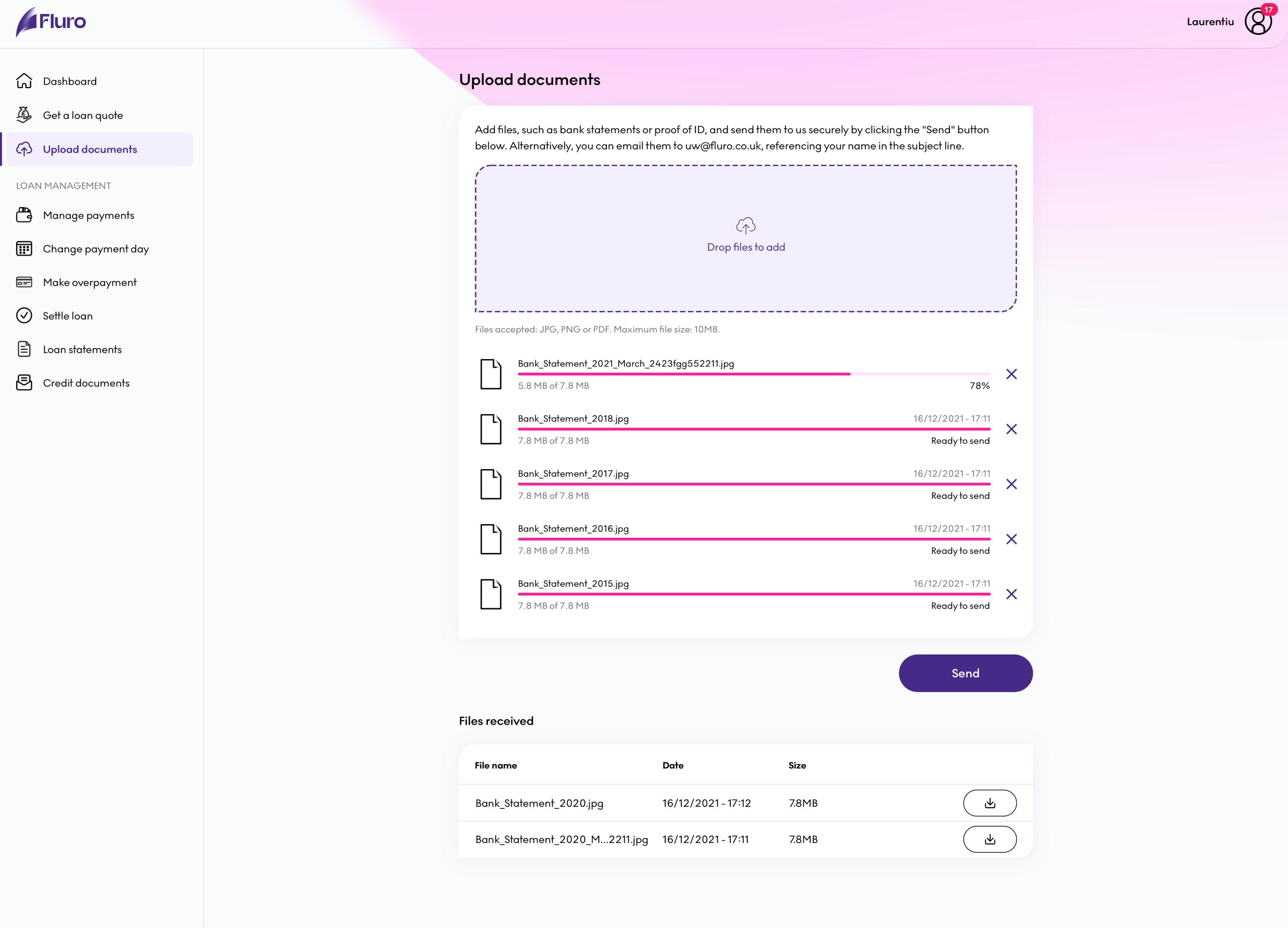
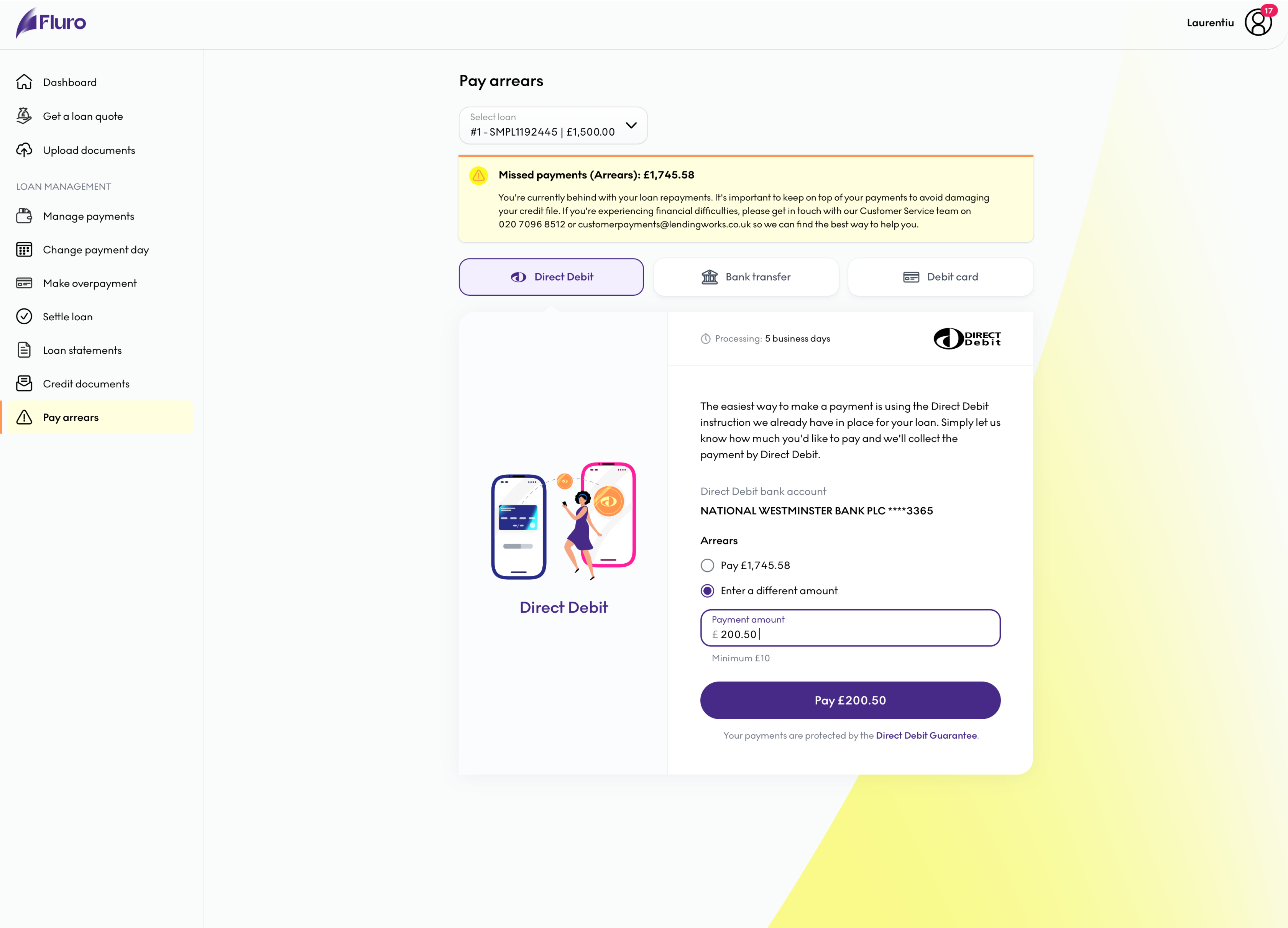
Inconsistency, ambiguity and bad UX
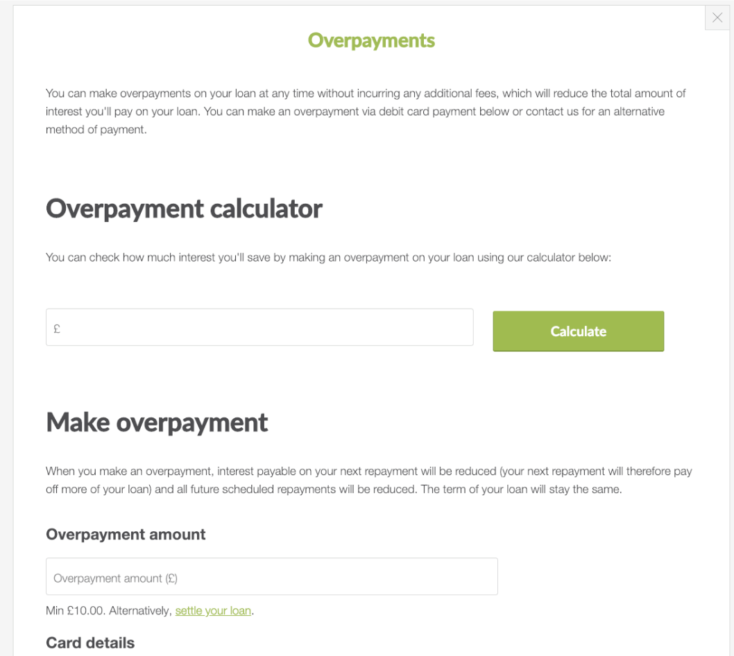
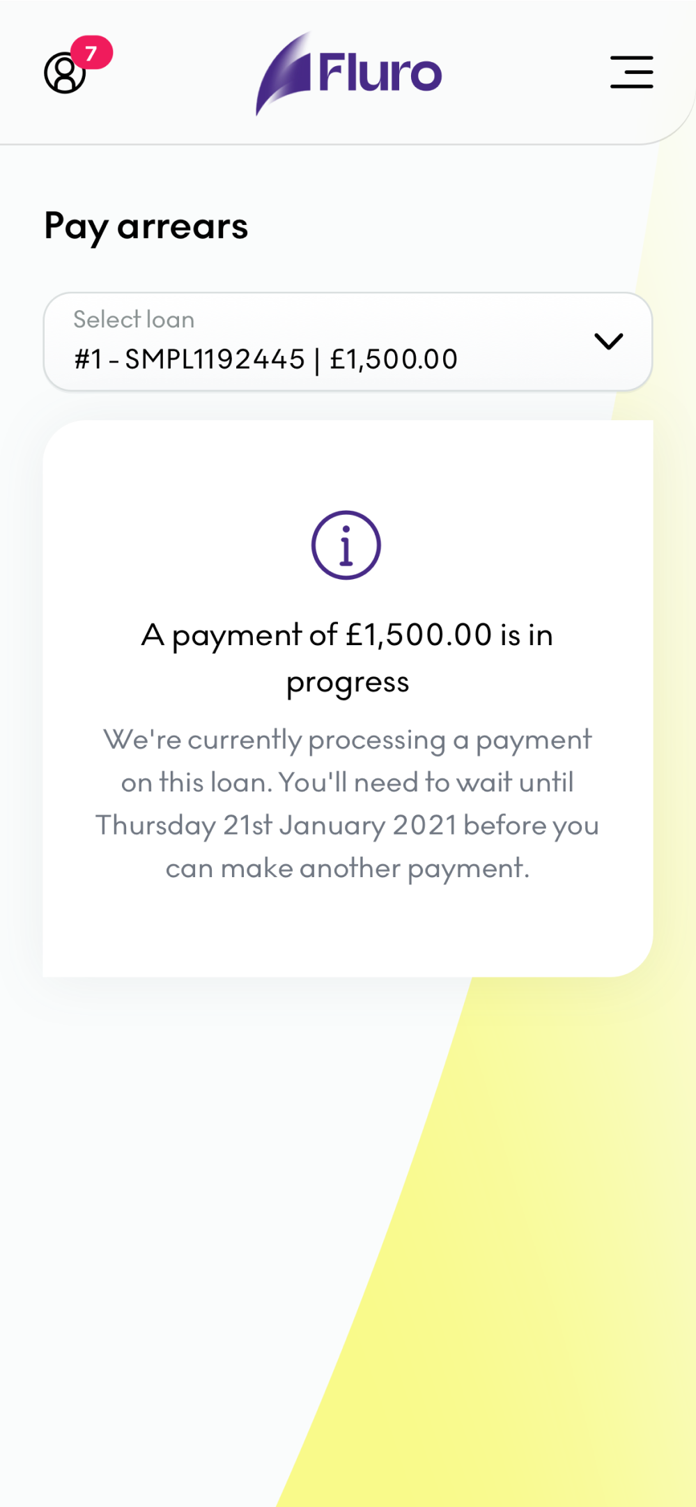
The main problem of the portal was that the bad design and UX that you can see from the screenshots below, created a lot of frustrations for customers. Many times they were trying to perform an action, like changing their payment day only to be prompted with a bunch of errors without providing the clarity of why those were happening. The general copy of the platform was also very fluffy and using “financial language” instead of terms that the general population can understand. This in turn led to complaints to the CX team, increasing their work load and make it harder to scale the loan volume.
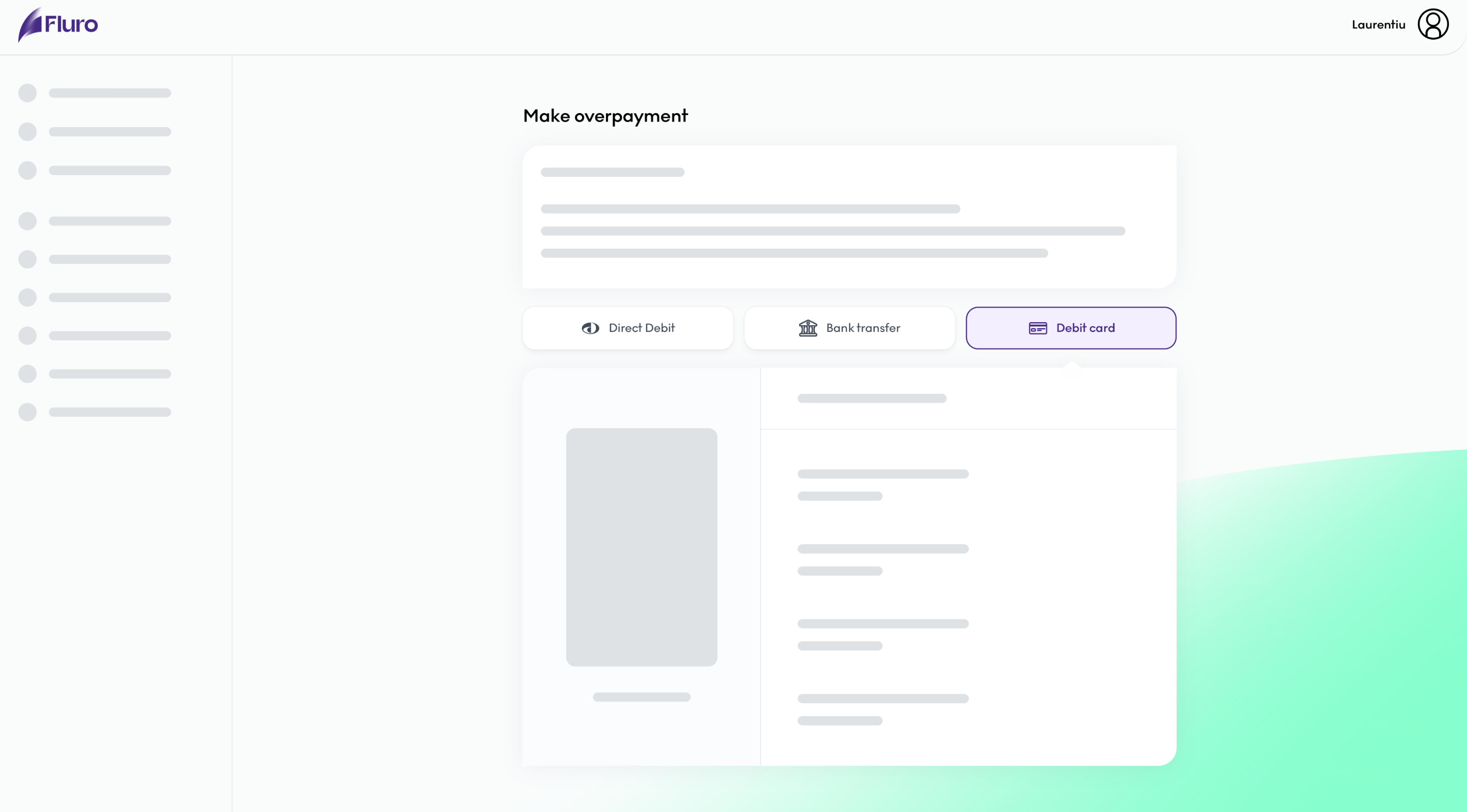
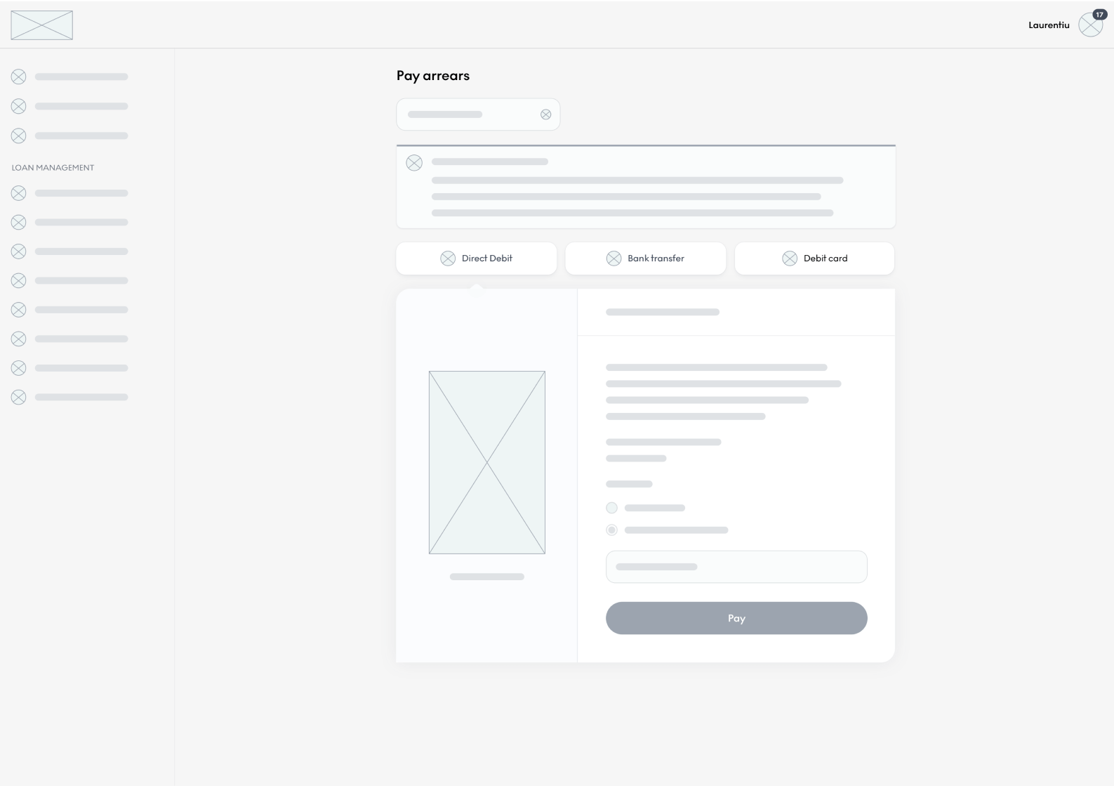
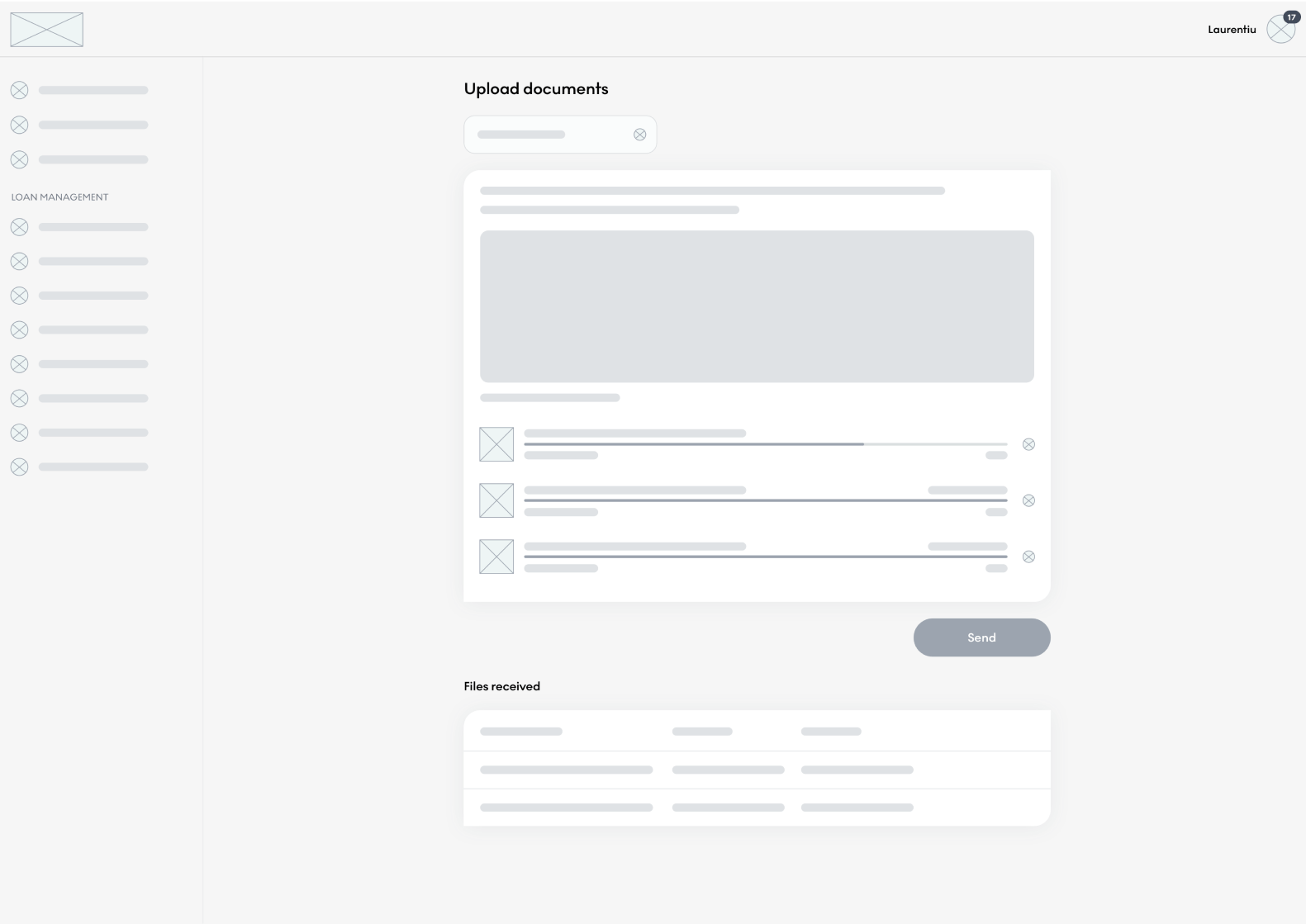
Time for a facelift
Once I had outlined all the problems that I could find, I started redesigning the whole portal, having a great emphasis on the mobile design. However, if this was not enough of a challenge, during the process I found out that there is a plan for a total rebrand of the company. The news made me adjust my design approach by focusing more on design modularity and adaptability to a future rebrand. Having the Design System ready proved to be a great enabler for design efficiency. The examples below are redesigned pages before applying the new brand guidelines.
03 PROCESS
Design process
The design process used for the portal have been quite similar the process I used for the borrower journey project as I was sometimes working on them in parallel. This was due to both projects being very tightly linked together as customers were being led to the portal at the end of the journey.
I started by defining the requirements along with the business needs. I did a deep dive into all the functionalities to discover and screenshot/record usability issues as well as looking for opportunities to add extra features to the portal. This is where I made use of HotJar and Google Analytics for qualitative and quantitative analysis as well. In this phase I also conducted interviews with the customer experience team (CX) as they were the people most aware of the user’s needs and problems they were facing. All this led to the production of a high-level user journey to provide everyone an overview of what the customers are experiencing.
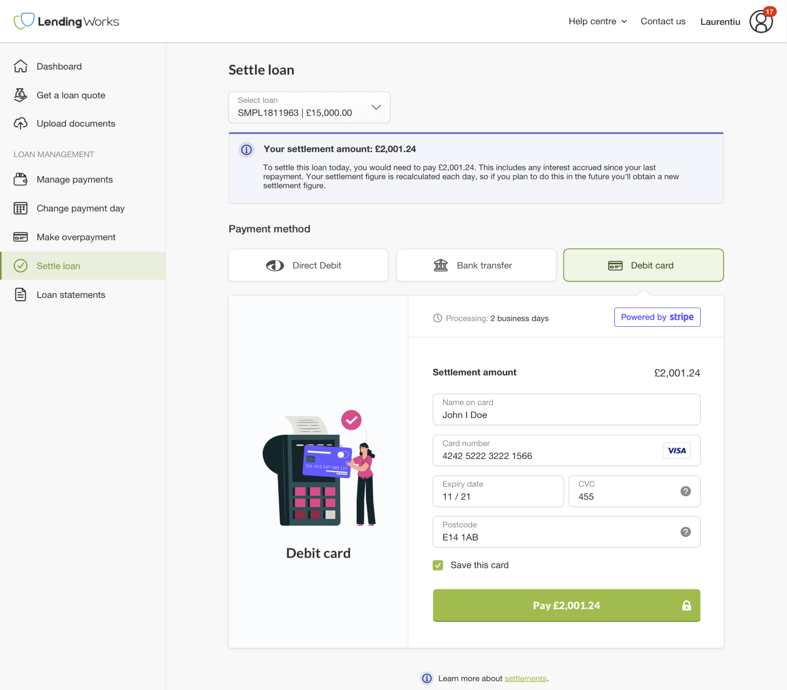
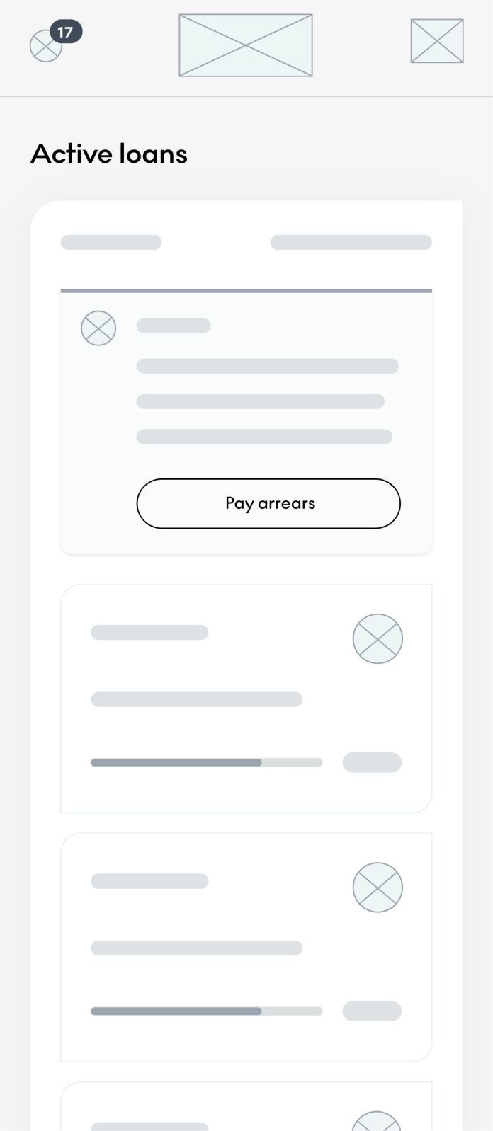
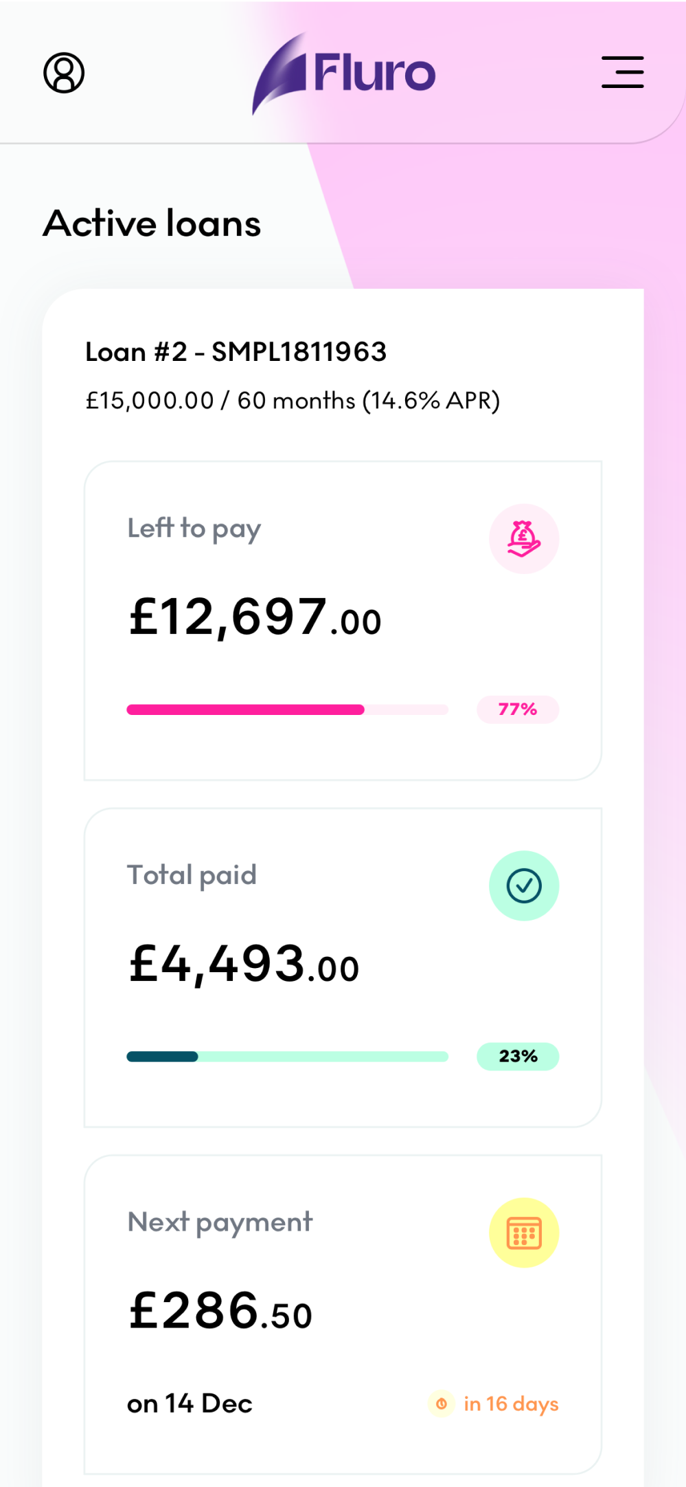
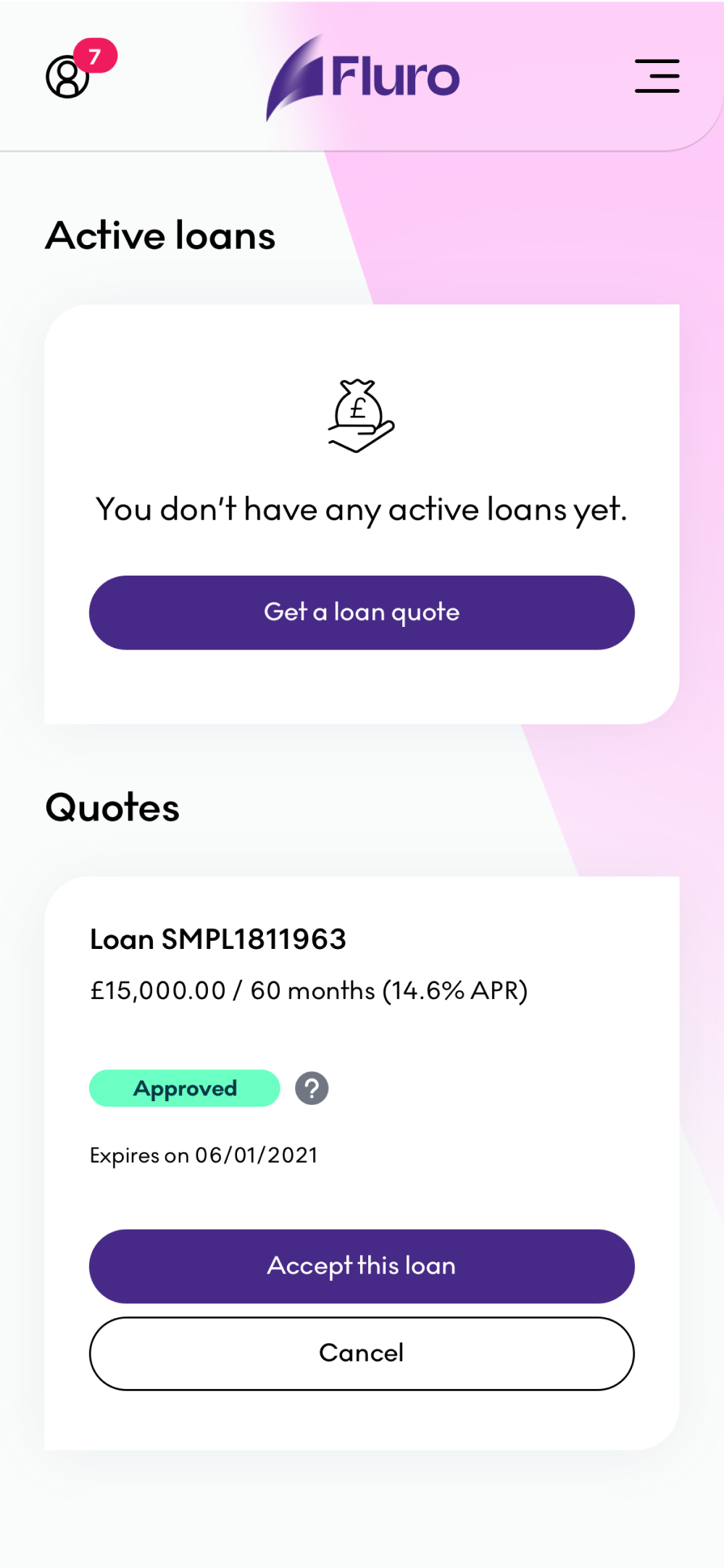
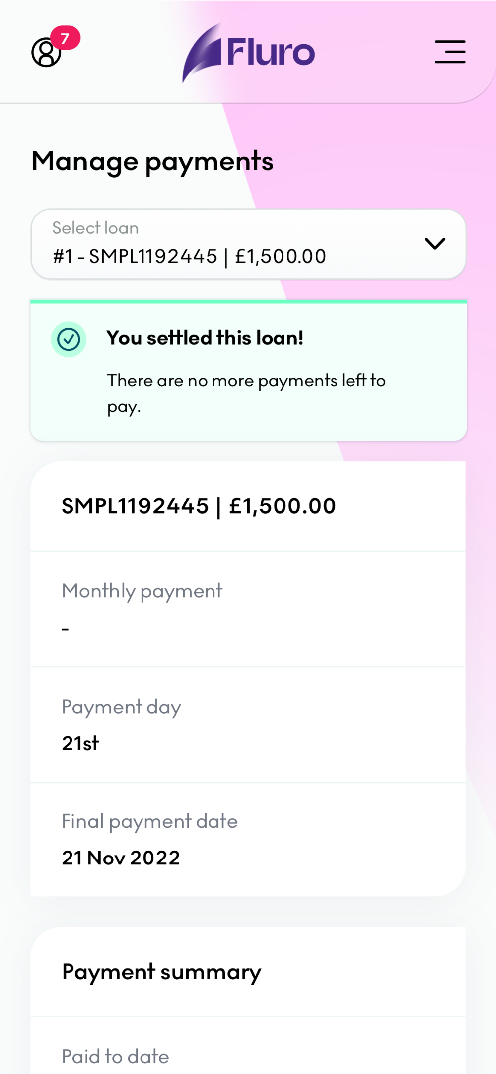
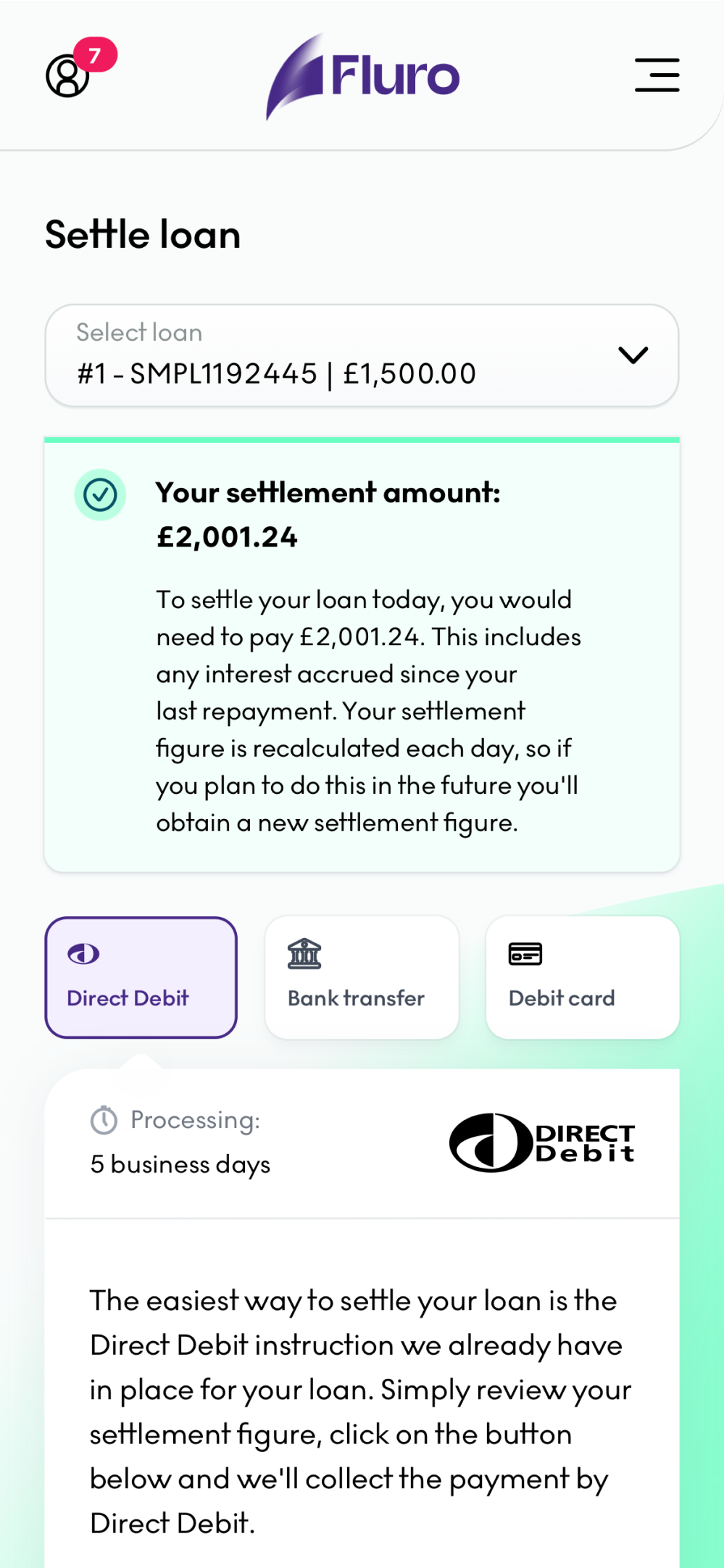
Once I had all the problems, I started producing wireframe solutions and gathered feedback from the stakeholders involved which they were eventually turned into high-fidelity designs and interactive prototypes. At the end of the project I conducted 15 user testing sessions, 5 session per user scenario. The response was overwhelmingly positive with “ease-of-use” and “fast” being mentioned multiple times by people. However, we also discovered that people are confused about their “Current balance” and they didn’t understand why when settling early they pay more, not less than the balance. I eventually solved that by redesigning the dashboard cards which reduced the customer queries from 100 calls and 70 emails per month to zero. No more confusions.
Last part of the process where I dedicated a big chunk of my time was being part of the development sprint and doing quality assurance for the designs implemented to ensure design accuracy.

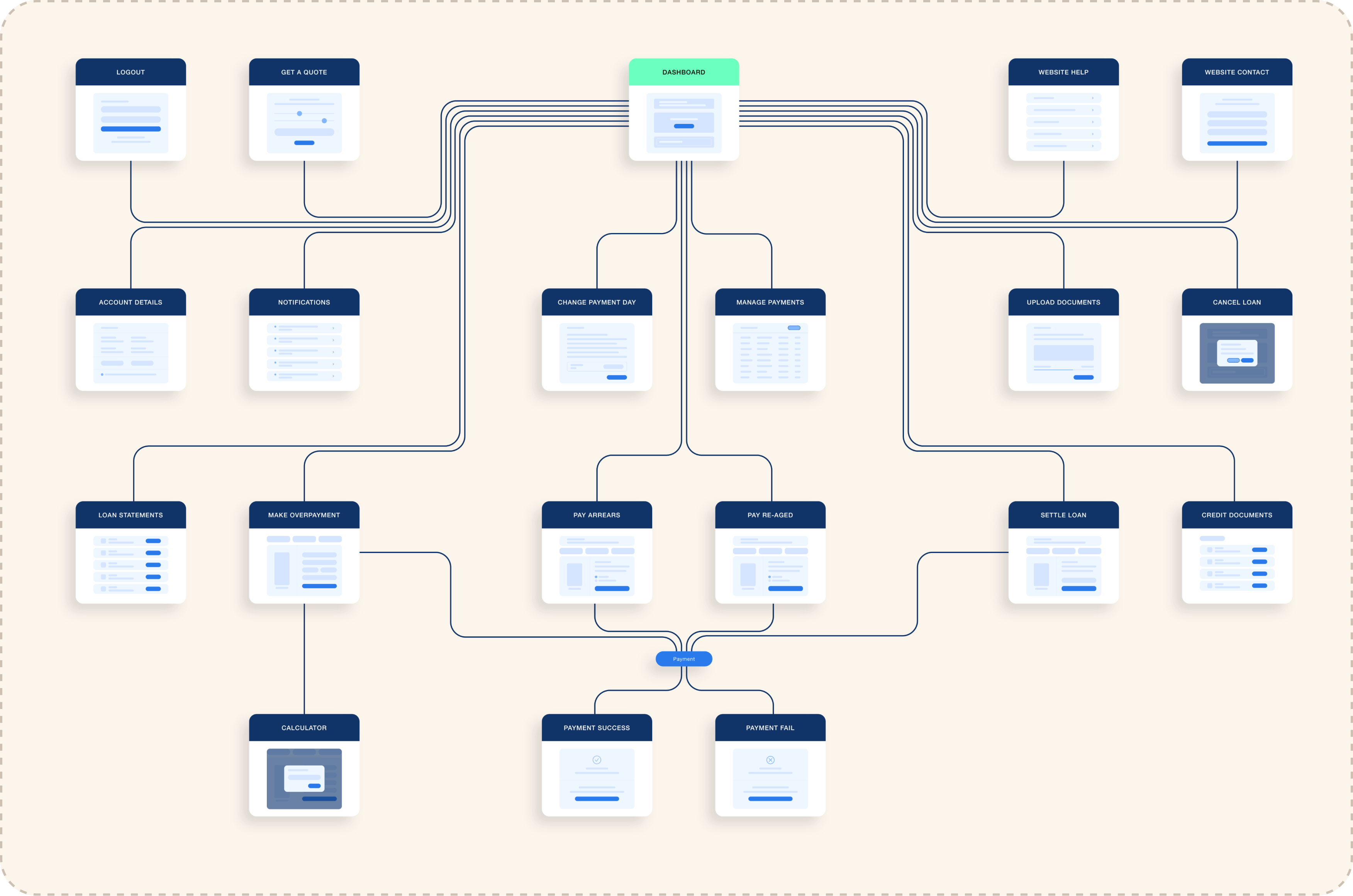
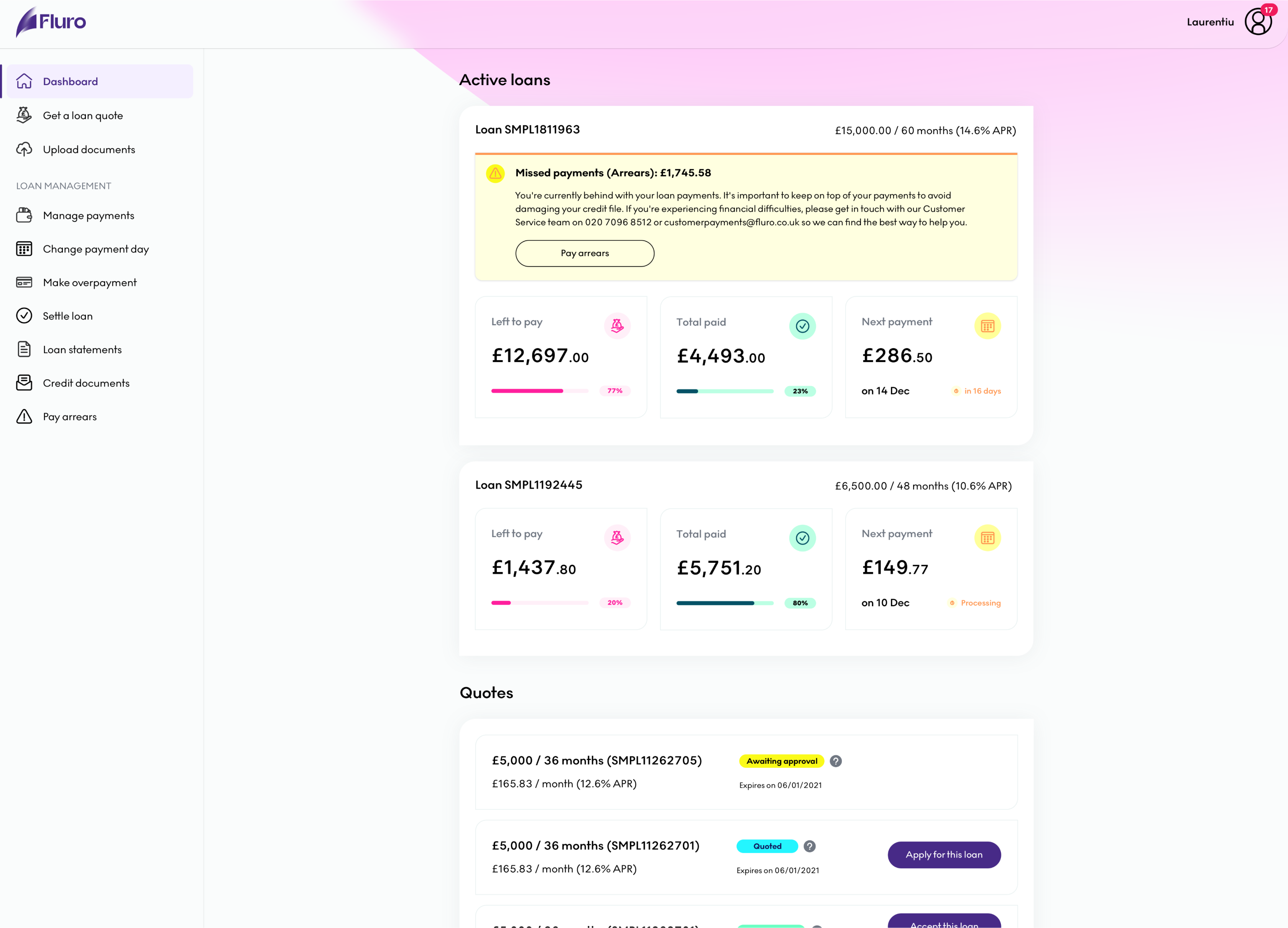
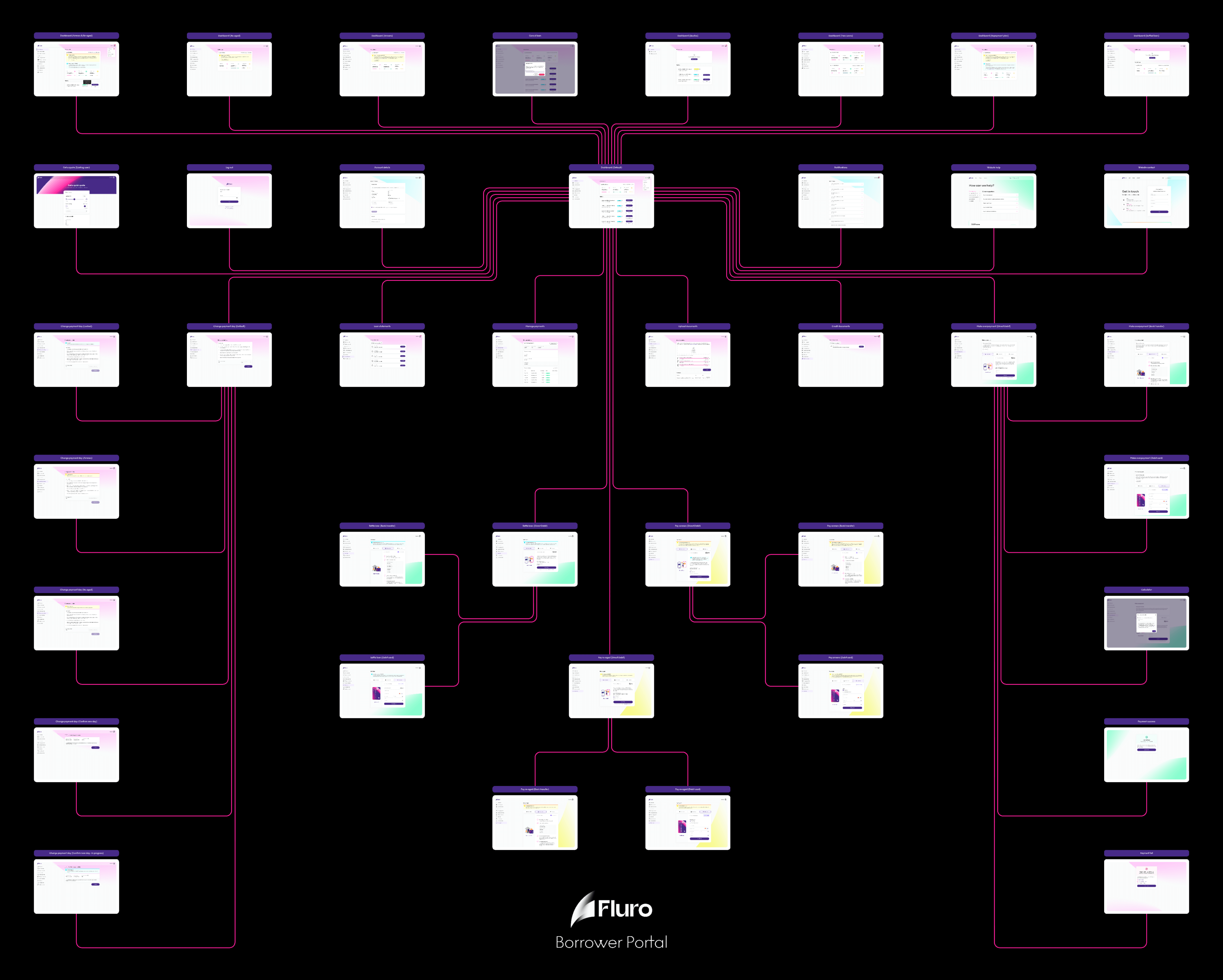
User flow
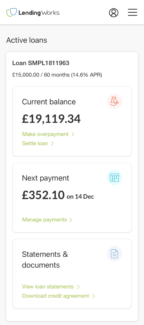
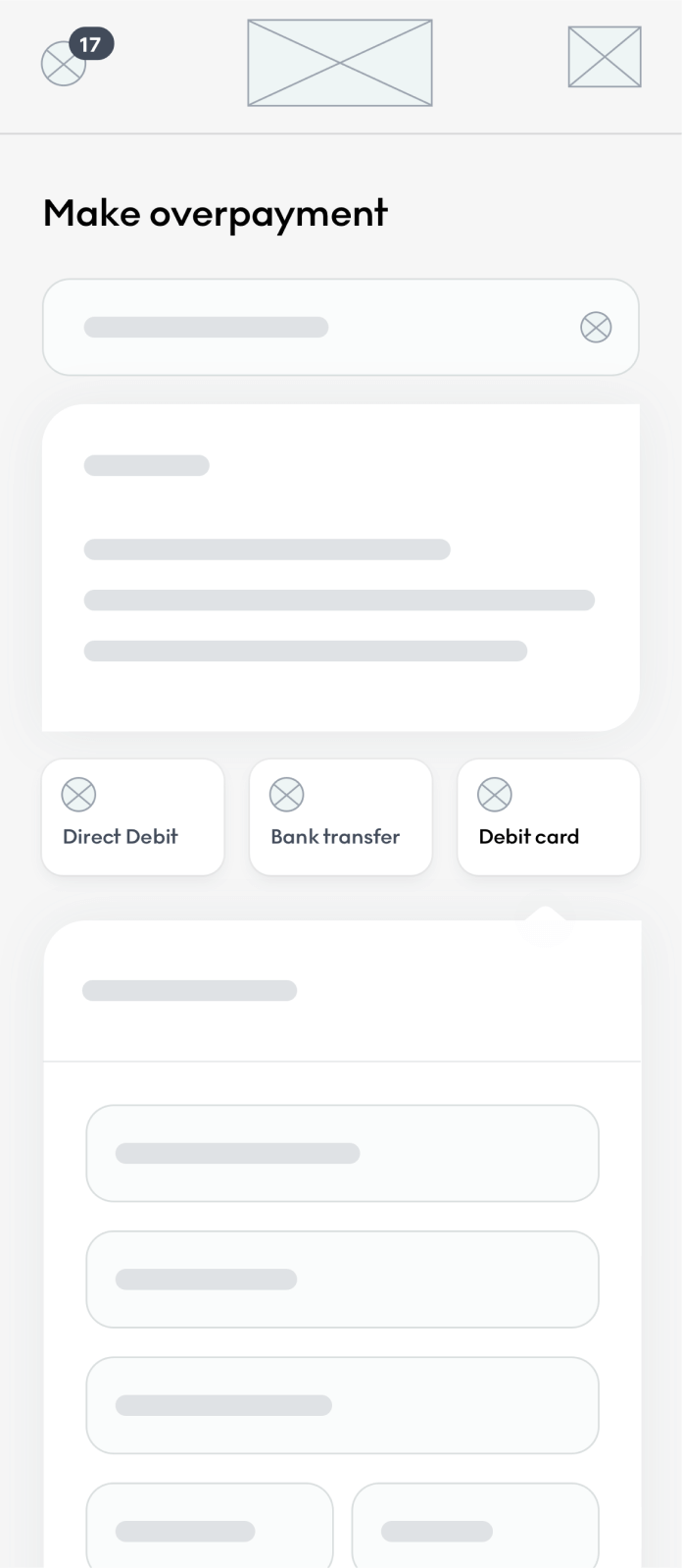
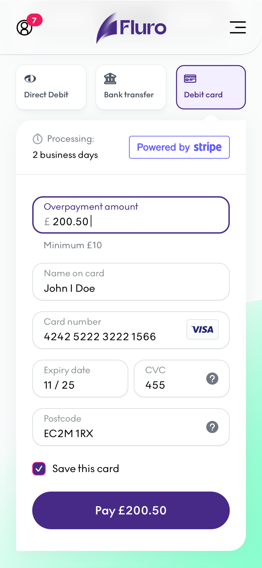
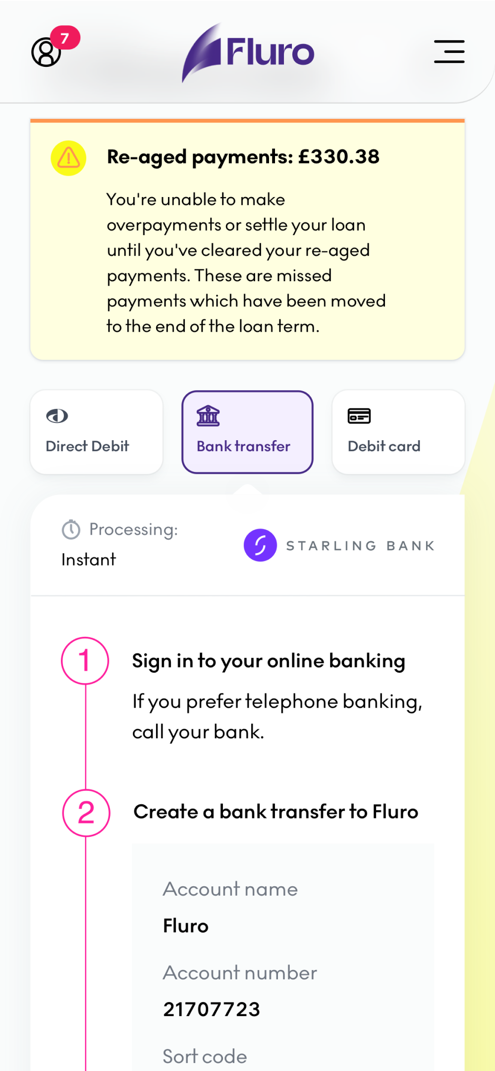
After the customer applies for a loan and gets an approval or referral response, they are redirected to the dashboard. This acts like a control centre for all the actions the customer can do regarding their loans. Things like changing their payment day, making an overpayment or settling their loan can be accessed from the dashboard menu. That’s the reason why the dashboard sits in the middle of the flow and connects with almost all the other steps.
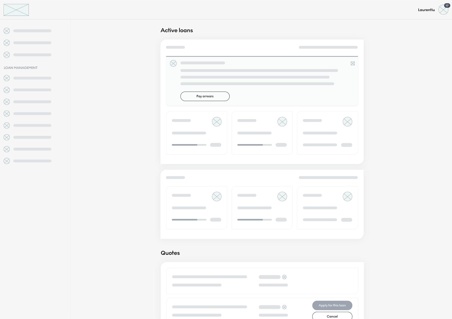
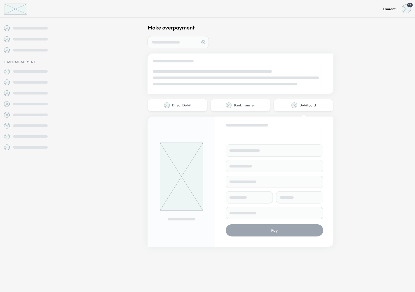
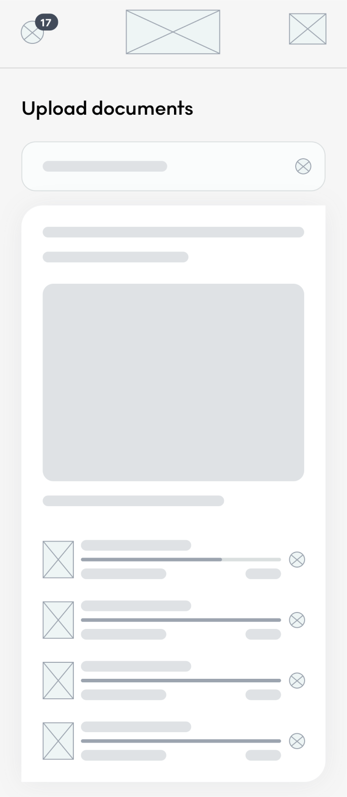
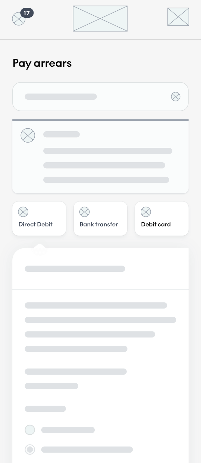
Wireframes
Having a design system already built before starting this project has been a great advantage in terms of creating wireframes. This allowed me to use already built components and go faster through multiple wireframe iterations.
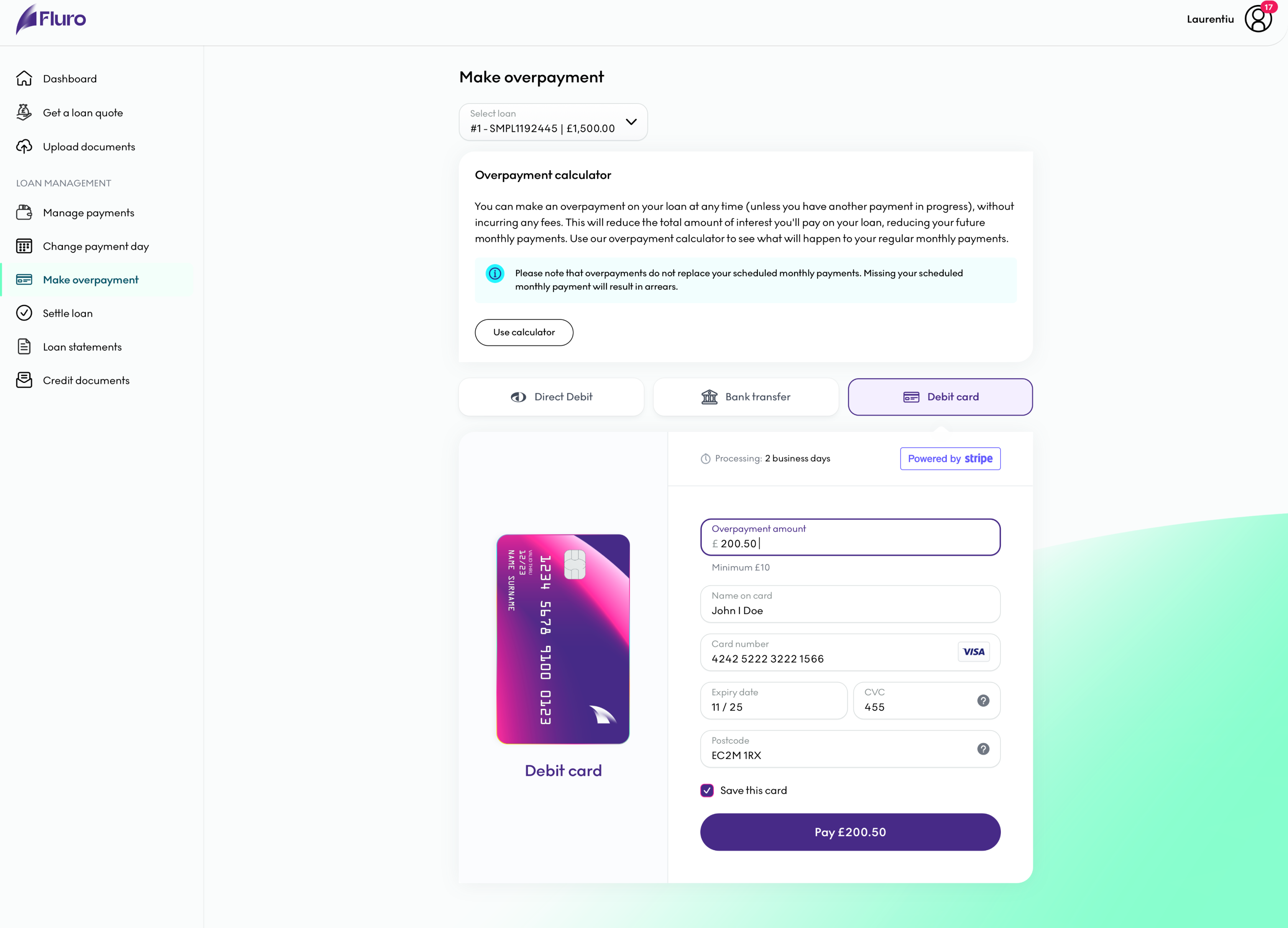
Hi-fi designs
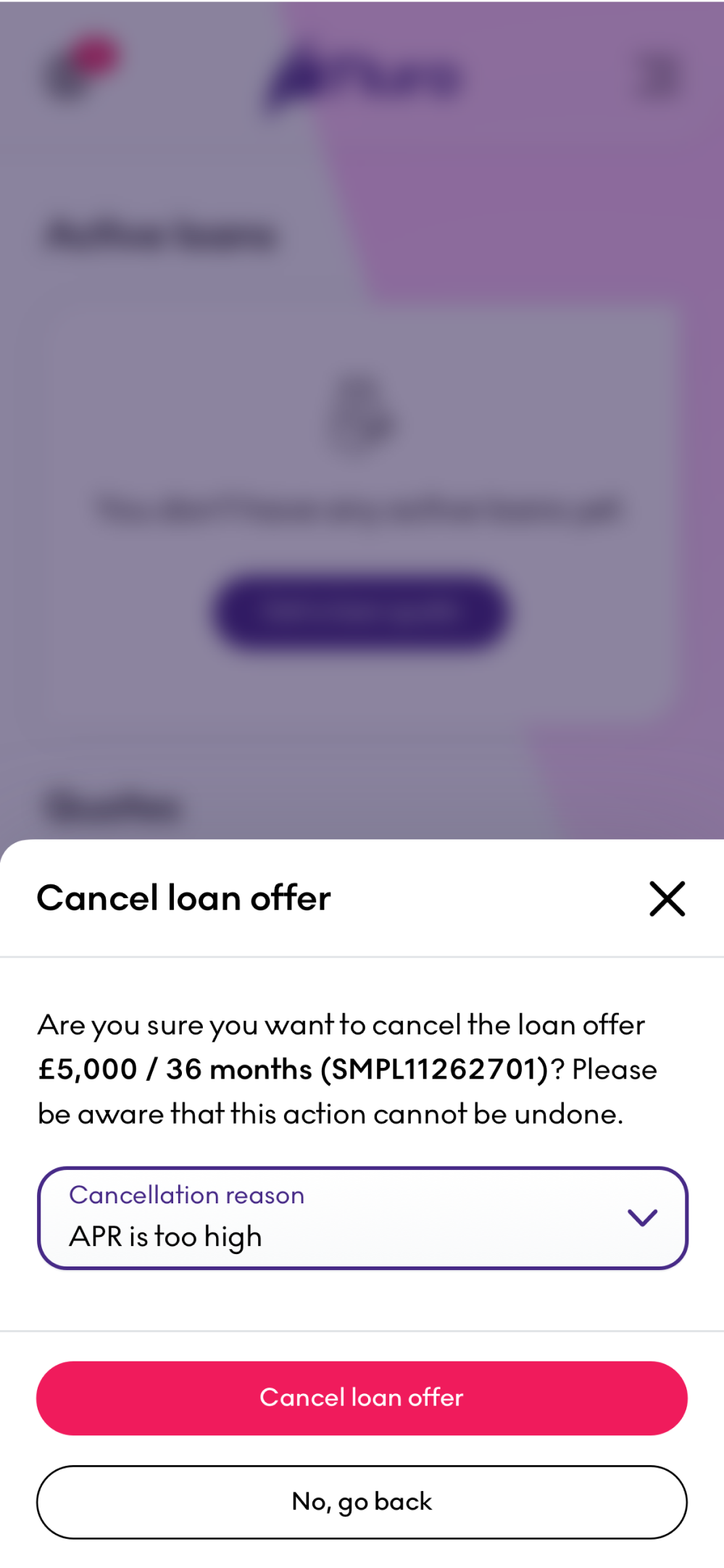
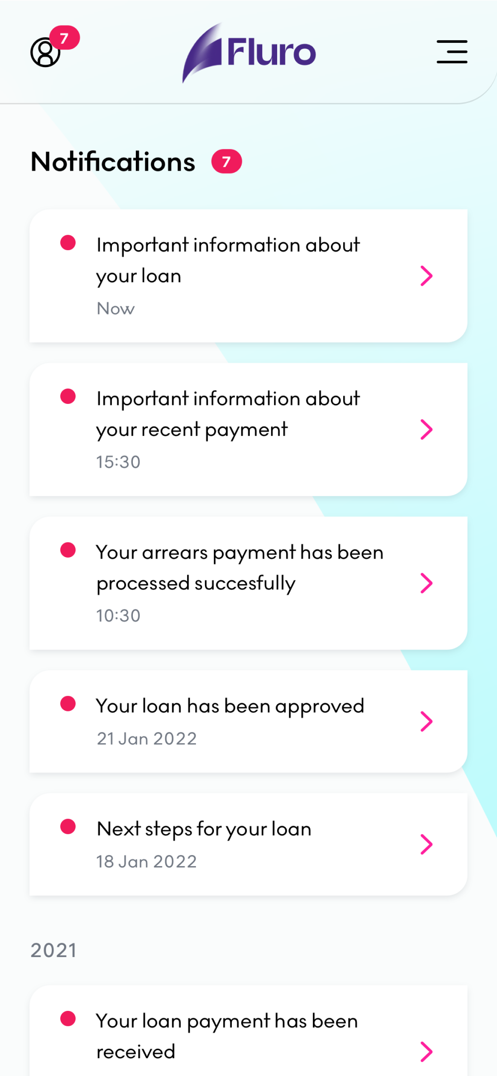
Creating everything from scratch with no previous design assets other than some icons and the screenshots of the existing system proved to be quite a challenge. The biggest advantage I had is that I had enough time to understand how everything works and document all the pages that existed in the system, including error, success and warning states. In the end I ended up designing 612 high fidelity screens in the past one year and a half. However, that included the desktop and mobile versions as well as the borrower journey which I am discussing here.
User journey
When I joined the company, nobody had a complete overview of the processes the customers were going through when applying for a loan and using the portal for managing it. Everybody had only pieces of the puzzle. Getting the complete picture that you see below have been really challenging because in the beginning, the company didn’t have an accurate representation of the portal in a dev environment. Most of the pages required developer time to simulate a scenario. Now imagine doing that for almost all the pages you see below.
However, this proved incredibly valuable because once we had the complete journey, we were able to point out obvious problems the customers were facing and triangulating with the data we were getting from Google Analytics and HotJar. What you see below is the latest representation of the journey.
Implementation and QA
I believe that one of the most important step in the design process is being part of the implementation phase (if the time allows it). Designs without being implemented in code are just pretty pictures with no use to any customer. In this project I had the privilege of getting involved into development process, QA the designs and ensure that everything looks and feels the way it was intended.
This could not have been possible without having proper development environments that can simulate exactly what the customers are going through. Being able to simulate these scenarios have been incredibly valuable in solving any implementation errors. Below you can see a recording of various pages from the portal as well as some pages from the journey which are connected together.