Design System
Fluro • Senior Product Designer • 2020 - 2022
01 OVERVIEW
The project
When I started working for Fluro (previously Lending Works), the design function was almost non existent so a design system was really out of the question. Therefore, what I did was to start by designing some existing pages, mostly created by developers using different inconsistent frameworks. Once I had the building blocks, I started working on the design system by mainly doing a full inventory of the existing UI components, then designing them in Sketch and improving or creating new components where necessary.
My role
I worked on this as a lead designer so my role was pretty much ownership of everything 😅. My role involved the painstakingly process of searching and documenting every single bit of UI that I could find in the system, then organising the mess. This part was not so much fun, but the next part, creating all the components in Sketch and having everything organised and well designed was a lot more fun. In the end, I also helped the developers implement the components, doing the usual QA to ensure design consistency.
Results
A new set of perceptual patterns to ensure brand consistency and facilitating the creation of new components
A new set of functional components that can be adapted and adjusted depending on the UI requirements without the need of changing the source components
Used the functional components to create a set of most common UI patterns that can facilitate faster design creation for new pages
Improved design and development efficiency

02 PROBLEMS
Design inconsistency
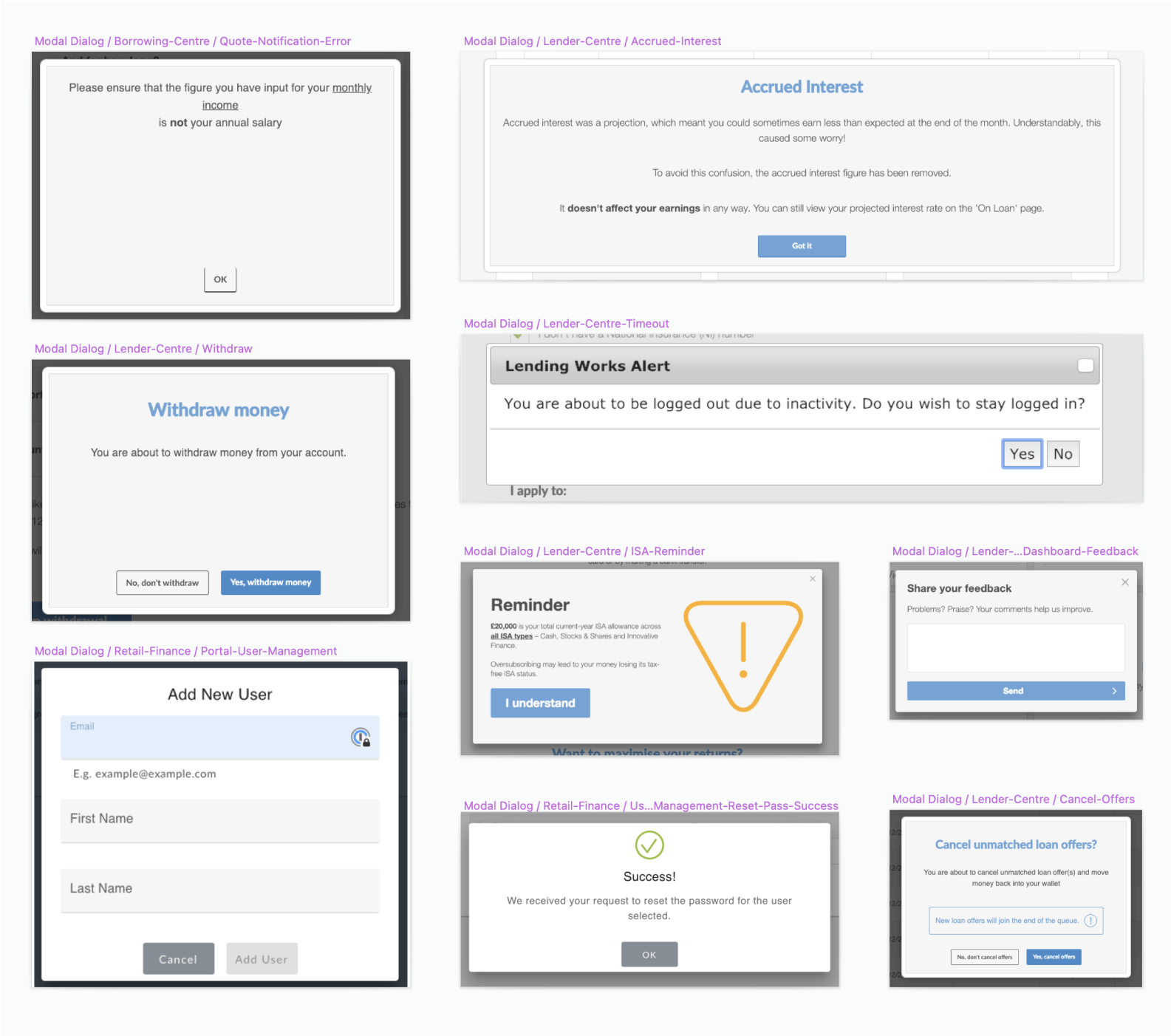
Inconsistency is probably one of the biggest problems a Design System can solve because consistent components, means less design and development time spent on creating UI from scratch, and more time focusing on solving customer’s pain points. Lending Works suffered of a lot of inconsistency because of a variety of reasons like different developers had different implementation approaches, different frameworks and libraries used, no real source of truth. With every new project, it felt like seeing and working with a different brand altogether. Having four types of modals is not really a recipe for a modern FinTech.
Missing interface elements
Many times, I found myself trying to design a new page from scratch and have the realisation that I have to invent new UI components because the existing interface was quite rudimentary. Some really basic elements were missing, like a warning indicator or a page tab that can adapt on mobile. Speaking of mobile, many of the existing components did not adapt well to different screen resolutions either.
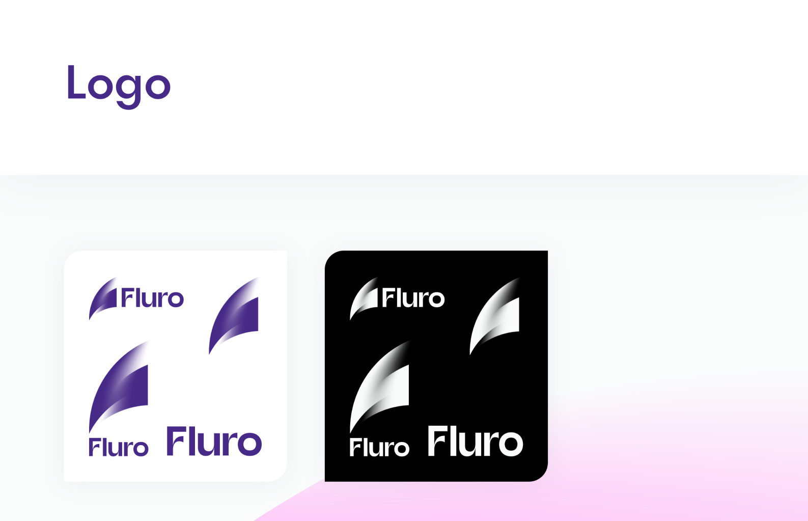
Rebranding to Fluro
Although at the time when I started working on the Lending Works Design System I didn’t know there will be a complete rebrand, I did build it with adaptability in mind. My theory was that even if the components I was building will need to change styling, making those changes should be as easy as possible. Considering these, I do want to mention though that rebranding the components to Fluro was still a pain in the ass because I was using Sketch and at that time, Sketch was not as powerful as Figma in terms of symbols / components adaptability.
03 PROCESS
Design process
The main need for a Design System became more apparent when we realised that developers, in majority of cases, when they were trying to implement a new design feature, they were building new components. Obviously this resulted in more time spent on delivery and on top of that, a plethora of inconsistencies throughout the whole system. So I gathered some resources and defined what a Design System is, why is is useful, how we can create one and then presented these findings to the wider team to get buy in.
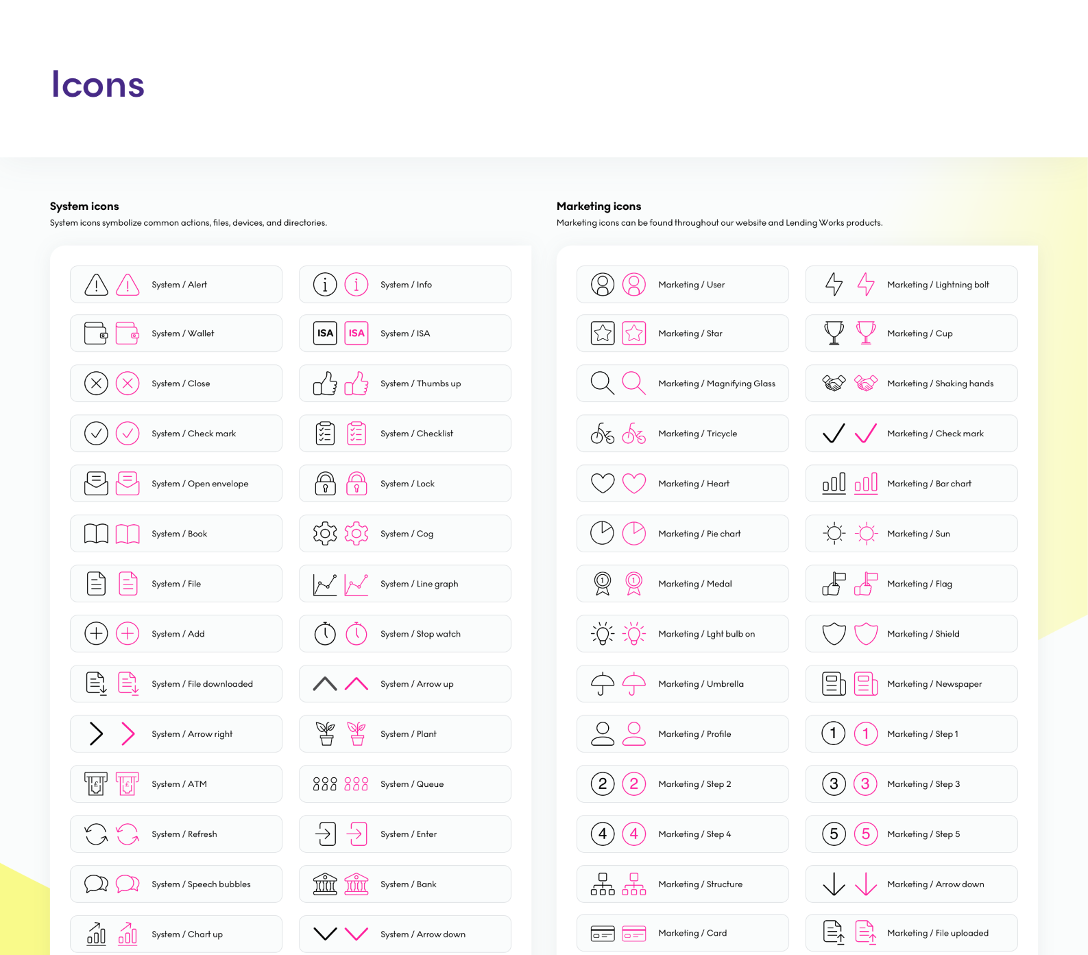
On the majority of the process, I used the steps described by Alla Kholmatova in her book “Design Systems” which contains a set of really practical guidelines. I started with my “favourite 😪”part which was auditing every single part of the Lending Works system and take screenshots of the components I could identify, including things like font, icons and colours. Then I tried to group all of these screenshots into specific categories to help me identify patterns, inconsistencies and areas for improvement.
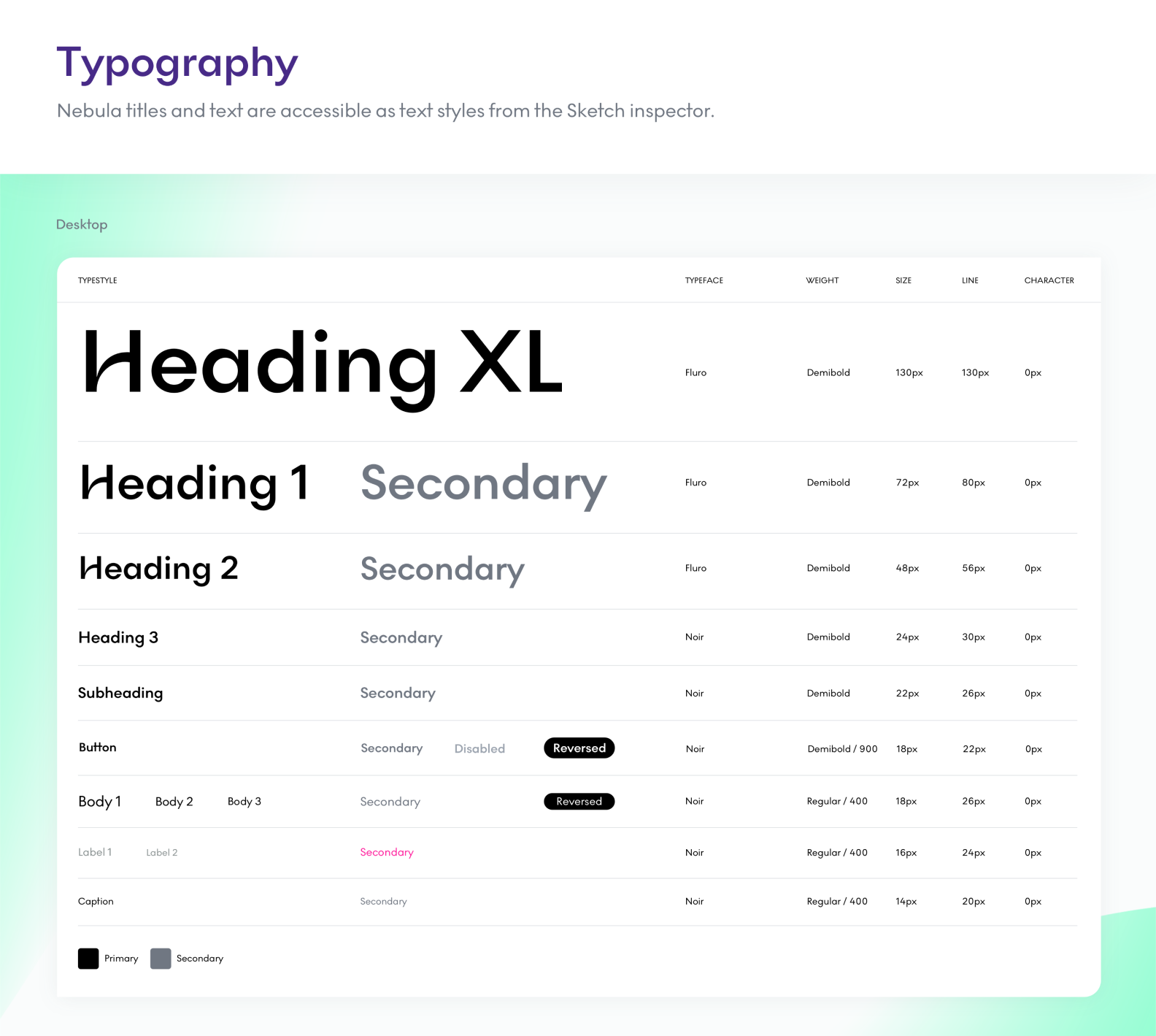
Once the design audit was done, I tried to create a set of design principles and brand guidelines that we can follow to develop the visual language. I laid all of these down in Sketch, including things like typography rules, icon sets and colours.
Now the fun part, creating the components 😌! Knowing the needs of the system from the audit, I knew exactly which components are needed and which are not. I also looked for inspiration from other great design systems to anticipate other elements the interface may need in the future and design those as well. This part of the process was a constant iteration because it also involved a rebrand from Lending Works to Fluro at some point, but it was adaptable and ready for a new branding.
Since we didn’t have the development resources necessary, this system was gradually implemented but in the end we eventually reached an almost complete status. There is still some work needed to get to 100%.

Design audit
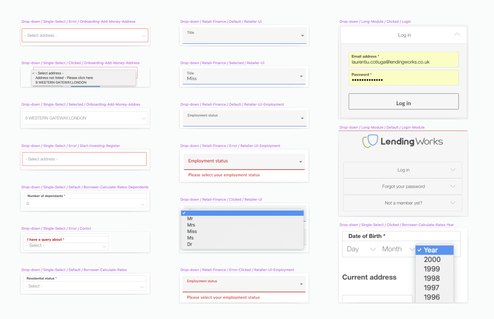
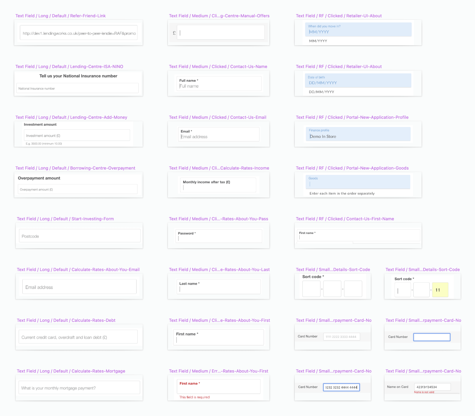
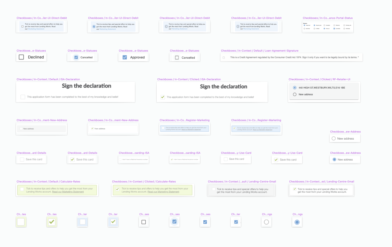
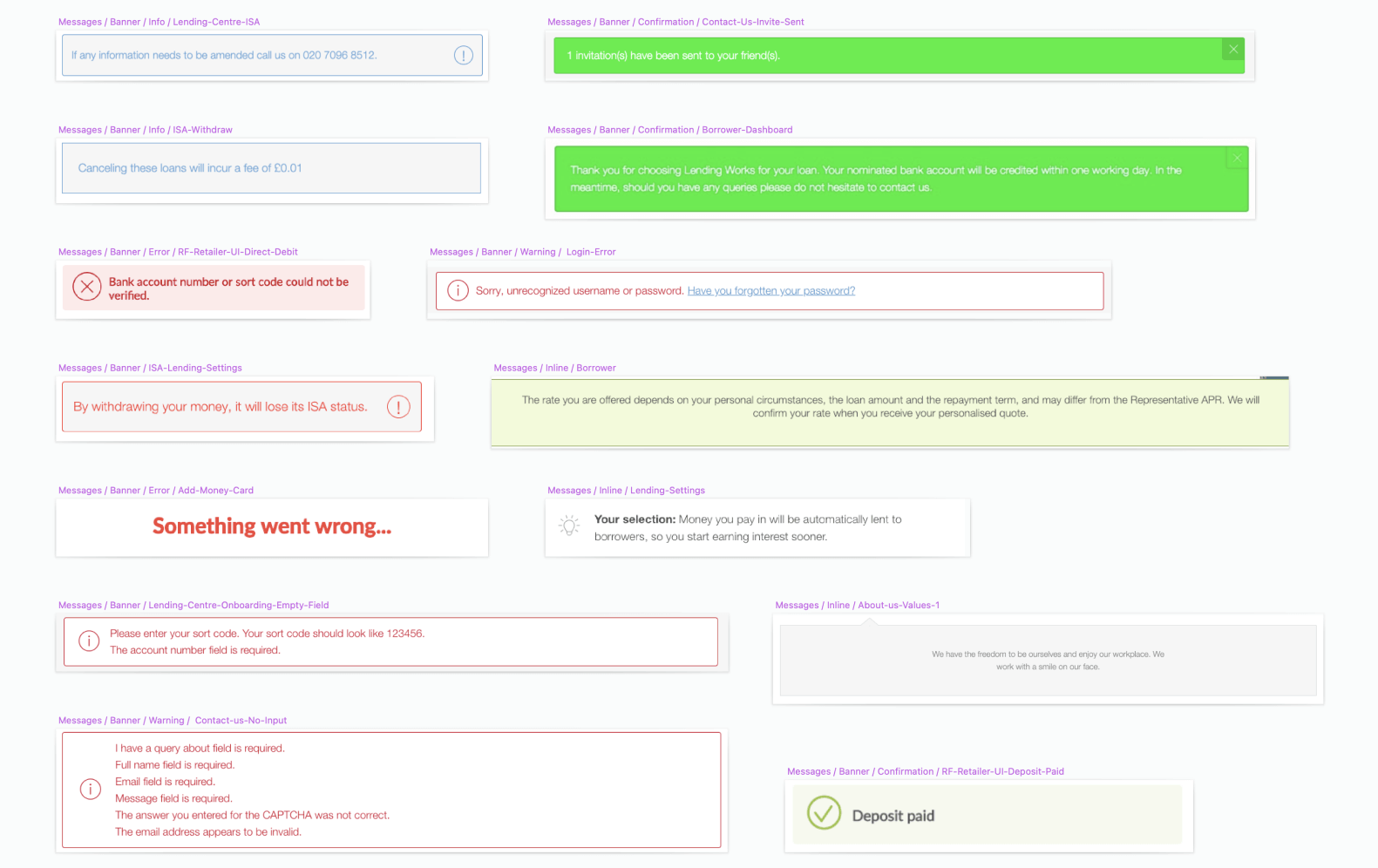
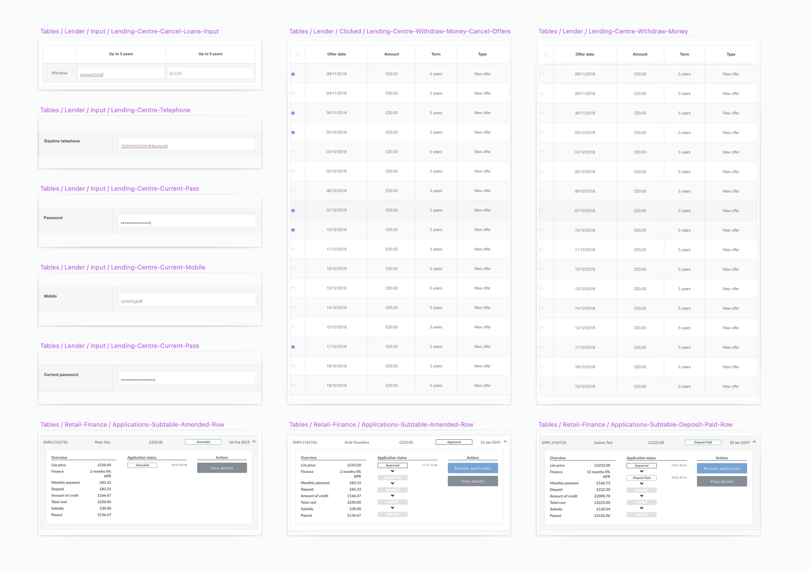
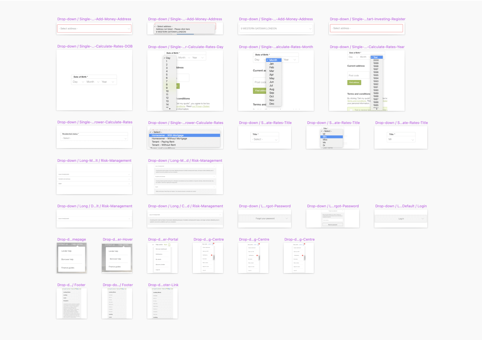
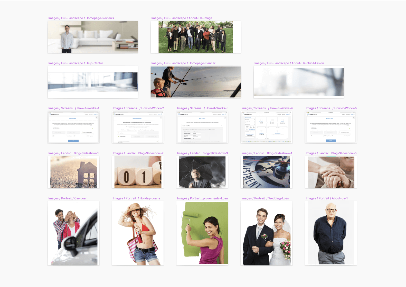
In order to have a comprehensive overview of every single piece of UI in the system, I took screenshots of individual elements of all the pages that I could find, including modules (groups of elements) and different UI states. I did take screenshots of duplicates as well because sometimes there were differences in how a hover state works for a specific button for example. How I approached this may not have been the most efficient way of doing things, but it did get the job done 😆.
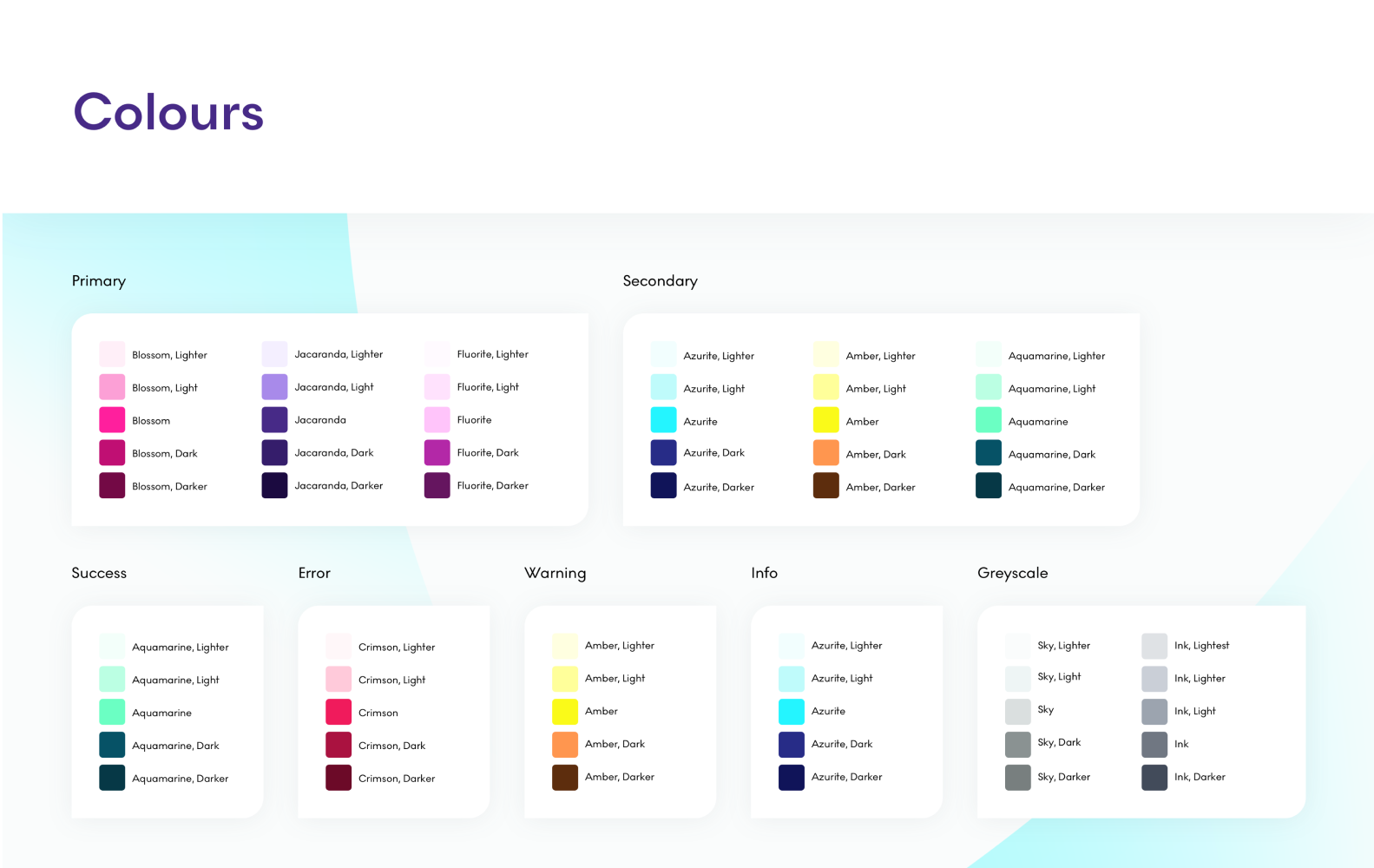
Visual language
Although Lending Works had existing brand guidelines, they were rudimentary and lacked the flexibility required to create a modern UI. After I finished the design audit and armed with all the new learnings, I started to create a more flexible visual language. However, this was still limiting because I had to keep the essence of Lending Works brand. Fortunately, this eventually morphed into a more exciting Fluro brand after an extensive rebrand process which I am describing here. The images you will see below are from the Fluro Design System, but it’s using all the building blocks from the initial LW system, only with slightly different assets.
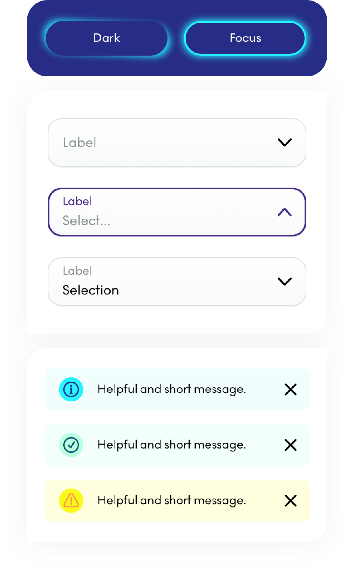
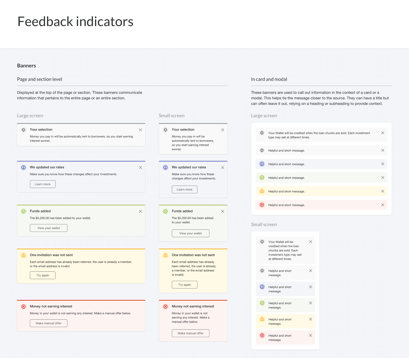
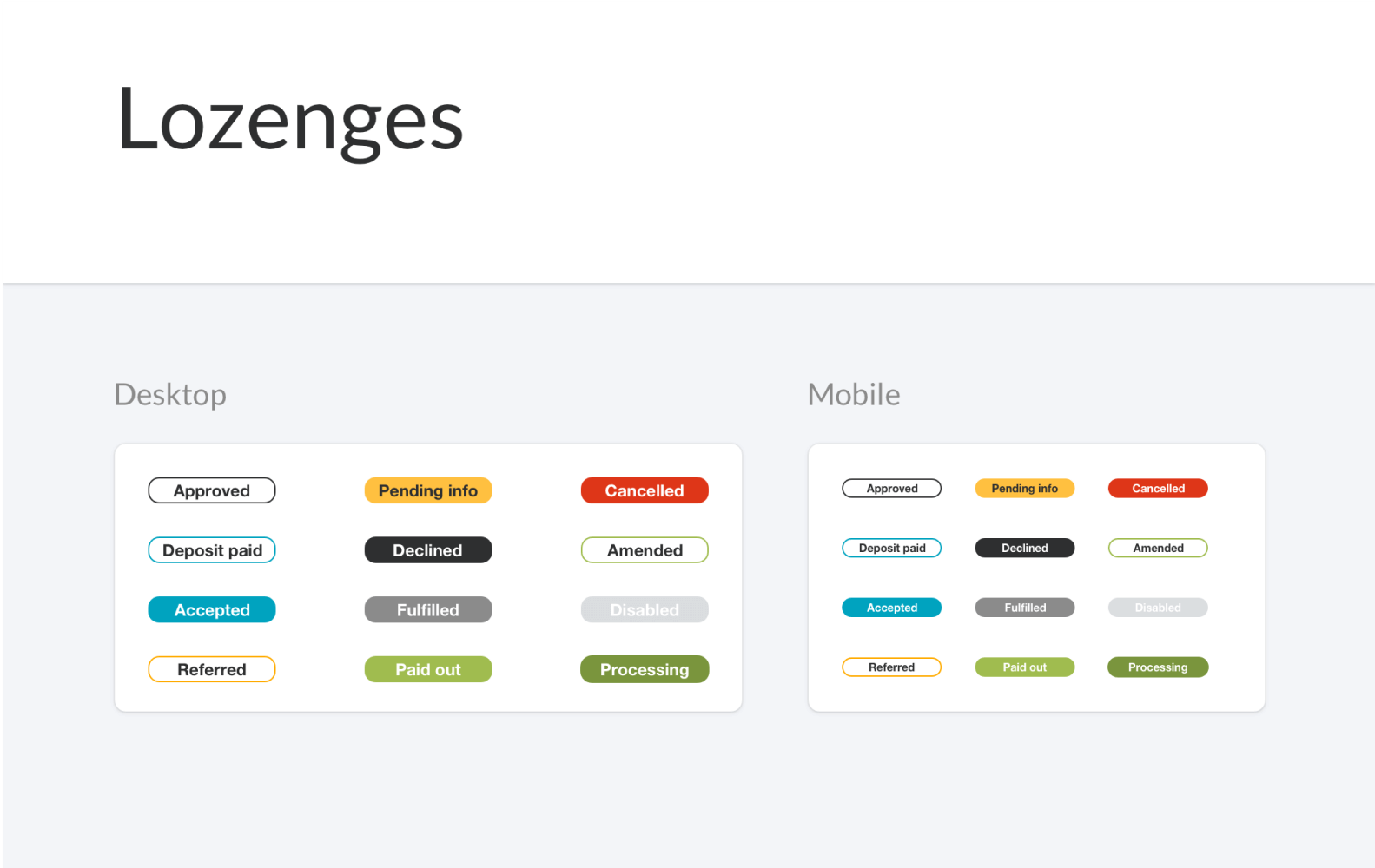
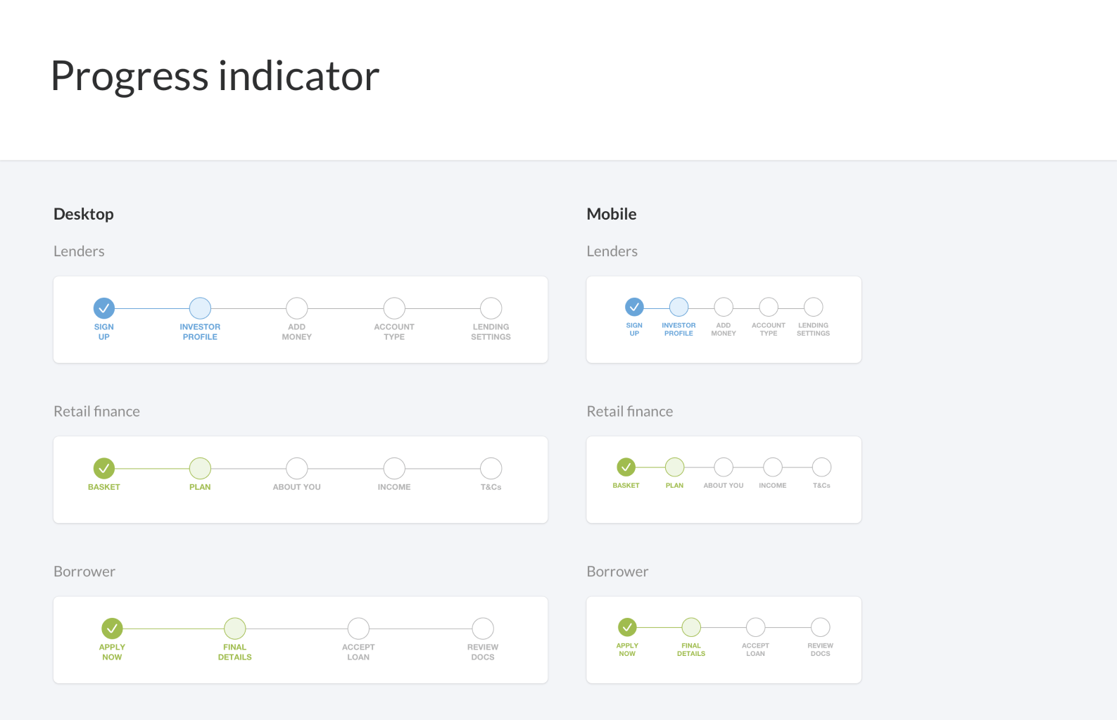
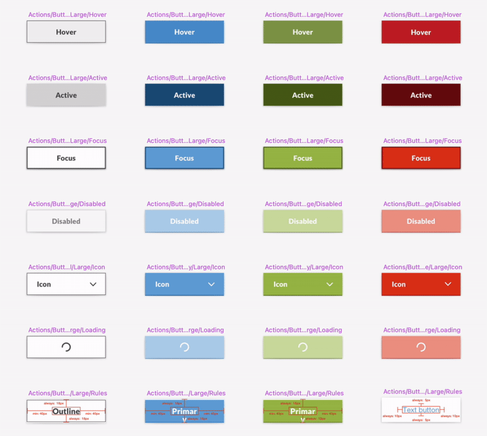
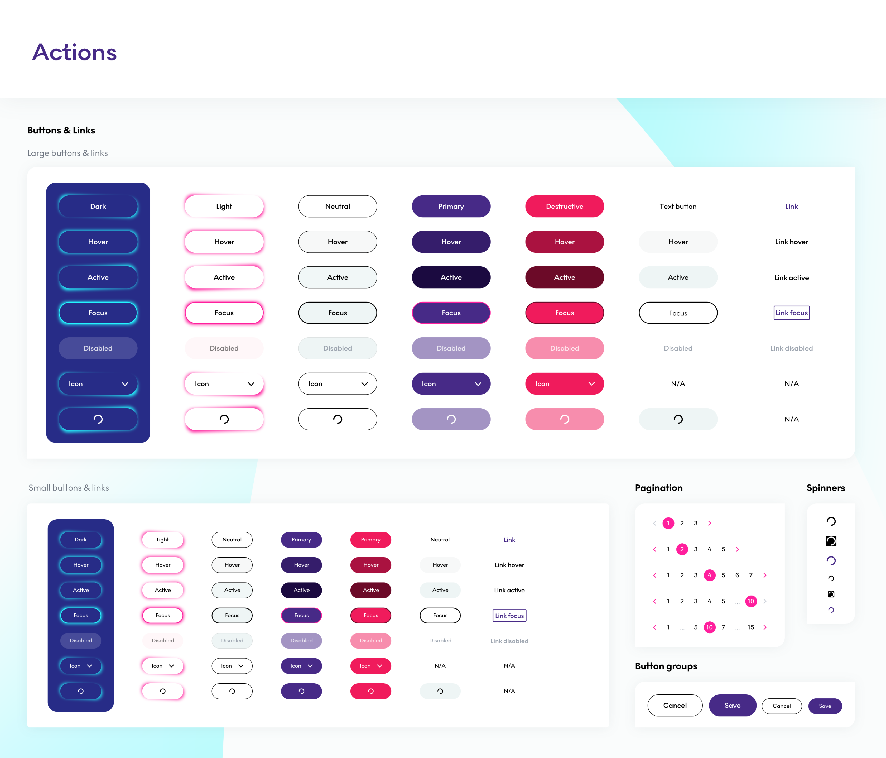
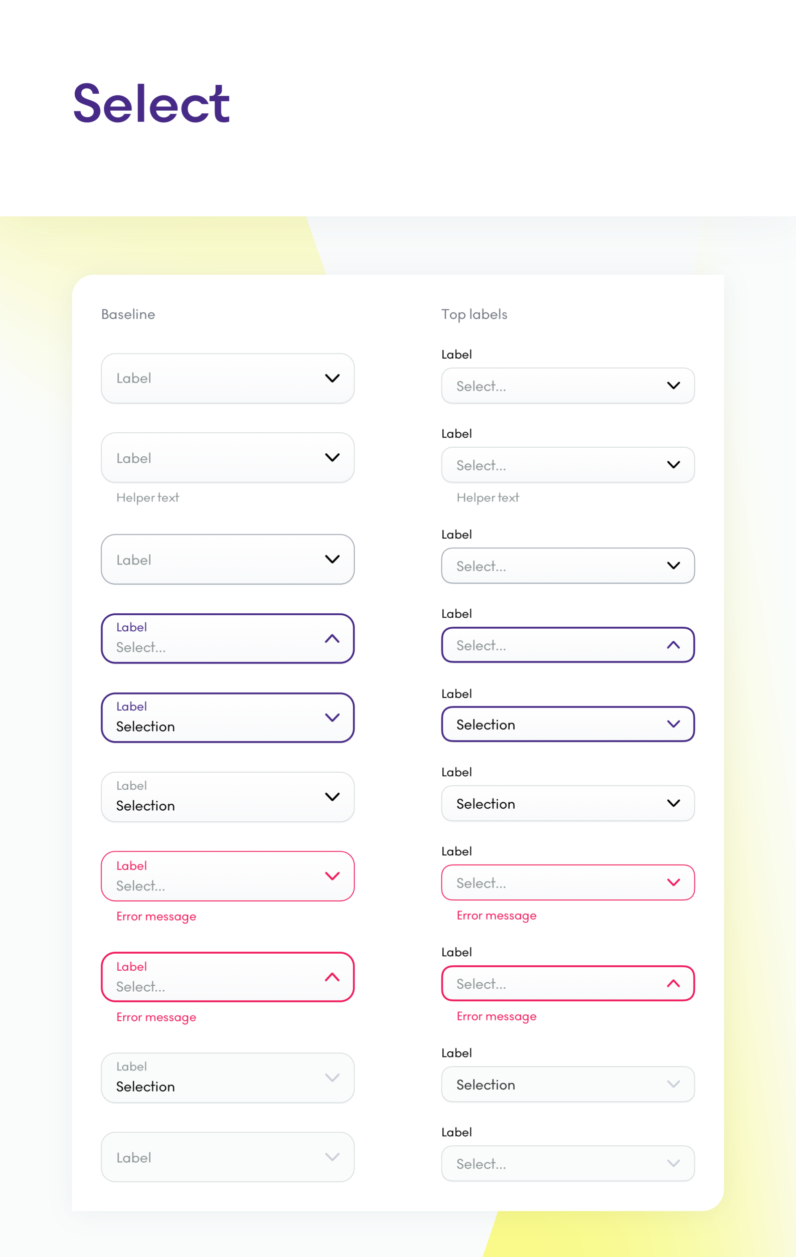
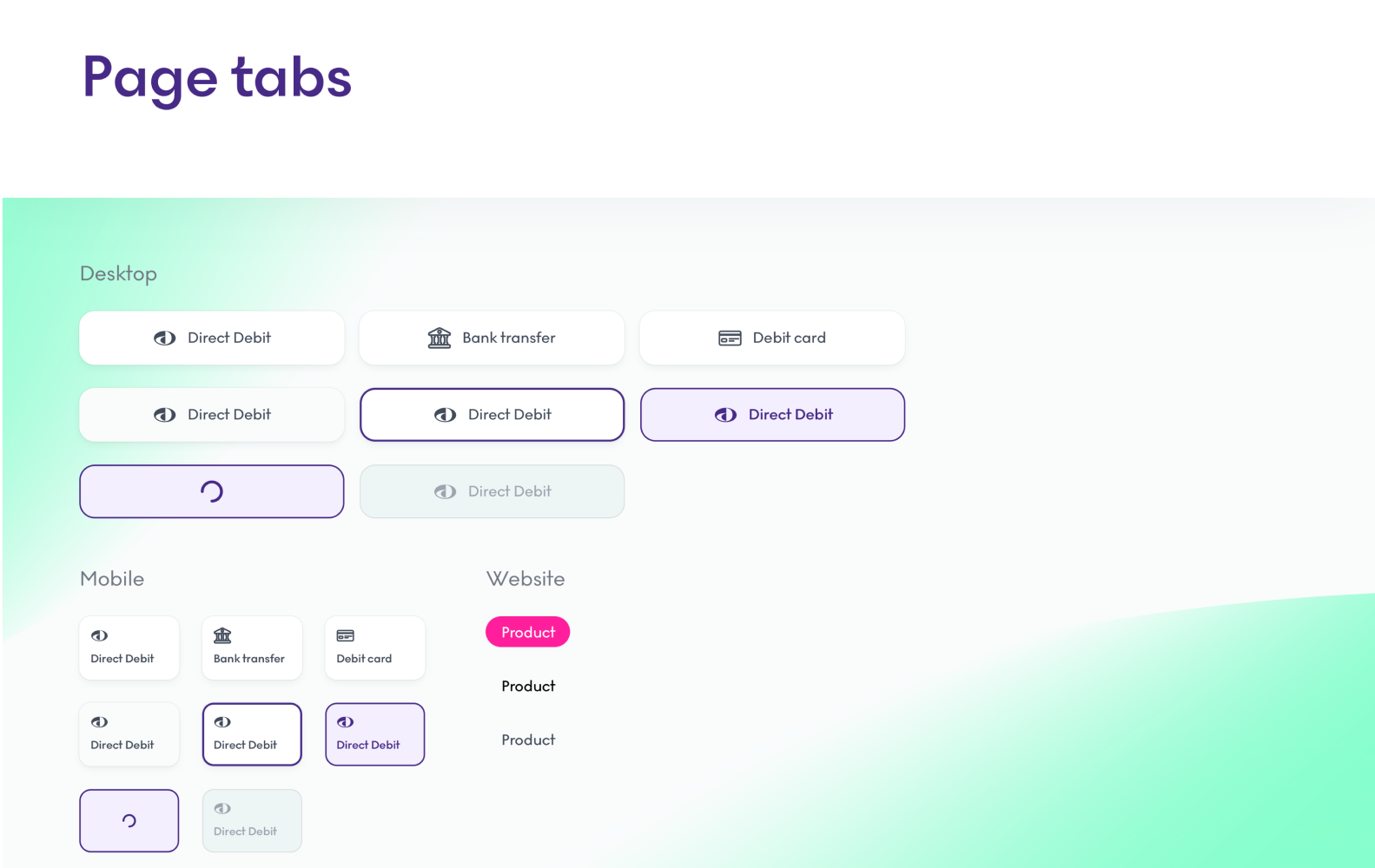
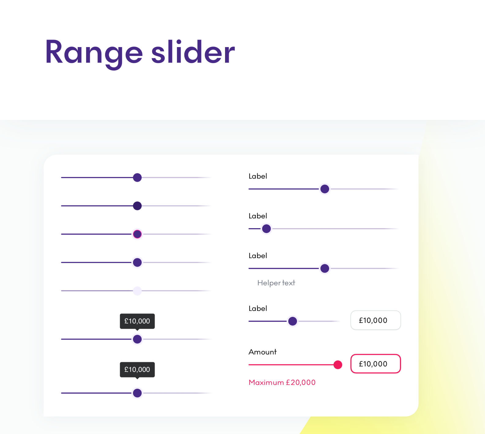
Components
Once I had the visual language established and all the original components organised during the audit process, I started building the future components. As with the visual language, I initially built all of these to fit the Lending Works framework, however with Fluro coming in, I changed the styling to fit the new branding.
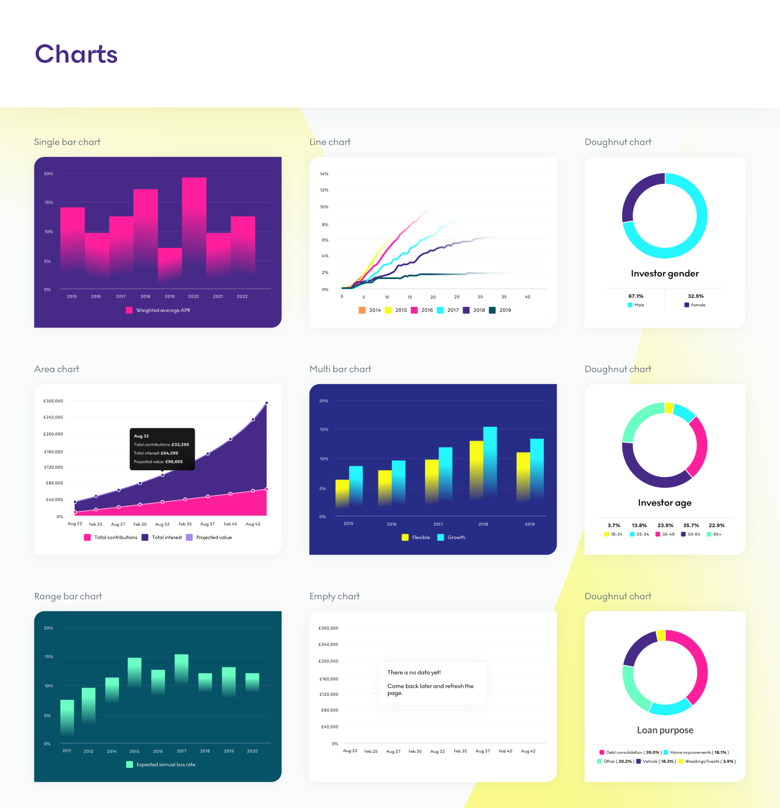
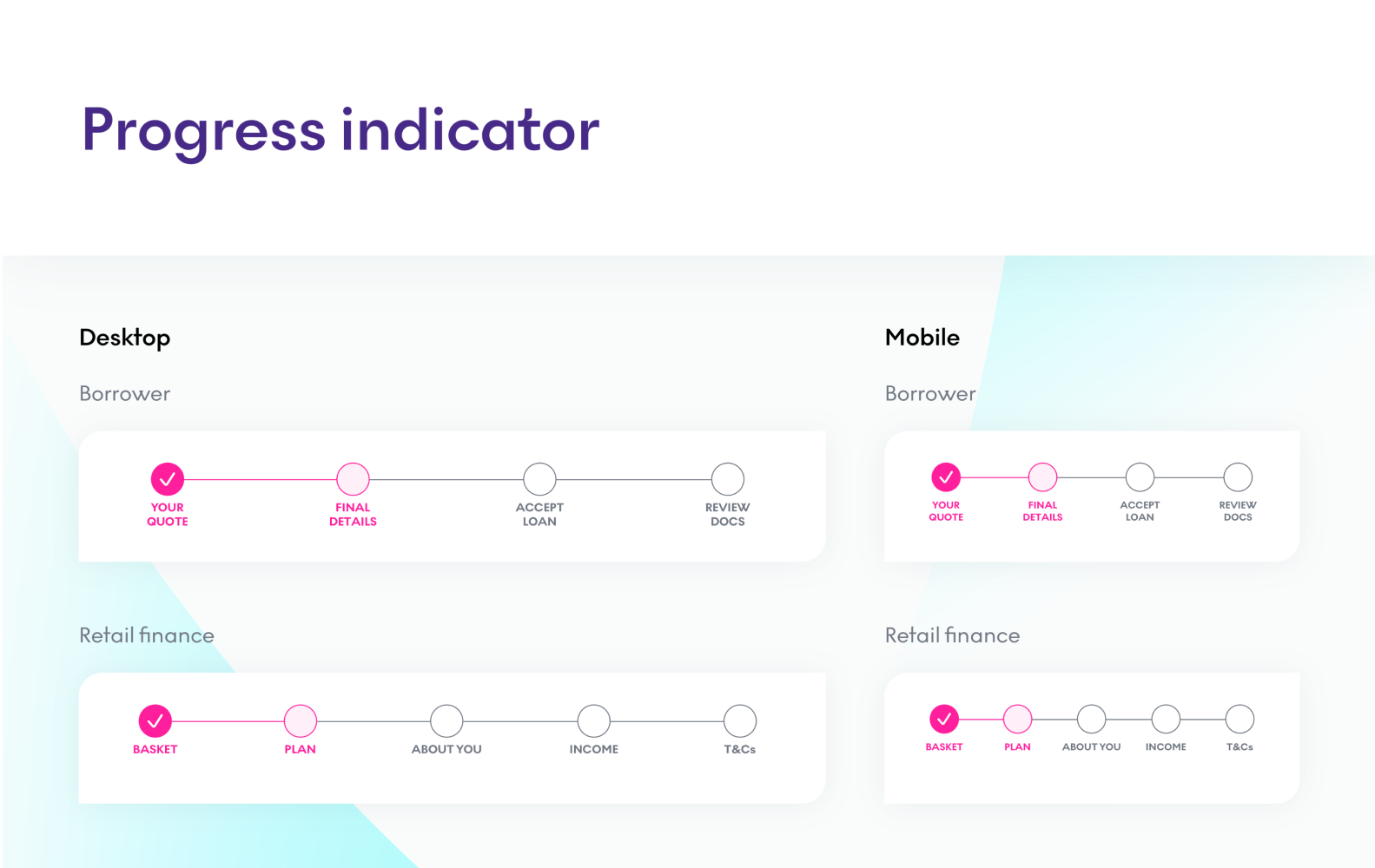
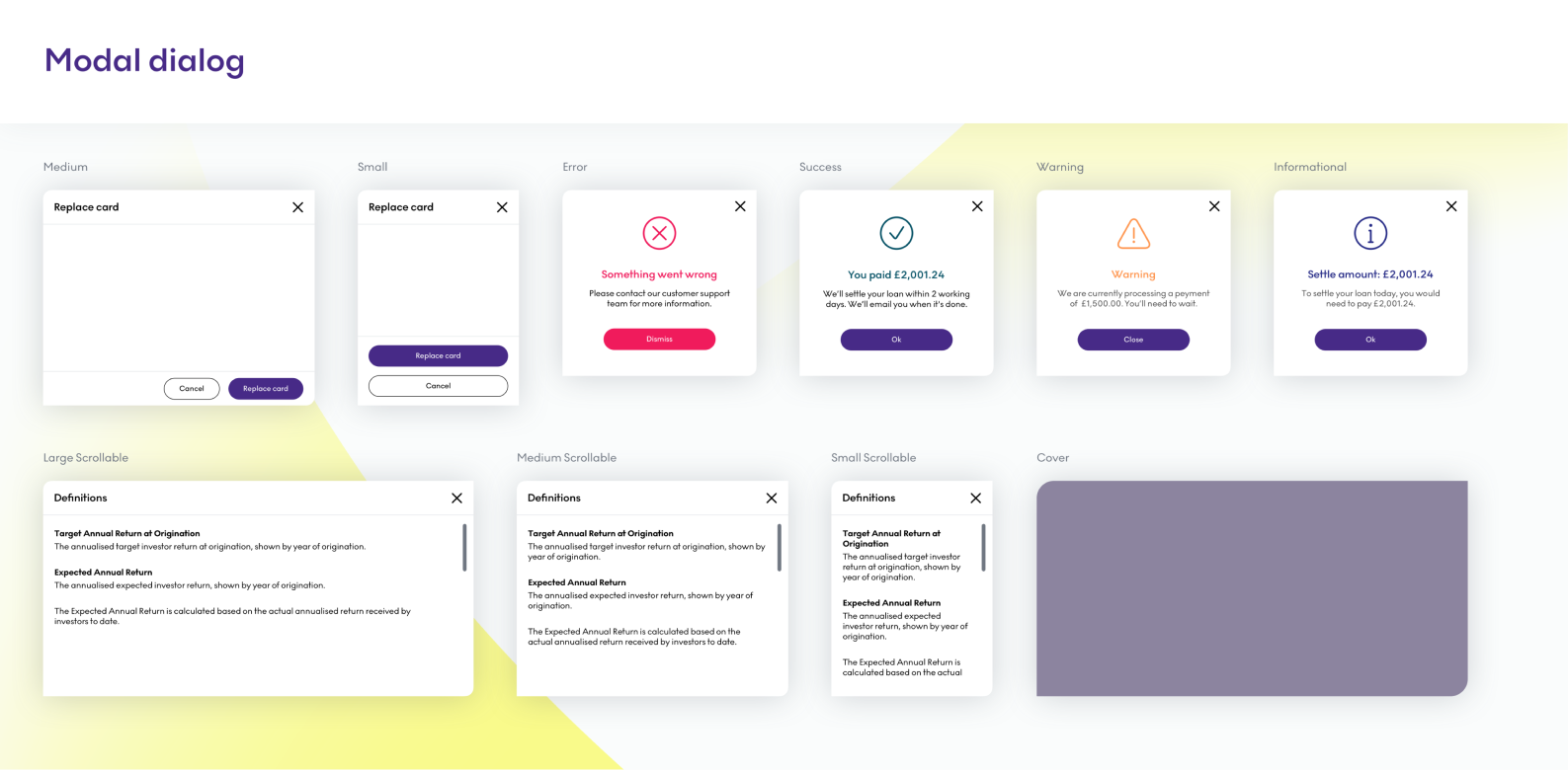
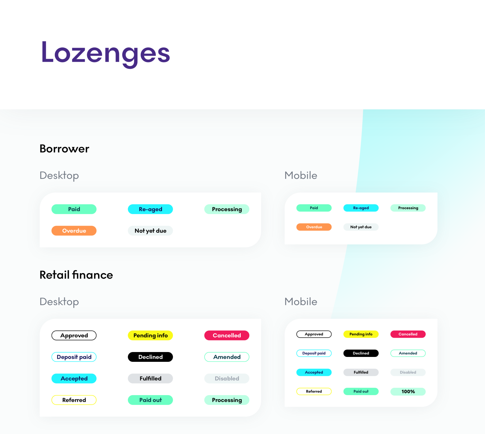
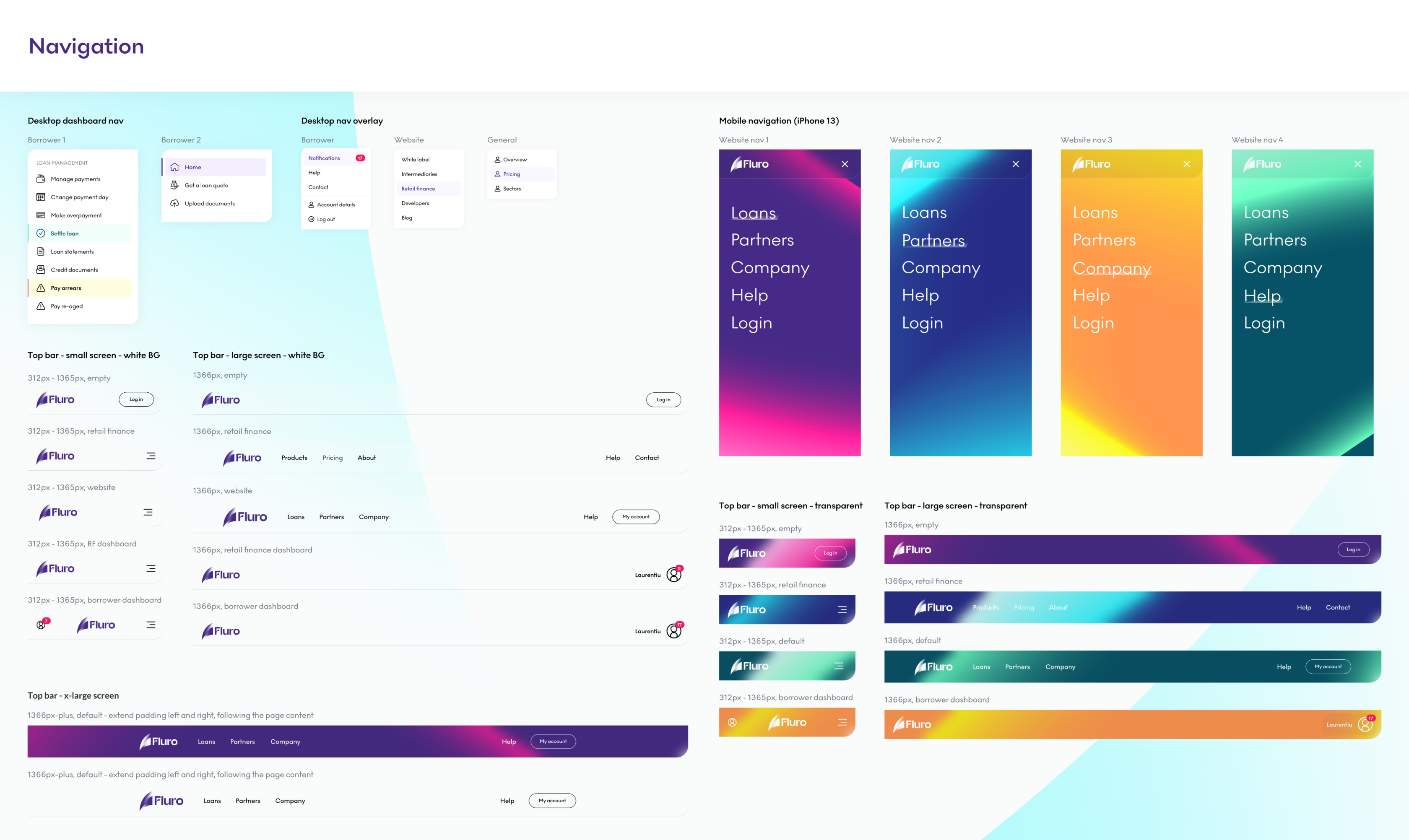
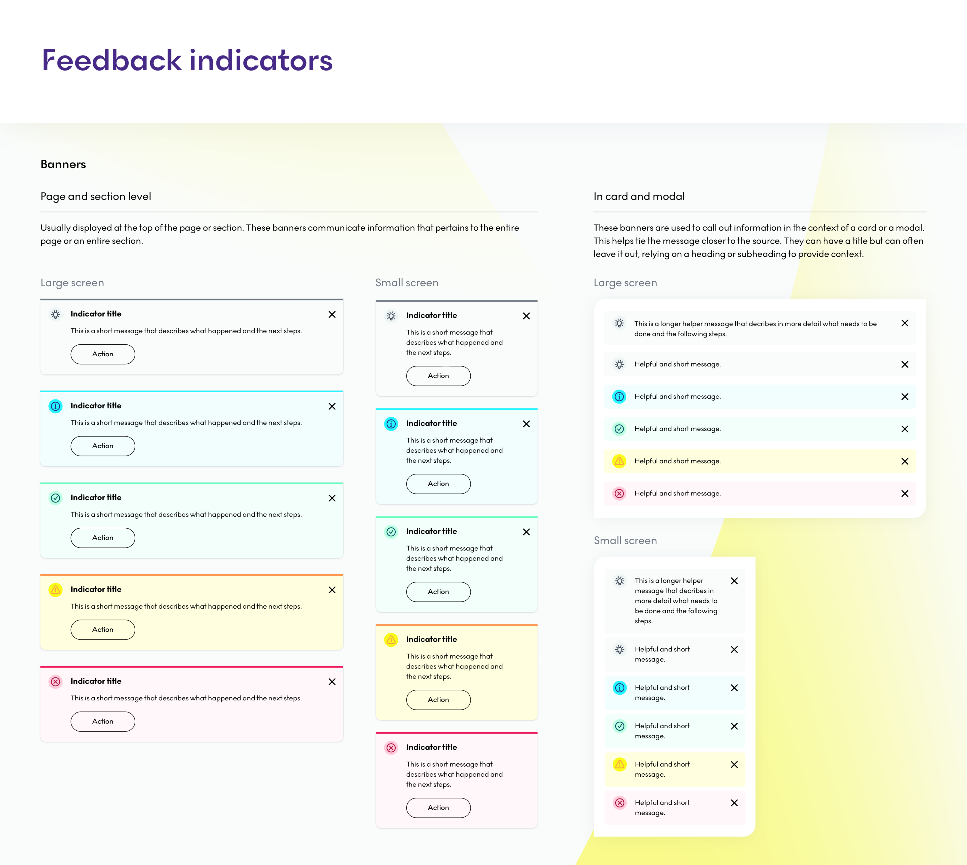
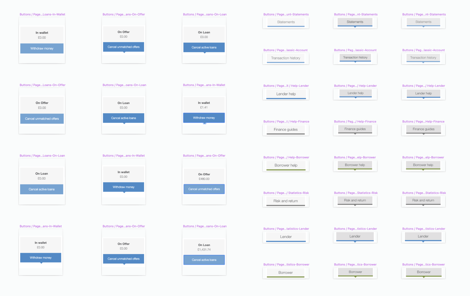
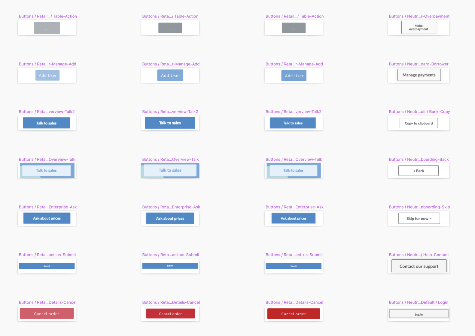
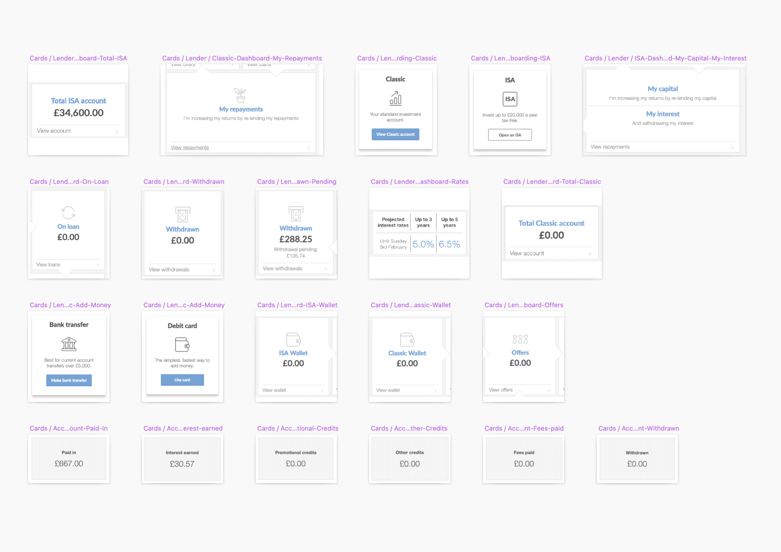
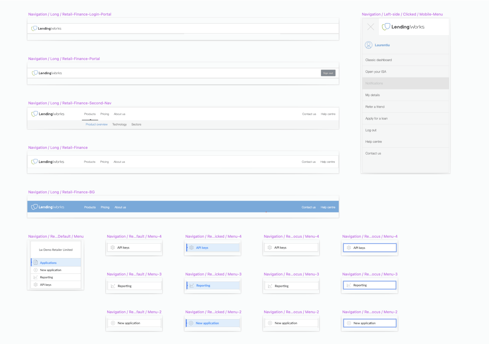
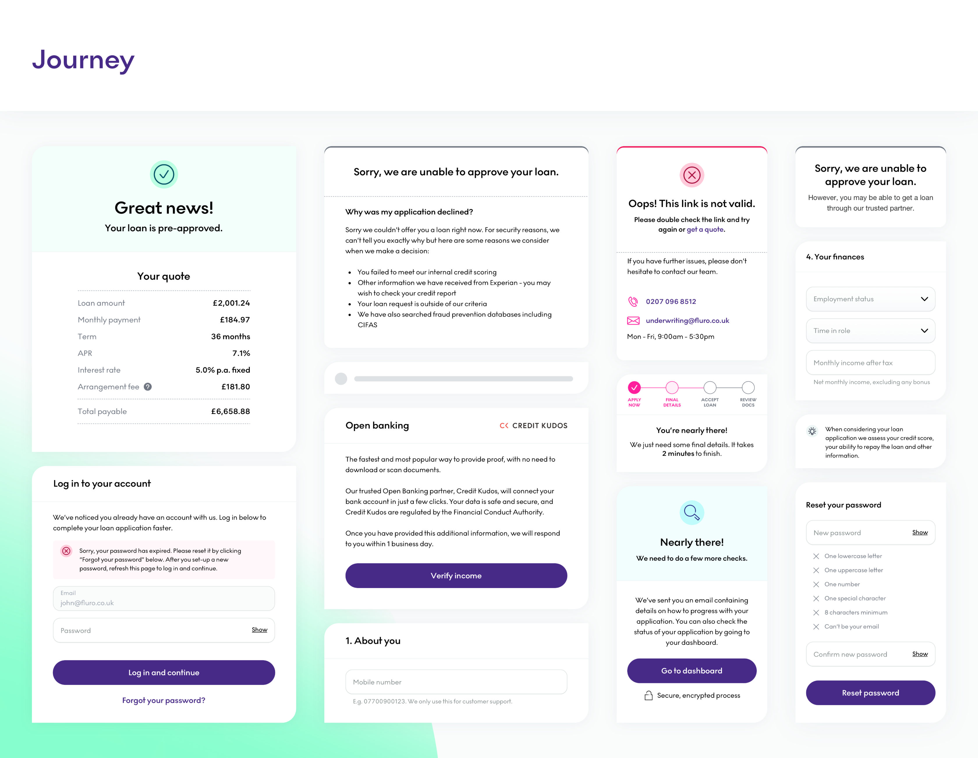
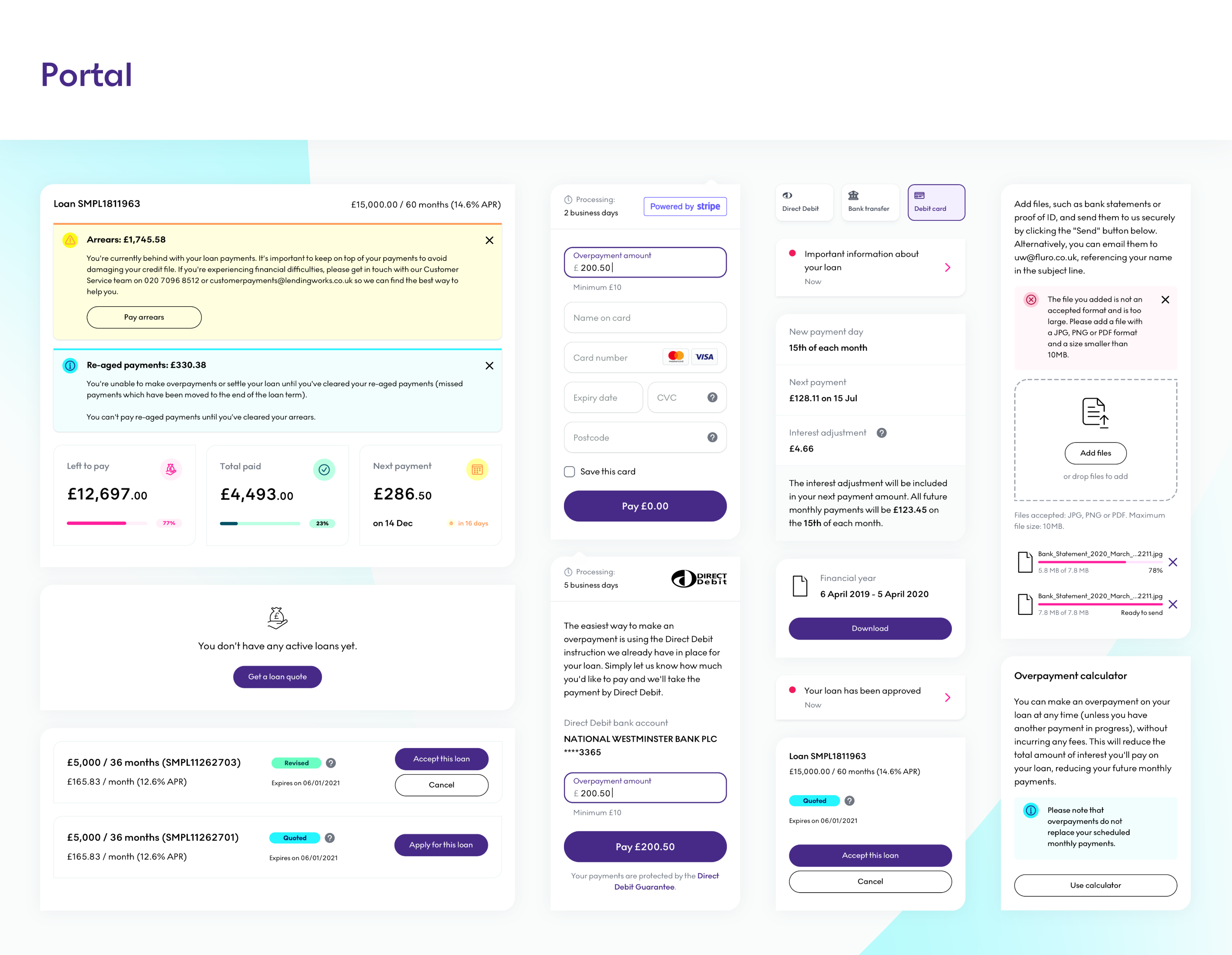
Patterns
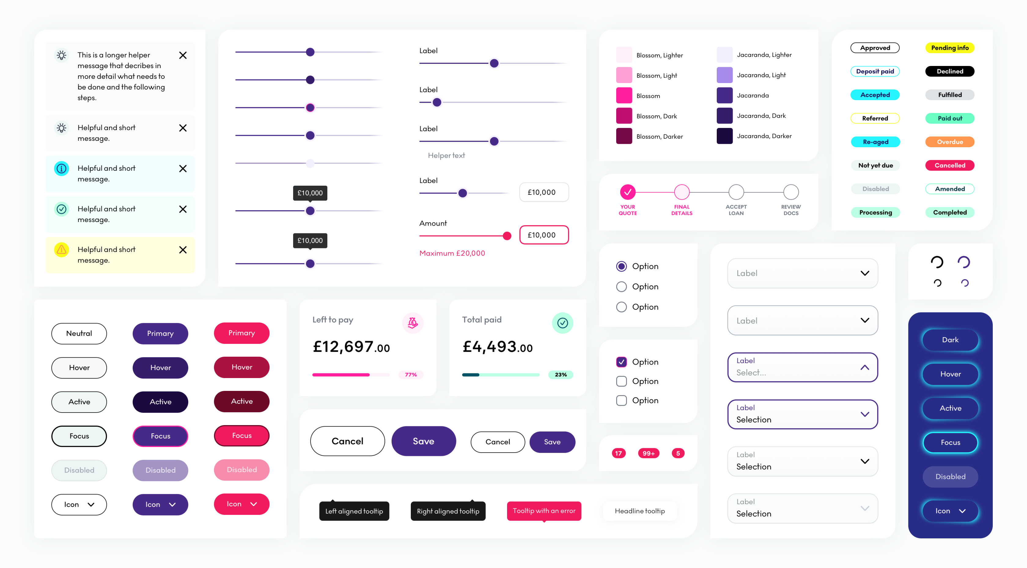
When I started working on the borrower journey and portal, it was the first time I started using this system. However, I quickly realised that in order to build a lot of designs by myself I needed to become more efficient and document repeating patterns. What I call patterns are basically a group of components that can be reused or adjusted without creating them from scratch with every new page. In other words, if we follow the atomic design system framework they are basically the templates. I would not have been able to design 612 pages and counting without these patterns 😅. You can see some of them below.
Implementation and QA
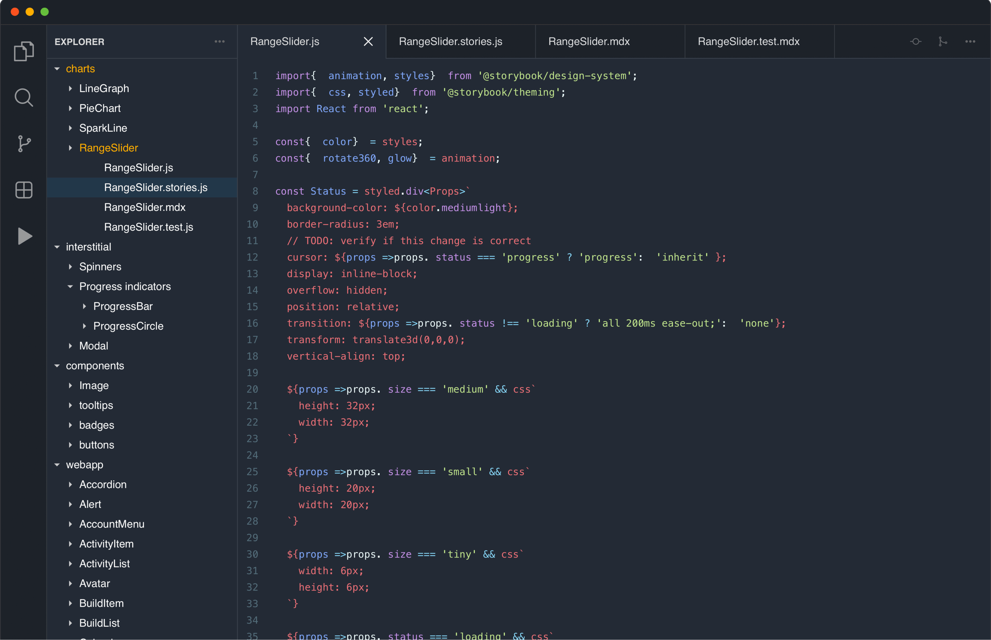
Initially when I finished the design of the system, we tried implementing the components using Storybook coupled to a ReactJS system. However, it quickly turned out to be an impossible task due to lack of front-end developers that can mostly focus on building this thing. So we approached this in a more “lean start-up” fashion. If a page needed a rebuild, it will most likely contain new components so the components were gradually being built when we migrated the technology from Drupal to a fully ReactJS system. We eventually reached a point when new pages were much easier to build because most of the components were developed already. This is far from perfect because as a designer I don’t have full visibility of the system like I would have with Storybook but at least we have the building blocks for the future.